HOME | DD
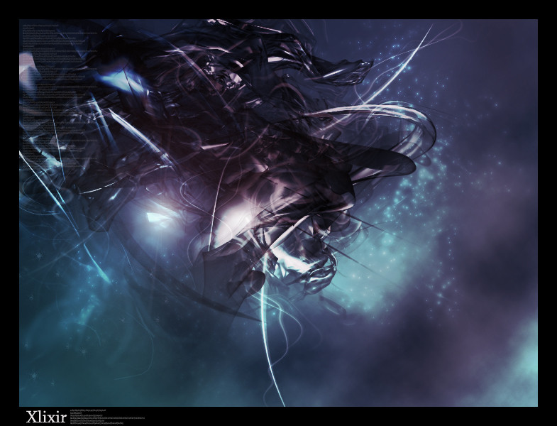
 isolerad — Movement by Isolerad

Published: 2003-07-27 22:31:29 +0000 UTC; Views: 8186; Favourites: 33; Downloads: 910
Redirect to original
Description
MOVEMENT.Hmm everytime I try to submit this something goes wrong...
Related content


Comments: 89

great job man.. a real nice render and really great brushing..but i would have chosen other colours for the 2d...
👍: 0 ⏩: 0

generally I like is but as the others said :
- the 2d stuff could be a. different or b. lighter and colourised
- the drop sharow in the black lines on the bottom sould be removed or set to a vert low opacity
other than that nice work and keep it up!
👍: 0 ⏩: 0


")

dude, this is sweet, and you know it  (Smile)")
i love the renders and the brushing but the 2d kills it, it would be far better if you either, dropped the 2d allthogether or do it again in a more organised form. other than that its grrrrreat
👍: 0 ⏩: 0

nice airbrushing, man. Very good composition and you can actually feel movement. You did a very good job on that picture. THough I don't really like the 2d on that picture (maybe because of colors), but some how seems to me it doesn't fit. But overall though it is really good piece of work.
P.S.: I feel you, every time i try to submit something goes wrong.
 (Wink)")
👍: 0 ⏩: 0


wow impressive 
gr8 work here - colours are beautiful

👍: 0 ⏩: 0

like the lighting fx .. the 3d and typoe needs work tho .. gj
👍: 0 ⏩: 0

This is a super piece of work
👍: 0 ⏩: 0

Wow, very nice. I love it all except the grey typo stuff. That throws it off IMO.
Good work nonetheless!!
👍: 0 ⏩: 0

Very sweeeeeet work, but the 2D just kills it unfortunately :-\
👍: 0 ⏩: 0


i like this a lot but get rid of that complicated grey block on the right :\
👍: 0 ⏩: 0
pixelphoenix [2003-07-28 03:29:39 +0000 UTC]
looks awesome, but as ppl have said, change the 2d by either lowering opacity or making it a better color, to fit the scheme... def. fade it more i think
great job still! if the 2d was more integrated into the piece its perfect
👍: 0 ⏩: 0


Purrrdy... *goes ooo and aah* Not too fond of the grey design in the center-right, though (is that what they call the 2d?). Anyway, +fav and I have a new wallpaper.
👍: 0 ⏩: 0

Nice renders and definetly a good use of negative space. keep up the godo work
👍: 0 ⏩: 0

awesome...2d needs work...very good. +fav
planning on making anything for evoked? the pack is looks amazing so far.
👍: 0 ⏩: 0

3D is great. Brushing is great. But the 2d is less than what it could be. I think it would look better if it was more spaced and not so bunched together. Also, I think it would look better at a lower opacity as someone said above.
👍: 0 ⏩: 0


if u remove the complex 2d and the drop shadow on the black line, it would be better.
Anyway Good work
👍: 0 ⏩: 0


wow thats great bro the darkness , lighting and brush work very impressive one complain for me would be the 2d but besides that great piece hmm should i yup 

👍: 0 ⏩: 0

I like it, use of space and the 2d left on one side brings a nice style to it, would have prefered the 2d to be more transparent, other wise, very nice
👍: 0 ⏩: 0

awesome lighting, it looks like something you'll see in an underwater movie..something with submarines.
Great job!
👍: 0 ⏩: 0

look nice

although i don't like the 2d ")
anyway... good job here
👍: 0 ⏩: 0

wowowowow. its like all smooth n shit.
i'd rather you didnt have any 2d ;p
👍: 0 ⏩: 0

Wow. This is very very nice.
I love the colors, the renders and the lighting most of all.
great work!
👍: 0 ⏩: 0

Dude! Like the darkness of this one. +Watch, +Fav
👍: 0 ⏩: 0

its pretty nice, but i think you should have colorized the typography, because like that it sticks out of the image too much!
kinda ruins a very nice work :/
👍: 0 ⏩: 0

badass although the 2d should be lower in opacity imo, still kick ass though. good stuff
👍: 0 ⏩: 0

Sweet brushwork and renders man , dun really like the typography :S other then that is pretty neat
👍: 0 ⏩: 0

That is so cool wat programs have you used? Nice lighting and colour.
👍: 0 ⏩: 0

OoOOoo.... preetttiiiiiiiiii make me think of blood - meviusu no wa @.@
👍: 0 ⏩: 0
<= Prev |