HOME | DD
 isso09 — Intergalactic Space Pantheon
Published: 2011-05-17 19:56:11 +0000 UTC; Views: 84126; Favourites: 734; Downloads: 1149
Redirect to original
Description
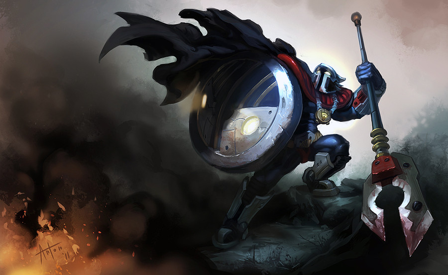
Whew! Long time no upload. I'm currently in between countries/homes so it's tough to find the time and the ergonomic space for painting.Anyway, fan skin for the LoL champion. Please give me some crits, I really want to know how to make him better.
*EDIT* Fixed some things based on your feedback and flipped the image. Hopefully it looks more like a real splash page now ^^.
IF you want to see this guy made into a skin, upvote my thread on the forums! [link]
Thank you again for all the awesome feedback!
Related content


Comments: 218

Space gods? I detect the subtle hand of Lovecraft in your work.
👍: 0 ⏩: 1

I wish! I've never read him, though I should.
👍: 0 ⏩: 0

Ace loving this wish I could do scfi art I tried once I totally to involved in the concept and over do the work great peice loce the comperistion and colour balance.
👍: 0 ⏩: 0

Wow, so cool 0_0
The only thing that might be changed here is his shoulder armor and "almost superman" pants, imho. everything else is just awesome
👍: 0 ⏩: 1
Thanks! shoulder armour is the most intergalactic thing I think. About the pants, yeah maybe he should lose them.
👍: 0 ⏩: 0


I would like this artwork more if Panth did have a more sleek, minimalistic helmet shape, almost like an android. Also, the red accents give Pantheon too much of a comical superhero feel. I'd suggest more neutral colors like gunmetal grey.
Of course, this skin is totally boss. I am a fan of Pantheon, and would totally buy this skin if made available to me.
👍: 0 ⏩: 1
Originally I did have a simpler helmet, and he was more desaturated, but then I realized that everyone in LoL wears really bright colours and the look of the engine is kind of comic-booky (bright colours, black outlines). That said, the super-hero vibe is actually left over from an earlier skin idea, when I wanted to make him into batman. What I ended up going for is old-school sci-fi, which, I think, had some super hero influences. If I were to re-do him, I would probably show more of him, though. Because those bracers and boots are actually kinda sweet.
👍: 0 ⏩: 0

Im sorry to tell you...
there is nothing more you can improve on...
👍: 0 ⏩: 1
That doesn't mean there's nothing i can improve. go look at algenpfleger.deviantart.com
👍: 0 ⏩: 1
Maybe it's just that I'm not an artist. everyone has their own style. I think its really in the eye of the beholder...
meaning I believe that really only YOU can decide what you need to make better. If stylistically, you aren't proud, then take a deeper look into your art...
Dunno. that's really all I can say. I hope this helped a little...
👍: 0 ⏩: 1
Certain styles of art are founded on fundamentals of form, light and space that are found in real life. When it comes to those skills, you can judge where you need to improve and what you need to make better. Then there's basic picture-making skills, which involve how people interpret visual information, and controlling information is what you do in illustrations like this. You can definitely tell when people have no idea what they're doing. YOU can tell too, even if you're not an artist. You just won't be able to explain it.
👍: 0 ⏩: 0

i recall liking the sheild and said something about the helmet. but this looks pretty good any way.
👍: 0 ⏩: 0

FUUUUUUUUUUAAAAAAAAAAAAAAAAAAA QUE ZARPAAADOOOOOOOOOOO !!!
👍: 0 ⏩: 1


see this is why iwatched yu, Pantheonn looookss ammazinggg ^^
👍: 0 ⏩: 1

Really good concept art. Marvelous.
👍: 0 ⏩: 0

Now you must make this into a real skin for the game D8
👍: 0 ⏩: 1
Maybe if I try hard enough, they will accept it.
👍: 0 ⏩: 1
Im sure they will 
It's totally more badass than the other Pantheon skins!
👍: 0 ⏩: 0

i think you made really good compositional choices in this piece. little things like how you used his cape's cast shadow to break up an otherwise-attention grabbing shield shape make me go, 'this guy probably knows what he's doing' *_*
👍: 0 ⏩: 1
Haha thanks! I went through a bunch of grayscale thumbnails before I could figure out what I wanted..
👍: 0 ⏩: 0

This is an amazing piece of artwork isso09 ^^ the only thing i'd say is that the legs seem a little short but hey LoL doesn't care much about that lol XD other than that i'd say this is really great you should submit this to riot, I'm sure that'll they'll give you something worth while for this ^^
👍: 0 ⏩: 1
Thanks a lot! Perhaps they will....
👍: 0 ⏩: 0

sweet piece man! I like that the cloak is so dark and half the shield. But I would like to see more of him lit. Also the legs and his right arm feel awkwardly posed. I dont if its the angle or the lighting or what. I think maybe his left leg is stretched too much.
👍: 0 ⏩: 1
True, more of him would be better. But aren't you just so enticed by the mystery?
👍: 0 ⏩: 1
I like mystery some times but for this piece, it makes me want to see him lit in a dynamic cool way. You really have to take advantage of that orange light!
Also its funny that you flipped the image because thats what i did yesterday when I was trying to crit it, looks better that way but I dont know why ")
👍: 0 ⏩: 1
I prefer the image from the other side, but the splash pages all have characters on the right, so that's why i did it. ^^ You're right, though, he should have had wayy more rims..
👍: 0 ⏩: 1
Are you going to work on it more? or are you happy with the way it is now?
👍: 0 ⏩: 1
It's not that I'm happy with the way it is.. It's just that I don't have time to fix it anymore. My self-imposed deadline passed.
👍: 0 ⏩: 0
the shield should definatly stay.
👍: 0 ⏩: 1
the shield should definatly stay.
👍: 0 ⏩: 0
the shield should definatly stay.
👍: 0 ⏩: 0

I thought this was Panth! Looks like a skin straight out of the game, nice work!
👍: 0 ⏩: 1


No need to bleed, but you better come through if it does come out ^^
👍: 0 ⏩: 0


 (Smile)")


 (Wink)")

it mean thats your work is very nice
")
👍: 0 ⏩: 1
Sounds awfully similar to "awesome" if you ask me.
👍: 0 ⏩: 1
<= Prev | | Next =>