HOME | DD
 isso09 — Intergalactic Space Pantheon
Published: 2011-05-17 19:56:11 +0000 UTC; Views: 84126; Favourites: 734; Downloads: 1149
Redirect to original
Description
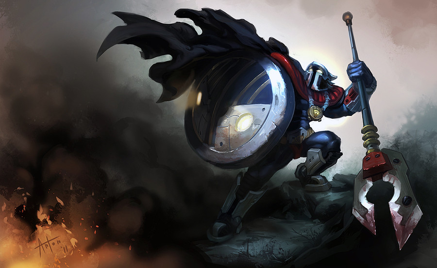
Whew! Long time no upload. I'm currently in between countries/homes so it's tough to find the time and the ergonomic space for painting.Anyway, fan skin for the LoL champion. Please give me some crits, I really want to know how to make him better.
*EDIT* Fixed some things based on your feedback and flipped the image. Hopefully it looks more like a real splash page now ^^.
IF you want to see this guy made into a skin, upvote my thread on the forums! [link]
Thank you again for all the awesome feedback!
Related content


Comments: 218

A way to make this better, are you kidding? Submit to Riot immediately, that's about the only way this could be better!
")
👍: 0 ⏩: 0

One word. Amazing.
Keep up the good work man.
👍: 0 ⏩: 1


^ THIS
I'd buy this skin in a heartbeat! Amazing job!
👍: 0 ⏩: 1

Its Jax!....its Blitzcrank!!!!.....no...its PANTHEON!!!!!!!....wtf? Lol I'd buy this the day it came out.
👍: 0 ⏩: 1

Perhaps it will... I might hold you to that if it does!
👍: 0 ⏩: 0


 (Smile)")

Man every time I am just clicking through my dev-watch looking for any thumbnail that looks interesting I always pick up anything you have uploaded without seeing the name. Like every single time, you are rad.
Anyway, He looks very much like a Marvel comic book hero/villain which is the type of thing LoL needs, but I have skipped out on LoL so I don't know if that is in keeping with how they designed their characters. Just figured they kept it in line with Dota, and so Warcraft. If that's the case then this is much cooler than that. I think his left boot is a little too greyed out behind the smoke, hes really got very little light on him besides the reflection on the shield and his eyes, its making his general colour scheme feel pretty grey/bland. I would bump up the blue where you can, maybe make more of his mantle that bright saturated red you have at the highlight. also at the end of his spear the red there is closer to us than anything else on the picture but its still pretty grey,
This is all sounding super negative. I do like it. In particular the lights in his shield, they are way cool.
👍: 0 ⏩: 1
Thanks so much man! This stuff is super useful. You're right, I will bump up the saturation in some key areas, and will put more detail on the spearhead.
👍: 0 ⏩: 0

Oooooooh !
There is the spirit of Frank Miller's 300...
👍: 0 ⏩: 1
<= Prev |