HOME | DD
 itirep — Syndicate Pictures logo itirep
Published: 2002-01-31 00:04:42 +0000 UTC; Views: 332; Favourites: 1; Downloads: 44
Redirect to original
Description
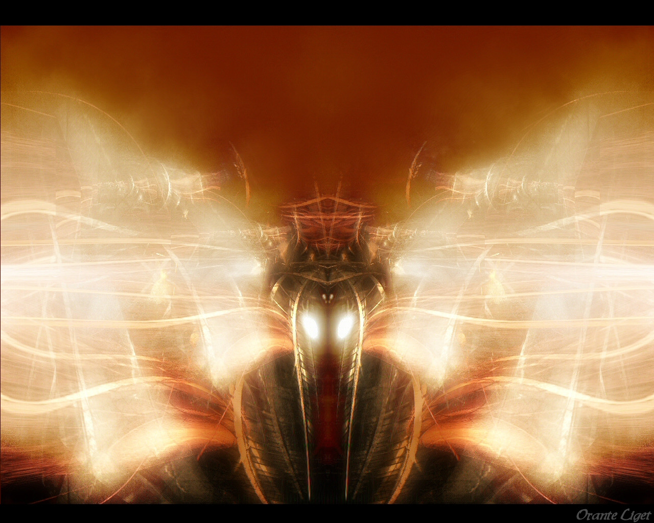
i figured i'd do a wallpaper version of my entry for the Syndicate Pictures contest. it prolly won't win but hell $500 is $500.it lacks some of the detail of the original but the original is 3000x2000 so i just left it at this. thought someone might like it.
enjoy!
Related content


Comments: 11

the film role, and the lensflare do not go with the picture, the glow is just.. not supposed to be there..
-----
___________
i am a kiwi...
aim: antL hate
email: keeblus4@earthlink.net
¯¯¯¯¯¯¯¯¯¯¯
👍: 0 ⏩: 0

good choice itirep!!!
I really like this!!
cazzanova is not an artist.....he is a state of mind
👍: 0 ⏩: 0

trying to say that's a GOOD use of lens flart.
----------------------------------------
Yes, this little devious deviant needs to get some.
👍: 0 ⏩: 0
Lens Flare alert!
Looks sweet, even with the "residue" from it.
----------------------------------------
Yes, this little devious deviant needs to get some.
👍: 0 ⏩: 0

Nice work with the lens flare, doesn't look too cliche.
¤-[Kwan Studios Finland]- http://www.kwanstudios.com
👍: 0 ⏩: 0

Very nice work man. I like the bright orange colours. The lighting effects seem a bit out of place, probably because there are just so many of them. Other then that, i like the setup and the overall piece. Good work.
:: exy BrazenSix(Mathias) :: http://www.dfektion.org ::
:: The snowman outside my igloo tells me to burn things ::
👍: 0 ⏩: 0

it looks good, but i think that flare over the letters is a little too... painfully bright. hehe... maybe if it were toned down just a bit. other than that, it's pretty sweet.
[from the mind of a deicidal maniac]
http://ka0s.hn.org
👍: 0 ⏩: 0

nice work itirep. not fond of the color choice but this is still good stuff here.
http://www.jarkolicious.com
👍: 0 ⏩: 0

yeah- as i said this is resized from the original so it has a few things that don't look quite right. those jagged white lines full size are lightning. i tried to fix what i could on it. oh well.
maybe i'll just redo the whole thing at a smaller size.mayb e not.
i want to die peacefully in my sleep
like my grandfather
not screaming and yelling like the people in his car.
👍: 0 ⏩: 0

Nice, but needs some work. I can see a lot of jagged white lines in it that should not be there and the text is rouf to. Hopefully you can fix these lil problems.
👍: 0 ⏩: 0

wow. that was fast bro. very nice. i hope it wins. =]
://cha.os
://perceiving.is.believing
👍: 0 ⏩: 0