HOME | DD
 itirep — Vixenary
Published: 2002-02-20 22:47:18 +0000 UTC; Views: 1165; Favourites: 10; Downloads: 119
Redirect to original
Description
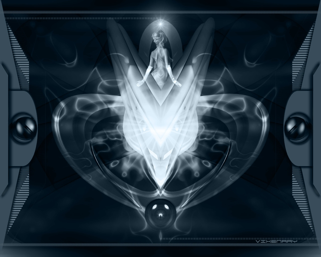
I posted this a couple days ago but took it down after some problems were pointed out. thanks to those who pointed them out.enjoy!
Related content


Comments: 27

I love the way your stuff works with both brightness of things and yet making it so dark.. I have always been amazed at people who make wallpapers.. because they're so intriguing (sp).
This is a beautiful piece.

👍: 0 ⏩: 0


oh my goodness! what beautiful work you do!!! i just don;t know what else to say!
👍: 0 ⏩: 0


Oh hell yeah!
Now that is a secksy WP.
-----
----------------------------------------
Yes, this little devious deviant needs to get some.
👍: 0 ⏩: 0

Whoa, those side objects really freak me out, they fit so well into the image.. (mr. 6 people put makeup on me and spanked their dicks on my face)
Note: no pun intended, just had to say it
-----
¤-[Kwan Studios Finland]- http://www.kwanstudios.com
👍: 0 ⏩: 0

Nice and smooth... I like the sides especially. Reminds me of the interface I've seen on some websites. Great work
👍: 0 ⏩: 0

Okay...it won't let me add it to my favorites right now...I'll have to try again...
(*)
-----
The fewer see me the better
👍: 0 ⏩: 0
Excellent! This goes into the favorites right away!
(*)
-----
The fewer see me the better
👍: 0 ⏩: 0

iti!!!!!!!!!!!!! just keeps em comin...
sweet work as always bro. your work so rocks...wish i was good like u man...
nice work
peace
-----
:::riven:::
👍: 0 ⏩: 0

daaaaaaaaaaaaaaammmmmmmmmmnnn *has heart attack*
-----
Just Another Jackass
.42920.789321.109322
https://mantra.deviantart.com/
http://haloeight.net/
👍: 0 ⏩: 0

You are working not on borders but on frames now...
interesting the kind of frames you have selected... solid frasmes vd jpg-likeable Content...
MAybe backwards would also be cool?
-----
The craziest deviant since Nov 19, 2000
👍: 0 ⏩: 0

Very smooth(obviously).. the borders and sense of symmetry are just right. I likes.
-----
www.thallos.net
👍: 0 ⏩: 0

nice play on words with the title... hehe. great picture too the borders are especially sweet. of course the focal point is pretty awesome as well.
-----
[from the mind of a deicidal maniac]
http://ka0s.hn.org
👍: 0 ⏩: 0

i dunno....i got mixed feeling.....just commenting because I can
-----
---------------------------------------- --------------------------------------
liquid.deviantart.com
How much can you know about yourself, if you dont try everything you can. Believe in the FACT that you can do anything.
-------Faithfully Adopted Son of w00zy https://w00zy.deviantart.com -------
👍: 0 ⏩: 0

I really like the colors, and although im not particularly fond of the two sides, the middle makes it up for me
-----
-amphex (Dan)
[Planning on thanking me for my comment? Why not do something 20 times more helpful..comment on some of my stuff! thanks!]
👍: 0 ⏩: 0

Damnit, i guess i must've missed it. Unless my memory is going again. Anyways, this is really great man. I love the mirrored effect as always and the colours are a great combniation. Good work.
-----
:: exy BrazenSix(Mathias) :: http://www.dfektion.org ::
:: The snowman outside my igloo tells me to burn things ::
👍: 0 ⏩: 0

this is beautiful work itirep. really love the colors and the pose that you put the focal point in. overall nicely detailed and designed to be aesthetically pleasing!
-----
https://www.deviantart.com/help/faq.php http://www.jarkolicious.com
👍: 0 ⏩: 0

Really smooth, great deep blues complemented by the white. it flows. neat
-----
___/dephunked]
👍: 0 ⏩: 0


awsome nice job
-----
-------------------------------------
up..
👍: 0 ⏩: 0

