HOME | DD
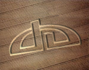
 ixnay — Cornfun
Published: 2002-04-14 12:44:38 +0000 UTC; Views: 344; Favourites: 1; Downloads: 107
Redirect to original
Description
Hehe, just a quick manipulation for this cool contestSometimes when I look at it it seems as if the logo comes out of the corn, I don't know how to change this problem.
What do you think of it???
Related content


Comments: 8


Mmm... very cool.
-----
Just remember, Alana lubs j00 all!
👍: 0 ⏩: 0

This one looks cool.
Try making the logo look 3D-ish by adding a cut-out shadow that's slightly darker than the line but lighter than the dropshadow.... err... does that make sense? My point is the logo looks flat and the dropshadow just makes it float.
-----
~Dissect Your Mind~
👍: 0 ⏩: 0

Hey pooka that's the problem, sometimes when you look at it, it comes out and sometimes it is in the field. Can somebody tell me how to fix it?
-----
I----
-X---
--N--
---A-
----Y
-----
👍: 0 ⏩: 0

Hehe... very cool. I dig the cropy, but shouldn't the pattern in the field be dented down instead of bulging up?
👍: 0 ⏩: 0


looks cool
-----
~TigAEr https://tigaer.deviantart.com/gallery/
~.:see-to-feel:.~
👍: 0 ⏩: 0