HOME | DD
 jaggedice200 — Abstract 6
Published: 2009-05-18 19:10:54 +0000 UTC; Views: 121; Favourites: 2; Downloads: 0
Redirect to original
Description
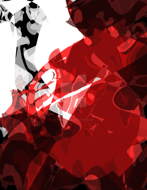
This one was a little forced... yes I admit it is. I make take this down and add a border later. It'sm missing something, it comes off jazzy but isn't quite complete. I might need ot add more white and black or something.At least it gives me an idea for the next image I will make ^__^
Related content


Comments: 2

lol thx for the comment, I might just end up making sequel instead of retouching it.
👍: 0 ⏩: 0

Really? I can't tell that this is forced at all. Then again, when I saw it from the thumbnail, I kinda "whoo-hoo~blooood!"-ed. XD Anyhoo, I'm diggin' the intense reds along with all of the curves/waves. If you do edit this, perhaps more white somewhere? Red always looks delightful against white. :D
...I'm starting to sound mildly morbid.

👍: 0 ⏩: 0