HOME | DD
 jankin — P5

Published: 2002-08-28 03:33:58 +0000 UTC; Views: 776; Favourites: 11; Downloads: 68
Redirect to original
Description
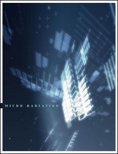
This one is a personal shape study. Took some time...Only Photoshop6.
And yeah, sorry for the big file size but all the grid looks very awful with higher compression. Thanks
Related content


Comments: 34

love your work on this one. very simple, very futuristic. the yellow is great.
👍: 0 ⏩: 0

nice, very nice
i really like this
especially the use of the yellow, thats what made me view this in the first place
good work, keep it up
👍: 0 ⏩: 0

well, i went through ever piece in your gallery looking for somethin i could 
 (Smile)")
👍: 0 ⏩: 0

the typography! the colours!
wow. just wow. heavy good study.
i like it a lot.
imrik-
👍: 0 ⏩: 0

I sipmly luv the composition and how you experimented with colors and shapes. Great work
👍: 0 ⏩: 0


both typo + photos are composed very nicely indeed, the hues and bordering also adds a bit to this piece... !
👍: 0 ⏩: 0

Very nicely done, if not for the "01-05" at the bottom, I'd fav it.
👍: 0 ⏩: 0

crazy! i love this, great mixture of photography and 3d/2d
love it.
👍: 0 ⏩: 0

Beautiful piece. I love the warm yellows and the different shapes in each box. Very nicely done.
👍: 0 ⏩: 0


very cool I was trying to figure out what was in there. thought it was skateboard wheels but i not sure what I see really. Just rambling.
👍: 0 ⏩: 0

wonderful design .. bold and lush. the images themselves are quite interesting, but your placement, additions and linework are superb. very nice piece. the colors warm me. but its damn hot here .. so im bout to burst in flames!
great work jankin.
👍: 0 ⏩: 0

that is very cool, i like the yellowish color tone in this image, I love the way u have divided the images and it works well in together. awesome job!
👍: 0 ⏩: 0

bravo, pure genius. this has so much identity, very original.
+fav
👍: 0 ⏩: 0

Wow, looks great! Took forever to load on 56k because of your compression rate... but it was worth waiting to look at. Great work.
👍: 0 ⏩: 0


Colors are great, and manipulation too. Nice work
👍: 0 ⏩: 0

very unique, nice color scheme, everything fits together real well, great job!
👍: 0 ⏩: 0

i decided to come here since you spamed the shoutbox like a mofo. lol . kinda neat. i agree with the advice above me.
👍: 0 ⏩: 0


pretty neat - the blending could be improved some - the transitions between blurred and non-blurred in the left 2 frames especially - just doesn't seem to fit in w/ the rest.
👍: 0 ⏩: 0

nice manip you have here... everything fits well together.. colors and shapes good job !
👍: 0 ⏩: 0

the yellow is tasty...would make a nice interface for a website somehow
only gripe is that the last 2 or 3 are a bit too bright
👍: 0 ⏩: 0


awesome work jankin. the little jagged lines in the photos are bit distracting but the color overlay and the photos are pretty amazing.
👍: 0 ⏩: 0


Wow!!!! Great combination youd made here!!!!! I just love the perfect yellow tone all over it!!!!!! You mixed the shape perfectly, and the other thingies you addes with photshop gives a kinda futuristic look! Very nice!
👍: 0 ⏩: 0

this is awesome.. I love all of the photos put together.. each one is unique and stands on its own quite well.. the bright thumbnail caught my eye and I just had to find out what it was. very intriguing piece..nice work, well done.
👍: 0 ⏩: 0


wow, this is sooo cool, i love the way you did this... im usually not that smart when it comes to photgrapy, but i know this is a worthy deviation
this is so incredible... +favs
👍: 0 ⏩: 0

It looks interesting. Not much to say about it (Don't take that wrong), but it looks great.
👍: 0 ⏩: 0