HOME | DD
 Jared1481 — Endless View
Published: 2010-07-20 15:00:18 +0000 UTC; Views: 8748; Favourites: 456; Downloads: 0
Redirect to original
Description
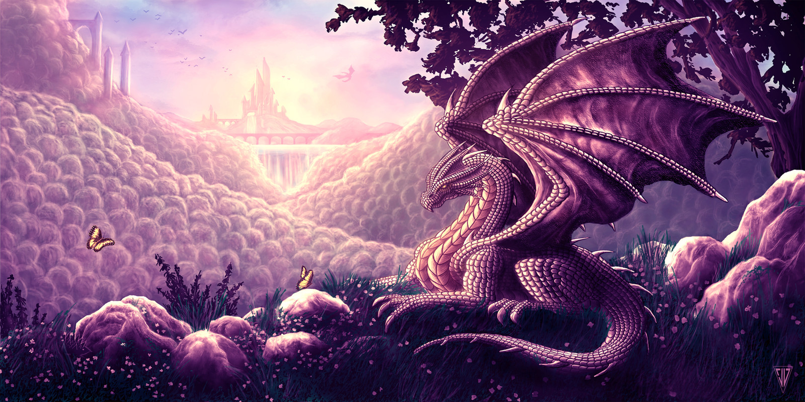
For my girlfriend Liz [link] who has been wanting a picture for quite sometime (Smile)")
I think I am happy with the end result. All I know is I can't look at this anymore and that usually means I am done. Even tho I know there are a ton of mistakes. Comments & Critiques welcome!
Wacom Intuos 4 Tablet
Related content


Comments: 179

Hmmmm 4-5 hours a day (if not longer) for over a month...so Ima say to freakin long lol. I honestly can't believe I stayed interested in this picture for that long. Usually after 2 weeks I am shot. But yeah, the more i look at it the more i see my mistakes and makes me not like it lol. Weird how that happens.
But yeah you are right. lots of problems with the anatomy and I hate the wings lol which I am surprised no one said anything about. Oh well...just need lots more practice. So glad you like tho and thanks so much for taking the time to leave me this comment. Truly appreciated
👍: 0 ⏩: 1

Man, that's pretty intense but it was definitely worth it. It's difficult to stay focused on something that takes as long as that for sure haha
And yep, practice, practice, practice...that's what it takes! You've got remarkable talent though so this is seriously no small feat at all haha I honestly love the wings xD
Either way, you're welcome for the comment! ^-^ Keep up the awesome work =3
👍: 0 ⏩: 1
Very difficult to stay focused lol But if I am gonna keep tryn to make everything so detailed I guess ima have to live with it. Thanks so much again ")
👍: 0 ⏩: 0

👍: 0 ⏩: 0

A beauty and I love the detail in that dragon!
👍: 0 ⏩: 1
Thank you Anna! Was very nerve racking. Glad you like
👍: 0 ⏩: 0

Great color scheme, beautiful effect. The shading on each individual scale...that must have taken forever!
👍: 0 ⏩: 1
haha you are right about that! Wayyyy too long! So glad you like
👍: 0 ⏩: 0


I really love the lighting and the landscape in here- the background looks so magical (as well as the foreground).
There are still things that can be improved. The dragon got some very nice details on his (her?) body, but the lines for the scales are almost too strong, means the shadows of the scales should also be affected by the light. There are some minor problems with the anatomy of the neck and the legs/arms. The neck looks a little bit weird with the two big scales run down the body. It looks a little bit like we look at it from the front and the side at the same time, which is a perspectivic paradpox. Also the right arm (in the background) wouldn't be so visible in this perspective.
The arm is attached a little bit weird on the body. It somehow looks like it isn't really a part of the rest, which is certainly not the case. Maybe you can look at somereferences of four legged animals (like cats) to see how the muscles will look.
Same for the hind leg, there you also could add some more shadows so we can see more clearly that the leg bended.
Now onto the colors: You basically just used a pinkish color for the whole picture, expect the foreground with some bluish colors. This difference is nice, because you get more contrast this way. Still, I would have chosen a different color for the dragon, because he is the main character of the picture and should get more attention. Right now he gets a little bit lost in the background, because he have a really simliar color.
Composition of the picture is really good. You have your character not in the center and the lines lead us all around the picture- I especially love the butterflies you added there^^
I think this is a really beautiful picture, which is really well done!
(actually, I guess I could have add this as a critique, but somehow I don't like to use this flashy feature^^)
👍: 0 ⏩: 3
Yeah exactly! I really dislike the hard outlines on the dragon. As well as alot of other things like the dragons anatomy. All things that I am really gonna practice more on. I also played with alot and I mean alot of different colors....but ended up stickin with this since it clashed with other colors. But you are too right...the dragon needs to pop out more. My color issues are another thing I need to work on. I usually do my pictures in black and white, then I will add an adjustment layer for the color then add in other little colors. For this one I used a pinkish adjustment layer. But I need to stop doing that. Sometimes it looks nice but looking back on my artwork they all have one color tone. So I really need to get away from that.
Thanks so much tho for your tips and your critique. I like when people are honest and tell me what I need to fix and work on. Only way Ima get better! So thanks so much OrmIrian
👍: 0 ⏩: 1
Colors are something really difficult- same as the lighting.
I used to start with black and white too, but I never really found a good color scheme at the end.
Now I start with the coloring, even if I need to be more careful about the light this way. Best way is to chose a gradient (two different colors) for the background right in the beginning.. like green for the ground and something blueish for the sky. Then you can start to detail the background and start drawing your characters.
I still work with the adjustment layers a lot, since I tend to chose horrible colors in the beginning
That's what I actually liked so much of your picture "Ancient Aliens"- there you got the perfect color scheme for such a picture
Hehe, my old pictures are all rather pale^^
No problem! I might not write so many comments, but when I write one, I try to write more than just four words
👍: 0 ⏩: 1
That is seriously a great idea for the colors. I am gonna try that on this one I am working on since haven't gotten to colors yet. I think my 1st 3 I have ever done on my tablet I did that because I didn't even know about the adjustment layer option. The adjustment layer I might still use at the end but I don't want it dominating my picture. I hear you about the comments tho. I gave up tryn to thank everyone for adding my pictures as faves as it gets really tiresome. So I usually reply to just messages and watches or if someone adds numerous faves.
I seriously love this site because I get great tips from great artists. Thanks so much again
👍: 0 ⏩: 1
Yeah, adjustment layers shouldn't be used too much- I always have too many layers at the end because of them
I have given up thanking for favs a long time ago- even though I still try to visit each profile (and leave a llama back!^^) I'm still thanking for watches though.. and of course I will reply to each one which comments my pictures
That's true, although most people just write "awesome" under each picture.. they don't even say what's so "awesome"..
I'm working at some commissions for a bigger project at the moment. Unfortunately, I may not upload the pictures until the project is finished
👍: 0 ⏩: 1
Yeah same here. I couldn't tell you how many layers I had for this one. Wayyy too many. By the end I was just so confused haha. I am just always afraid of merging layers. I got spoiled being able to go back and fix things on this tablet lol
👍: 0 ⏩: 1
Sometimes you can't even merge the layers anymore- if you want to have the characters on a seperated layer and maybe used options like "overlay".. if you merge just the layers for the character, it will look differently than if you don't merge it ")
👍: 0 ⏩: 1
Haha exactly! By the end of a picture it takes 15 minutes to save since the file size is so big. I just really need to find a new method of doing things.
👍: 0 ⏩: 0

I have to disagree on the dragon...Dragons are mythical creatures, therefore their anatomy is subject to interpretation
👍: 0 ⏩: 1
Yes, dragons are mythical creatures, but if you draw them in a realistic style, you still need to follow some antomical rules. I don't say you have to copy the anatomy of a cat or whatever.. it can have it's own anatomy, but it has to be somewhat logical- or at least explained, otherwise it looks weird.
That's why using some references never is a bad idea (although I also use them rarely^^), because then you see how the body of other animals works and can base your concept on it.. base, not copy.
If you use an "unrealistic" style (something more abstract), I would agree. But if you want to reach a certain realism, there are some more rules to follow.
👍: 0 ⏩: 0
I have to disagree on the dragon...Dragons are mythical creatures, therefore their anatomy is subject to interpretation
👍: 0 ⏩: 0

hmmm, nice light play, i wonder: those in backgrounds are rocks, and further waterfall in front of castle?
Did you got some picture in your head before, or just random thinking...both-way it's was worth to mention.
"Be gentle as butterfly"
Well....dragon look little odd
 (Wink)")
👍: 0 ⏩: 1
I mainly had a picture in my head what I wanted. But took a few pictures as references for the hills. That is my attempt at a waterfall tho...something i need to work on lol Glad you like tho
👍: 0 ⏩: 0


wow looks amazing i wish i could do stuff like this on photoshop oh well nice job
👍: 0 ⏩: 1
Thanks so much! Your work is really detailed which I like
👍: 0 ⏩: 1
ya perhaps and skill with drawing too i cant draw with a tablet very well lol better with sketches and etc oh and thanks thats nice of you to say to me ^^
👍: 0 ⏩: 1
of course! Your artwork is really good tho and I do see alot of skill
👍: 0 ⏩: 1
thanks glad you notice that i put detail in my drawings. Well i just want people to notice my work more so i figured if i get really good with a tablet i get more watchers and etc.I still have a ways to go to good luck to you
👍: 0 ⏩: 1
Yeah same here. Good luck to you too
👍: 0 ⏩: 0

Awesome colours!! LOve the bubble wrap like hills, lol. The dragon is so detailed, awesome!
👍: 0 ⏩: 1
Thank you Glaiceana
👍: 0 ⏩: 1
You are too kind. Thank you
👍: 0 ⏩: 1

you're welcome. I can be harsh if I want to but you have given me no reason to with this picture.
👍: 0 ⏩: 0


The coloring is amazing. Mostly when people paint a picture one single color, it looks bland, but... you've got it going on. I also have a special love for dragons.

👍: 0 ⏩: 1
Wow thank you
👍: 0 ⏩: 1
You're welcome, no problem.
Haha, obviously. But I wouldn't quit completely on it; you're pretty good at balancing out the different shades.

👍: 0 ⏩: 1
<= Prev | | Next =>