HOME | DD
 jdybowski — Distant Optimism

Published: 2005-05-02 16:09:01 +0000 UTC; Views: 1472; Favourites: 36; Downloads: 217
Redirect to original
Description
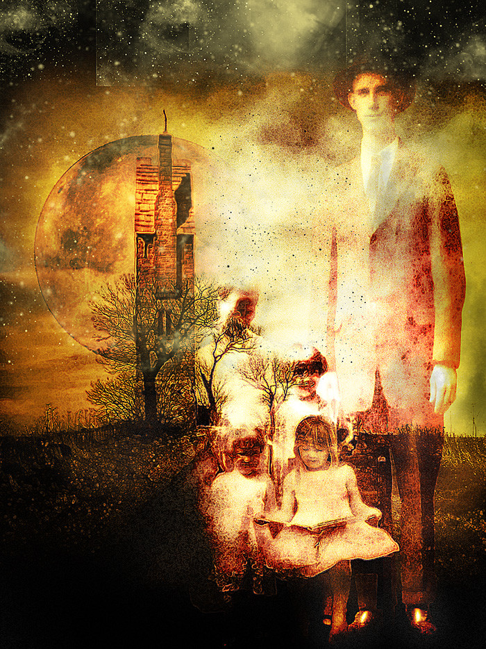
felt the need to do another piece to get back into the swing of things....and well, here is the result. i think it came out pretty descent for not trying too hard. tell me what you think. TY.John
Related content


Comments: 21


The piece is great, no doubt about it. The shades and colors go together fine. You can't really tell it's a photomani. , which is skill.
I suggest you change around the shading a bit. It seems too dark, especially at the front. The black trail from the stairs doesn't look too good, personally I think this piece would be better without it. Also, the top of the stairs is too blurred.
Great piece.
 (Cool)")
👍: 0 ⏩: 0


wow this is an amazing peice of abstract art. it reminds me somewhat of the wizard of oz
👍: 0 ⏩: 0


simply wonderful!
--------
visit my stock: ~KasStock
my art: ~world-of-silence

👍: 0 ⏩: 0

Whoa. You know what I love the most about this one? Color. For me - it brings sadness. Like if I wanetd to be optimistic but no matter how hard I try it's always impossible for me to see the world this way...
Sounds kinda stupid... Well, let's just say that I like this one, ok?
 (Smile)")
👍: 0 ⏩: 0

this is just a very fun image. and the greenscape really adds to the optimism of it all
👍: 0 ⏩: 0


Great concept looks really cool. Now, i dont know if how you wanted it, but it looks like you were goin for a sort of grungy look to the whole thing. And you did with most but certain parts like the house mainly, and the antena some are way to sharp and clean i think yopu maybe add grain or a small blur they might fit in a lil better....hehe ya asked for critique ")
👍: 0 ⏩: 0

Nice job, man. I really like the colors and the way this piece shows everything going together. I´m not sure about the shadows though. Anyway, I just love it and this adorable piece is amazing! 

👍: 0 ⏩: 0

very nice
👍: 0 ⏩: 0

I think that this looks so awesome, i honestly do. Everything goes together in that surreal kinda way..very aweseome effect
👍: 0 ⏩: 0


sweeeet.. enormously cool and very surreal.
👍: 0 ⏩: 0


The color looks like one is looking at the scene through night vision goggles. The staircase reminds me of the stairs in The Labyrinth or Harry Potter. i like it. It makes it sort of an optical illusion. Really great for a quick "get back in the game" piece.
👍: 0 ⏩: 0

THats really pretty cool man!!...Dont ya just love quickies
👍: 0 ⏩: 0

Wow, fantastic work! Love the surrealism. Since you’re looking for critiques, the one (tiny) thing that popped out to my eye was the staircase might use a little more definition at its curve, right now it gets a bit lost. I dunno, it’s really awesome. What’s your medium exactly?
👍: 0 ⏩: 0