HOME | DD
 jedeye459 — Forgotten Impression

Published: 2002-11-26 16:10:50 +0000 UTC; Views: 2725; Favourites: 44; Downloads: 271
Redirect to original
Description
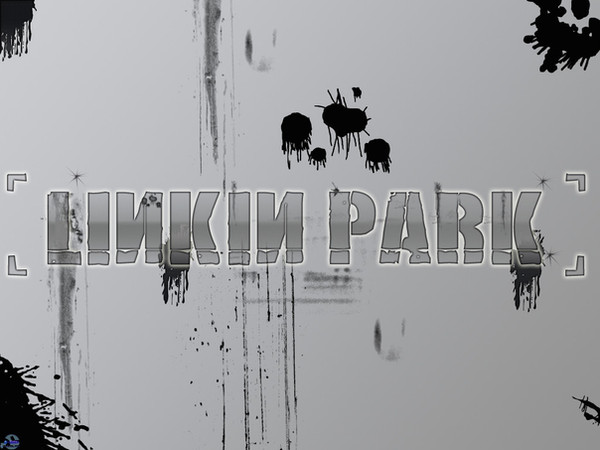
Well for digital imaging we had to make something that reflected a song or poem… I chose Forgotten by Linkin Park b/c I thought it would be fun… I ended up just going to town with this one… the final product came to a size of 60x10 inches, and looked really good printed outSome of you may notice the 2d elements from enterprise… hey who says I cant recycle
Related content


Comments: 72


Absolutely beautiful. Those colors are awesome...just...everything....
👍: 0 ⏩: 0

Although I am not a linkin park fan. I must say this is an amazing graphic.
Normally I think the grunge look is generally overused... but this here is what defines the grunge look... at least for me anyways.
Amazing work.
Good Job A+
👍: 0 ⏩: 0


Very cool!
God would I love to have this hanging on my wall!
The grunge work is very nice, but the detailed 2D work really just blew me away
Amazing work.
👍: 0 ⏩: 0


Man, that's some awesome stylish intricate 2D work!
👍: 0 ⏩: 0

That's an excellent piece of work, and there's nothing wrong with recycling. If it's a crime then I'm guilty as charged
👍: 0 ⏩: 0


excellent work! the typography, the design... simply marvelous. i think you should try more of this style. it suits you quite well.
👍: 0 ⏩: 0


This is excellent work. It is very relevant to the band IMO and all the visual elements, composition, colour and the grunge are very well designed.
Reminds me of a uni assignment I did of a CD cover on a ficticious band similar to LP because I used hexagons as well.
Excellent work Jedeye
👍: 0 ⏩: 0


that looks beautiful jedeye, i would just use a different font.
good job
👍: 0 ⏩: 0

I really like it a lot!! But i Don´t like linkin park
Great work though
👍: 0 ⏩: 0

sexy Jon.... it's allways a blast when you submit I miss the old days. Get working on that poster
👍: 0 ⏩: 0

That's great, the colors and grungy look really fit the theme of the deviation.
👍: 0 ⏩: 0

AMAZING! +fav just love it very inspirational to me
👍: 0 ⏩: 0

wow... Im not generally a fan of grunge, nor am I a fan of Linkin Park, but this is just awesome... There is never a "flat" spot, everything has texture and presence. Very cool. I like how the black and red seems to make the skyline of a city... very awesome.
👍: 0 ⏩: 0


This kicks ass, really like it
when are you going to start back on the 3d rendering man
👍: 0 ⏩: 0


uhmm... *gets rocked*
awesome tribute to LP dude..
you outta submit this in and show them
they'd prolly get rocked too
no joke.. this is right up their alley/style of design work.
great job!
👍: 0 ⏩: 0

jeebus!! love the colors. dammit, the whole thing is awsome. good job jedeye!! fav!
👍: 0 ⏩: 0

I'm not crazy about Linkin Park, but I really like this piece. Very industrial-tech look to it.
👍: 0 ⏩: 0


Very grungy. I like it. Since you say it looks so good prited out, planning on selling on DA Prints?
👍: 0 ⏩: 0


perfect iek-indus style. i like the typo in it. amazing grunge compo in full view
👍: 0 ⏩: 0

amazing style ..........
finally ,,i see something new here ..
+fav
👍: 0 ⏩: 0


Fantasmic! This is some gorgeous work! Probably the LOOOOOOOOONGEST deviant ever though
👍: 0 ⏩: 0

oh yeah! you certainly went to town on this one
sweet vectors!
👍: 0 ⏩: 0

beautiful composition. I love the complexity of layers and imagery. Great typography. Good colors.
very well done.
👍: 0 ⏩: 0


This is so well done. Im really loving the sweet vectorness, mixed with the grunge. I now have an inspiration for something Im working on
I really enjoy the text, though the stereo levels thing could use a bit of work, but not much. Maybe grunge that up a bit, I dunno.
Overall, Im really enjoying this
👍: 0 ⏩: 0

| Next =>