HOME | DD
 jedeye459 — Motion Capture TIL v2

Published: 2004-03-23 06:19:21 +0000 UTC; Views: 1409; Favourites: 27; Downloads: 711
Redirect to original
Description
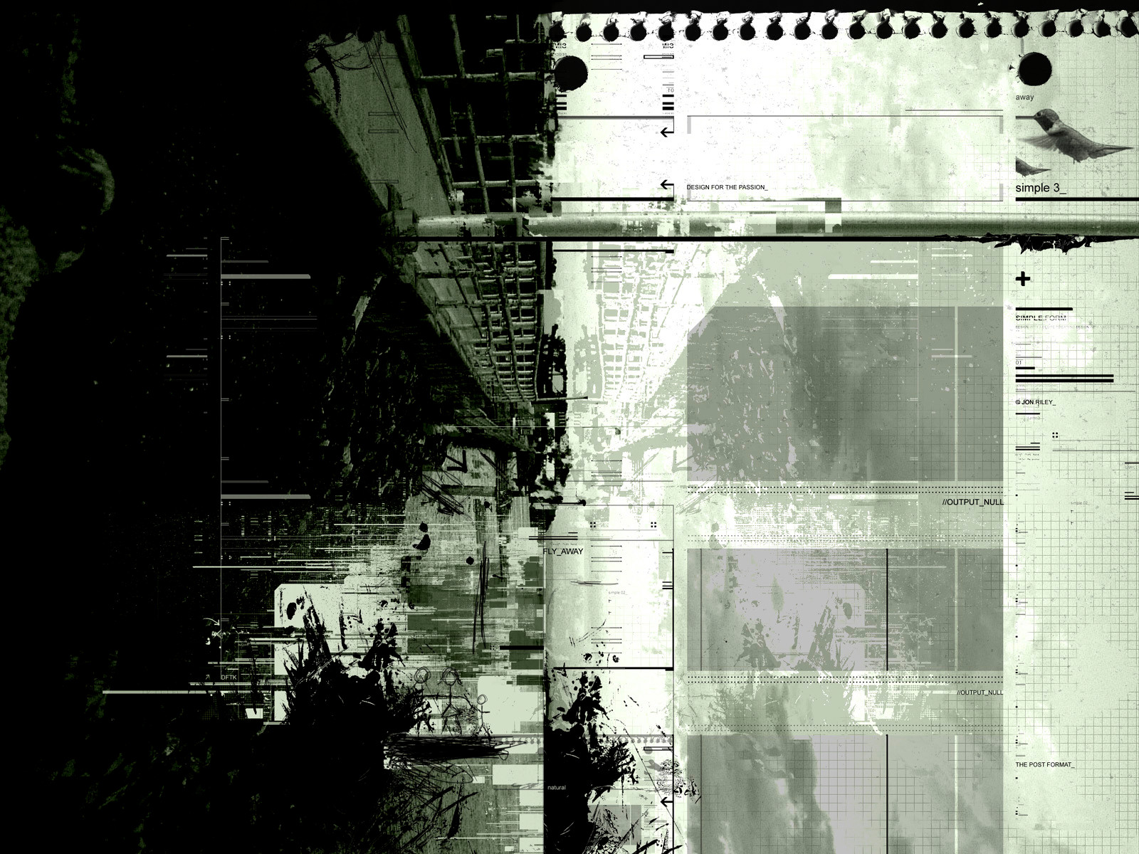
got a print, and descided to work out a few things... hope you like the changesRelated content


Comments: 36

this is great - so much energy throughout the whole piece! i like the way you've used some pixel pieces in there on the left hand side - its something a little different to what you usually see.
i also think that the diffused look that you have going on here is the way to go - that soft glow really adds to the sense of slow motion that i get from this piece. the way you've used the photos in the middle to add a very flat line across the whole piece works to conteract the strong isometric lines that are everywhere else - it gives a good sense of horizon.
good work, mate!
👍: 0 ⏩: 0

Mein Gott! This is a fantastic render. What software programs did you use?
👍: 0 ⏩: 0


Fantastic render. I love the motion captures at the top, great detail.
👍: 0 ⏩: 0


There are so many elements in the picture that one can enjoy that I can look at it for the whole day long.
👍: 0 ⏩: 0


Very awesome. Love the complexity, awesome colors. Great render.

👍: 0 ⏩: 0

The science of energy... Yeah, that about sums it up for me, this is just brilliant... Thankyou for inspiring me.
👍: 0 ⏩: 0

")


The shapes are nice, but the strong colours make it seem a bit disoriented... which is not bad. The typography is nice.. but it seems as if something is lacking, a general focus of some sort. But this would look kickass as a poster!
")
👍: 0 ⏩: 0

I can only dream how much better it looks printed. I'm sure I couldn't even comprehend it if I saw it.
👍: 0 ⏩: 0

This is C...(beccus on DA), RaVen's friend.......
anyway, this is from RaVen:
Jesus, Jon, this just blows me out of the water......
the power, the energy......
Impressive.......
love ya
RaVen
(by C...)
PS: sorry, sometimes she channels.......
👍: 0 ⏩: 0

 (Cool)")


wow. Very lively!
Great layout. I like the boxes that go across the image...looks like windows into more peaceful energy. It's a nice balance amongst all the choas going on.
👍: 0 ⏩: 0


 (Wink)")

Looks great but that orange blob of color looks a bit odd there.. anyway great work.
👍: 0 ⏩: 0

so complex
the series of photos are great
fantastic sense of motion
and the color variation really adds
👍: 0 ⏩: 0


Jaw droppingly coooool, dude. Great style and flair to it. Just flat-out awesome all around, doing nothing but lookin' baaaad-aaassss.
👍: 0 ⏩: 0


I certaintly do like this one, I really like the filmthingies and the 3d work. It all fit's nice together (Smile)")
👍: 0 ⏩: 0

Wow... I like the mix of styles in there. Great layout.
👍: 0 ⏩: 0
