HOME | DD
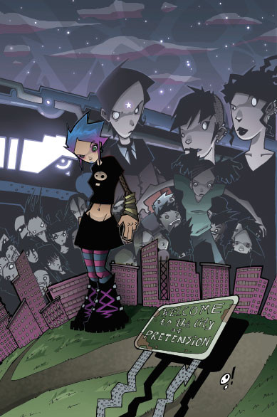
 JeremyTreece — Gravity Cover colored
Published: 2005-01-07 05:41:51 +0000 UTC; Views: 1385; Favourites: 25; Downloads: 301
Redirect to original
Description
BAM!Related content


Comments: 18

you bloody rock, mister.
jesus...i want your brain.
*goes and ramsacks your gallery for further brilliance*
👍: 0 ⏩: 0


that looks awsome. Good detail and it will be pretty too look at in stores.
👍: 0 ⏩: 0


Pchaw! That's really hot. Nice cover again, Crisis!
👍: 0 ⏩: 0

dude, this is killer... I wasn't totally diggin just the inks... thought the images got lost.... but you really fixed that with the colors... nice depth, nice lighting... the only thing I'm not sold on are the purplish buildings... they seem really flat compared to the rest... maybe just a slight texture, or some light sources from the windows... nothin much of course... just something a little more.
👍: 0 ⏩: 0

 (Smile)")

very cool dude ;D not sure when ill be able to finish my version by though... tones of things have come up ;\ hopefully not that long
👍: 0 ⏩: 0

jeremy, thanks for an amazng cover.
im really happy with the result.
this is amazng.
d ")
👍: 0 ⏩: 0

See, now that's bangin!
The perspective is really weird, what with the drop-shadow from the sign... makes things look a lil flat. But then again, she's bigger than the buildings. It's all good. Good clean and crisp coloring!
👍: 0 ⏩: 0


