HOME | DD
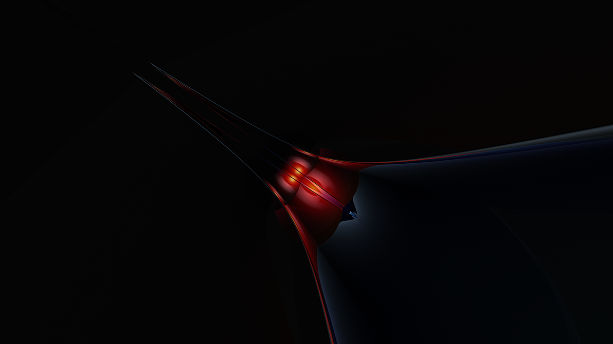
 Jesar — Quarter Past Midnight Session1

Published: 2005-11-26 04:47:40 +0000 UTC; Views: 176718; Favourites: 1573; Downloads: 33872
Redirect to original
Description
[link]Related content


Comments: 224

Omg those colours are so cool! thats pretty bloody good for a "quick" finish..
👍: 0 ⏩: 0

Another Great work of Jesar
it is unfinished, but who cares - it still looks good
👍: 0 ⏩: 0


It still looks wonderful! I love the subtle colours and the layered patterns.
👍: 0 ⏩: 0


It nice pretty simple but its so sharp so clean that just makes the design stand out nice work
👍: 0 ⏩: 0

That's really quite beautiful.
Saw it on the front page, and I was drawn by the colors.
Excellent work <3
👍: 0 ⏩: 0

Any chance of seeing one of these in a widescreen resolution for laptop monitors?
👍: 0 ⏩: 0


Yoooo you should put that up on a wall man. That's freakin' sick!
👍: 0 ⏩: 0

Sweet. I like the colours. I don't think you need to label it unfinished, it looks excellent.
it seems very abstract. Obviously it's an abstract model, but if you did want it to look more real, a more obvious shadow would do the trick
👍: 0 ⏩: 0


WOW! That's awesome :3 I love the colors and the simplicty is really nice!!
Fav!
")
👍: 0 ⏩: 0

deliciously smooth.
time for you to send me more stuff for a collab!
👍: 0 ⏩: 0


gotta agree with smashmethod on this one, that box bumps it down a few points.
it is really nice though, love the colours and i love that you didnt just grab a sphere then warp it beyond belief and make it look all shiney then call it an abstract.
nicely done
👍: 0 ⏩: 0

Would be much better without that pointless box full of text on it.
👍: 0 ⏩: 0


doing a print of this bud?
ill work on our clb tomorrow btw
👍: 0 ⏩: 0

Doesnt look like much...very undone looking. Its cool though since its minimal.
I like the colors though, it just dont seem to meet your work.
👍: 0 ⏩: 0


great choice in colors! They're pale yet they stand out!
👍: 0 ⏩: 0


killer.. i agree, great ideas come after midnight hehe
very nice choice of colors.. keep em coming..
👍: 0 ⏩: 0


did you mean couln't instead of could?
awesome stuff as awalys anyway
 (Wink)")
👍: 0 ⏩: 0

Beautifully sculpted, perfect colour, great work. On top of all that, it just has that cool, laid back feeling that makes me want to 
👍: 0 ⏩: 0


a visual treat, and now you have made me want to look at all your gallery !

👍: 0 ⏩: 0


Really a good wallpaper...i've seen some wallpapers here...and your really deserve some recognition...
👍: 0 ⏩: 0

You have some lovely colours going on here, they create a nice airy feel to the the image. Your text arrangement looks really good too, has a very modern feel to it  (Smile)")
👍: 0 ⏩: 0

is dir mal wieder super gelungen, wie immer ^^
mit welchem programm erstellst du eigentlich die render?
👍: 0 ⏩: 0

This should be used as a laxative, because I just shit my pants.
(in awe)
👍: 0 ⏩: 0
<= Prev | | Next =>