HOME | DD

JesseJentzen — Elegy

Published: 2008-12-06 16:11:56 +0000 UTC; Views: 9277; Favourites: 332; Downloads: 1
Redirect to original
Description 
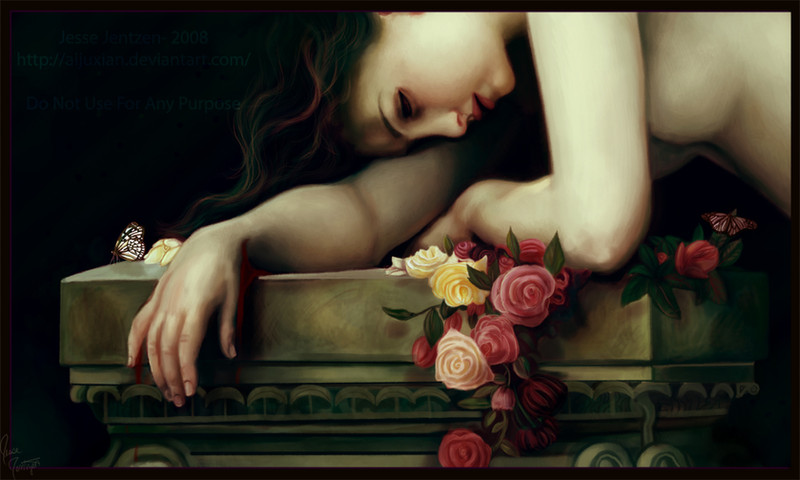
Full View Please

This is my version of a very old renaissance art done by William-Adolphe Bouguereau and I took my own spin on it. I drew this for fun. I really am proud of the flowers, because I am trying to work on plant life and animals in my drawings, please let me know what you think of this.

comments and critiques are most welcome.

Photoshop CS3 and Wacom
Time taken- about 13 hours
Related content
Comments: 78

JesseJentzen In reply to ??? [2009-01-08 14:25:09 +0000 UTC]

thank you so so so so so much!!!

👍: 0 ⏩: 1

CearaFinn In reply to JesseJentzen [2009-01-08 20:50:50 +0000 UTC]

you're welcome

👍: 0 ⏩: 0

CearaFinn [2009-01-01 07:03:13 +0000 UTC]

Brilliant work! you've really done an amazing job with both the details and the overall atmosphere is so dramatically beautiful
just one little thing stands out...the blood in the shadow of her wrist needs to be just a little darker, its making that area flat...other than that...i love it!

👍: 0 ⏩: 1

JesseJentzen In reply to CearaFinn [2009-01-01 17:25:29 +0000 UTC]

WOW, thanks... and the blood thing is an issue, I will try to update this piece when I have the time, thank you so much for the compliment.

👍: 0 ⏩: 1

CearaFinn In reply to JesseJentzen [2009-01-01 21:15:09 +0000 UTC]

you're welcome

👍: 0 ⏩: 0

ninaogsofus In reply to ??? [2008-12-30 17:02:31 +0000 UTC]

This is lovely! Great composition!

👍: 0 ⏩: 1

JesseJentzen In reply to ninaogsofus [2008-12-30 17:52:08 +0000 UTC]

thank you!

👍: 0 ⏩: 0

Sarnika In reply to ??? [2008-12-24 05:19:21 +0000 UTC]

awesome! very great job!
I really have to fav it!

👍: 0 ⏩: 1

JesseJentzen In reply to Sarnika [2009-03-22 20:52:30 +0000 UTC]

thanks.

👍: 0 ⏩: 0

JesseJentzen In reply to ??? [2008-12-19 14:51:06 +0000 UTC]

thank you.

👍: 0 ⏩: 0

sentimentalfreak In reply to ??? [2008-12-19 14:44:10 +0000 UTC]

great skills

👍: 0 ⏩: 0

JesseJentzen [2008-12-15 23:46:03 +0000 UTC]

lol, the red is supposed to be blood.

👍: 0 ⏩: 1

Just-Peer In reply to JesseJentzen [2008-12-17 18:12:58 +0000 UTC]

Oops :$ sorry

Now I did see that it is dripping down

👍: 0 ⏩: 0

Just-Peer In reply to ??? [2008-12-15 18:11:45 +0000 UTC]

When I saw the small version I first thought it was a photo.
It looks really nice!

Her hair, flowers and the butterfly are beautiful.
But one point of critics:the red shadow? around her right hand
(especially on the right side of her thumb) looks pretty weird.

But I still think this is beautiful!
Keep up the good work!

👍: 0 ⏩: 0

JesseJentzen [2008-12-14 16:59:31 +0000 UTC]

thanks,

👍: 0 ⏩: 0

tndrhrtd37 In reply to ??? [2008-12-14 12:30:54 +0000 UTC]

Beautiful work!

👍: 0 ⏩: 0

JesseJentzen In reply to ??? [2008-12-08 01:08:47 +0000 UTC]

Thank you!

👍: 0 ⏩: 0

delusional-dreams [2008-12-08 00:32:56 +0000 UTC]

Beautiful; effortless and elegant

👍: 0 ⏩: 0

WOKgeotobi In reply to ??? [2008-12-07 18:08:25 +0000 UTC]

love the flowers

👍: 0 ⏩: 1

JesseJentzen In reply to WOKgeotobi [2009-01-01 21:27:41 +0000 UTC]

very appreciated.

👍: 0 ⏩: 0

revgar In reply to ??? [2008-12-06 20:14:19 +0000 UTC]

wow *-*

👍: 0 ⏩: 1

JesseJentzen In reply to revgar [2009-01-01 21:27:57 +0000 UTC]

Thank you,

👍: 0 ⏩: 0

gryphons-aerie In reply to ??? [2008-12-06 18:07:12 +0000 UTC]

I think it is a great work.. good job with the details. nice subtle shades with the flowers and girl. this is one of those paintings that would look best from a distance so that the opticals of it could work

👍: 0 ⏩: 1

JesseJentzen In reply to gryphons-aerie [2009-01-01 21:28:49 +0000 UTC]

I agree about the distance, thank you very much.

👍: 0 ⏩: 1

gryphons-aerie In reply to JesseJentzen [2009-01-03 15:04:37 +0000 UTC]

you are very welcome

👍: 0 ⏩: 0

JesseJentzen In reply to ??? [2008-12-06 16:50:10 +0000 UTC]

thanks for the critique it is honest and apprecited.

👍: 0 ⏩: 0

un-dead-lord [2008-12-06 16:32:39 +0000 UTC]

The detail is stunning. I never would have thought of using those colors in the hair.
The positioning of the roses could use some work. The positions they are in make them look flat. (For example: The peach rose had a red rose positioned directly behind it making it appear to end right there. The red rose would be squished or tilted off to the side if it was that close.) (Note: Do different colored roses grow on the same plant???)
The podium appears to 'twist' on the right side you can see the corner and part of the other side. However, on the left you see the side and part of the top. (you should not see the top at this angle and the side should get slightly smaller as it goes back -[ one point perspective ])
Also your decoration adorning the lower part of the podium does not follow the rest of the angles and gives it an award appearance.

👍: 0 ⏩: 0


<= Prev |