HOME | DD
 jocpoc — Spasm
Published: 2001-11-30 17:01:05 +0000 UTC; Views: 1364; Favourites: 6; Downloads: 593
Redirect to original
Description
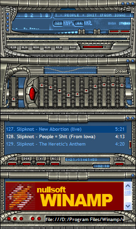
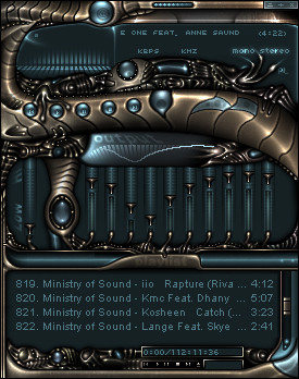
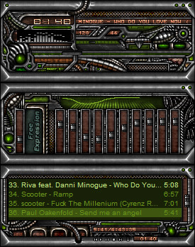
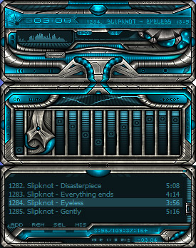
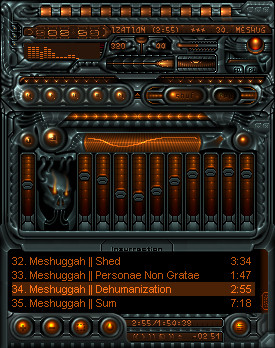
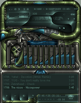
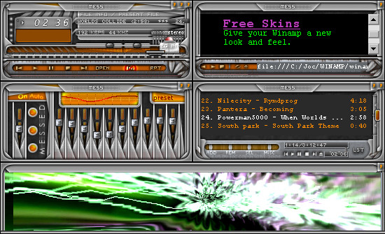
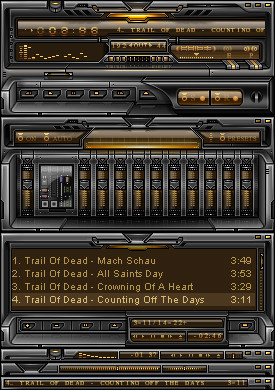
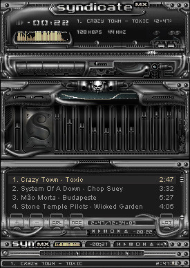
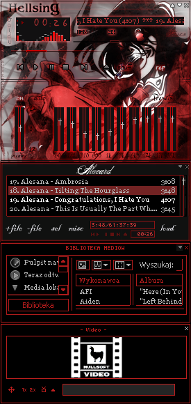
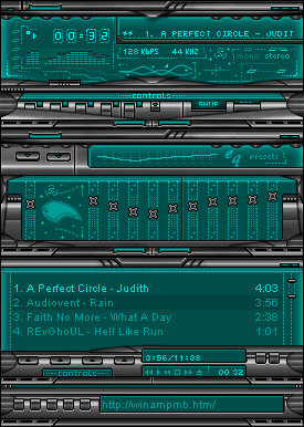
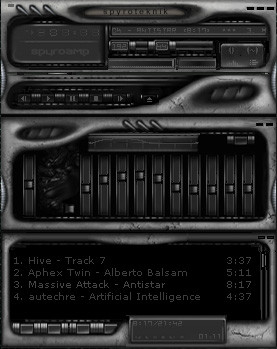
My freshest....eh latest skin. Didn't take much time to do. I am VERY pleased with the result. A little mix of different styles here. As always, comments are welcome.and after a comment i changed the name. just something out of the blue.
And yes, I know that it isn't the MOST original skin.
Enjoy!
Related content


Comments: 33

Now this is the good style. Not too detailed, but still detailed enough. I like the curves and tile look.
👍: 0 ⏩: 0

spasm rocks! damn, dont remember this one. very cool joc
👍: 0 ⏩: 0


Excellent skin! good work, man!
Cheers!
// xjoshuax
👍: 0 ⏩: 0

awesome, i like the colors, although green would have been better than blue of course. hehe. im serious.
___________
I eated the purple berries!! uhh, owww. They taste like... BURNING!!! -Ralph
👍: 0 ⏩: 0

Ever heard the saying "sometimes too much of a good thing isnt good"? Well in my opinion theres too much of a good thing here. Too much of the same detail and its way too busy. let some of those little details be plain. it will make the larger details more special. this is just way too much of the same thing and i think it detracts from the look of it. Try some restraint next time. My opinion.
Jesh
The Skins Factory http://www.theskinsfactory.com
An Authorized Windows Media Service Provider
👍: 0 ⏩: 0

skin looks great, I don't like the blue and the red, but the red the most.
Great skin ;D
- enjoy our quality responsibly -
👍: 0 ⏩: 0

Airbrushing is very hard to do, and accomplished very well here. Great work.
goldenchild
http://etomicpower.cjb.net in the works
👍: 0 ⏩: 0

Damn sweet jocpoc, I can see wich styles you have mixed here with your own. Good one !
-Smaken är som baken, den är delad-
👍: 0 ⏩: 0

this looks sooooo cool!
i wish my skins would come out like this!
i agree with c-spectre the red parts dont really fit with the rest of the skin.
but other than that i cant fault it!
awesome stuff!
👍: 0 ⏩: 0


I really like this. usually any inspired skin gets too busy. the details and ideas are there but it misses the balance. this skin has good balance. the red helps the balance I think. I like the cartoony outlined snake scales. they look neat , like GI joe.
I like it.
👍: 0 ⏩: 0

golden shower heh...that's sick...
well, the skin is nice...dunno bout the red, sorta looks good, but sorta looks bad too
[kyle]
http://www.thegrue.com/cypress/saturn
👍: 0 ⏩: 0

I know it isn't THAT original. But I wanted to do this anyway. It IS indeed inspired by some of the greatest skinners today.
:-Þ J O C
👍: 0 ⏩: 0

Very nice skin! The metal reptile style reminds me of Goochtek's "Thumpa".
I do agree with the others about the red, I don't like it.
Btw, you forgot to edit you mb text,
add this to you pledit.txt :
mbfg=#foregroundcolor
mbbg=#backgroundcolor
That way the url display will be colored as the rest .
-_____________________________-
:: Pin me down and call me a pixel! ::
-__-__-__-__-__--__-__-__-__-__-
Homepage: http://www.smar.nl
👍: 0 ⏩: 0


Hmm... who is this skinner? He has some cool skins... jocpoc? Oh wait, it's jocpoc! lol.
This looks cool and all but a little original as the other dude said... try something a little more "unique" next time and it'll be even greater!
👍: 0 ⏩: 0

Very nice skin. I happen to like the red, it gives it a lil bit of a twist.
Be careful whose toes you step on today. Those toes may be connected to the foot that kicks your ass tomorrow
👍: 0 ⏩: 0

im sorry to say this...but it doesnt look very unique at all (even if that's not what your goin for) it just looks like ideas from all the big skinners (monaux,fyre, etc) put on this.
👍: 0 ⏩: 0

yes yes....the red...
_-=-abh0rsen-=-_
Dont look to the ocean
Restless in its dreaming
Dont look to the heavens
for they will tell you nothing
If living is for learning
Then dying is forgetting
Once we have forgotten
Then we can go on living
_-=-Devin Townsend SYL-=-_
A Musical God
👍: 0 ⏩: 0

den var jävlar i mig nice den! good job.
> mikkeh.com
👍: 0 ⏩: 0

Very interesting combo here. I love it.
I think the red was a nice touch.
You wanna sniff little piles of demon poop? You oughta know where the trail leads, right into the devils hiney!
👍: 0 ⏩: 0

[Quote]I dont get the name, but this is a very nice skin! I can tell a lot of time was put into this! Great work.[/Quote]
Did you read the descripton, vizionier?
Really neat skin, a bit too comic-like for me...
👍: 0 ⏩: 0

Very nice, i like the scheme. The detailsa are very nice as well, i don't mind the red parts just adds contrast ... Good job and keep it up
::Till all are one::
👍: 0 ⏩: 0

well, the only reason I made some things red was because I made that jewel thing in the eq as the only red thing first. But the other (main and playlist) looked bad with no red, so it had to be red there. I could change it, but not now.
:-Þ J O C
👍: 0 ⏩: 0

Wow, looks good. colours are unusual but they work IMO. Great job
..meow..
👍: 0 ⏩: 0

oh.. this is a great skin, really like this one.. there is onlu on thing and thats the red details, think blue would be better.. or only red details insted of blue.. mm.. other then that it´s an awsome skin.. really cool
_________________
Titilituut .VS Peek-a-Boo
CrazysunART - http://crazysunart.narod.ru/
👍: 0 ⏩: 0

I see no gold so the skin name sounds unappropriate to me...
Anyway the skin is terrific: i love that "metallic snake" texture in the frames and the blue and red details gives it a cool appearance (i'm not agree with c-specter who said the red parts are bad...).
Last thing regarding the name: have u ever heard about "golden shower" movies? They are a kinda pervert porn movies with actors pissing upon each other... It's disgusting, I know... So I think it's another good reason to change your skin's name...
👍: 0 ⏩: 0

I dont get the name, but this is a very nice skin! I can tell a lot of time was put into this! Great work.
::Visions are Deeper than Sight::
:: ::
::
::
::
::
::
👍: 0 ⏩: 0

awesome work! but the red parts do not fit to the skin... anyway great airbrushing!
👍: 0 ⏩: 0

damn nice skin. nice job on the airbrushing. i like the metallic and blue mixture.
👍: 0 ⏩: 0