HOME | DD
 Joey-Zero — Gotham Icons: Complete set.
Published: 2008-05-22 20:26:34 +0000 UTC; Views: 23040; Favourites: 758; Downloads: 1991
Redirect to original
Description
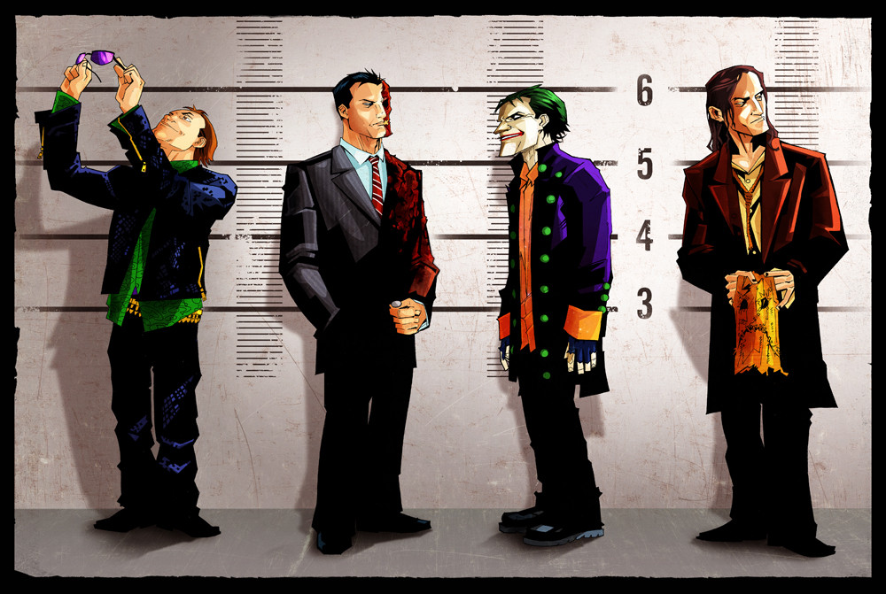
Whew!!! I finally got to finish them all. This is the final piece (layout options aside). Linework by the illustrious *KidNotorious , colors by me.Characters ©Batman, DC Comics.
From left to right: Commissioner Gordon, Calendar Man, Mr. Freeze, Poison Ivy, The Riddler, Ra's Al Ghul, The Joker, The Scarecrow, HarleyQuinn, The Penguin, Catwoman, Two-Face and, of course, Batman.
Let me know what you guys think of the presentation... Do you like the straight line-up, or would you guys prefer to see them laid out a different way? Let me know.
Peace kids.
Related content


Comments: 129

Excellent work!
Maybe add more rows instead of just laying 'em out straight, in terms of the layout.
👍: 0 ⏩: 1

Yeah, definitely for print's sake... It's just waaaay too long like this.
👍: 0 ⏩: 0

I love the line work and coloring, great job to both of you. As far as the layout, I would of preferred to see the lines a little staggered as apposed to the 'film reel' look of the layout now.
👍: 0 ⏩: 0

You are my god.
I love what you did with the cat in the 11th panel (L to R)… very effective coloring and the kid that drew it did a bang up job as well. The 11th panel is by far my favorite, I love how both the girl and the cat have the lower part of their faces hidden, very mysterious.
👍: 0 ⏩: 0


Really clever, and great usage of an idea. I'm jealous! Congrats!
👍: 0 ⏩: 0

I like it a lot more with having Batman and the Commissioner on both ends of the image with the villains in the middle. Tells very visually what their rolls are in the story.
👍: 0 ⏩: 0

if u want my 2 cents on the placement, i would just change the place of riddler and Ras i dont think they should be next to each other because they are both looking the same way and kinda have the same pose
but i really love they way you drew each character and how the villains and book-ended by James and Batman, nice touch
👍: 0 ⏩: 0

i think this format works..... maybe two rows depending on the size of the print, but this works!=]
👍: 0 ⏩: 0


Wow great! Riddler is the best
Btw.. I never heard about Calendar man O,O

👍: 0 ⏩: 0


You and KidNotorius make one hell of a team.
👍: 0 ⏩: 0

 (Wink)")

so wicked! i like the line up (though i have a huge screen ")
👍: 0 ⏩: 0

I'd prefer if the images were in two or three rows instead of one. It's a shame that one has to scroll across the screen in order to look at everyone.
👍: 0 ⏩: 0


Straight badaazzz! The layout looks good too. I really like how you put Commissioner Gordon and Batman on the ends with all villain between them. The only problem I have with it though is that there is so many images next to each other that I have a hard time focusing on one image without my eyes wondering to the next one. What I think would be sick, is if yall made a illustration of Gotham City, then divided the characters in a row on the top and the bottom. It would be a lot more work but it would be worth it. That would be the illest poster. I would definitely buy that.
👍: 0 ⏩: 0

This is awesome & ridiculous. You get a watch for this.
👍: 0 ⏩: 1

Dude, great job. Your lines are sick. Your joker is a straight pimp. He looks classy and crazy at the same time. I'd love to see some more collabs between yall.
👍: 0 ⏩: 1

You never know what the future might hold!...
👍: 0 ⏩: 1
yeah man, i'll definately heep an eye out.
👍: 0 ⏩: 0
<= Prev |