HOME | DD
 JoeyJazz —
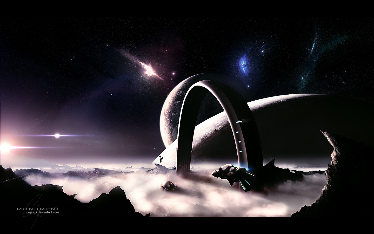
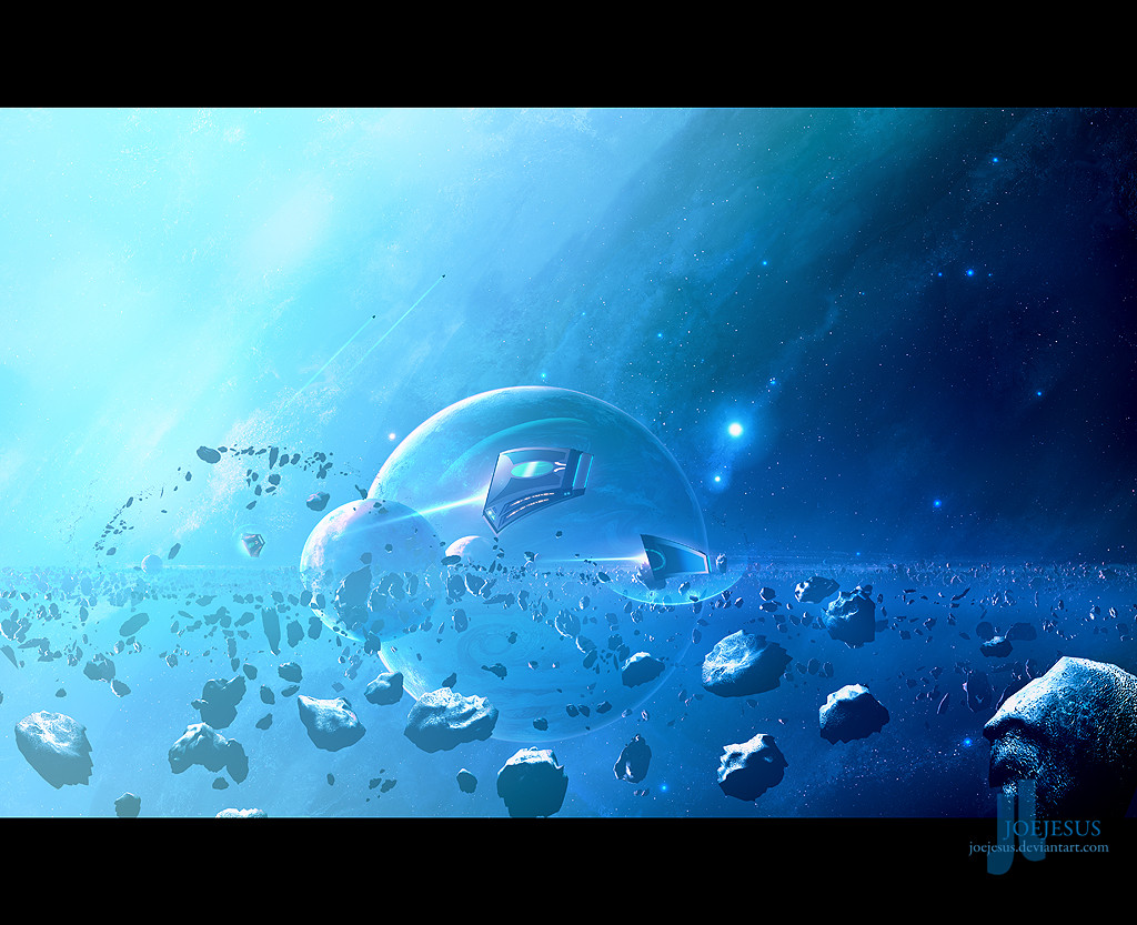
Monument
JoeyJazz —
Monument
Published: 2008-01-30 22:10:32 +0000 UTC; Views: 103045; Favourites: 1464; Downloads: 9004
Redirect to original
Description
So, since there were some changes in the rules of the wallpaper sci-fi contest ( [link] ), taenaron ( ) allowed us to eventually change our submissions and since my first piece called Aries ( [link] ) wasn't exactly a sci-fi (just a plain spacescape) I decided to use this opportunity to swap that piece for this one, called Monument. Yeah, it's quite 'overWOWed', but hey - you like it that way anyway") .
.In the wall-pack you'll find:
1024x768
1280x960
1440x900
1600x1000
1600x1200
1680x1050
1920x1200
Technical info:
PS CS2, 3DSMAX, Terragen, Mont Blanc panorama stock from [link] (It was manipulated into pieces - you probably won't recognize a thing.)
Space, planets, clouds and landscape done entirely in PS CS2.
10% of the ship and structures were made in 3D SMAX, then heavily adjusted in CS2.
Approxim. 50 hours of work.
Enjoy...
Related content


Comments: 136

great entry here  (Smile)")
I think the contrast is a tad too much though and the colors could be a little more varied, but I bet you'll be one of the contest winners. Good luck!
👍: 0 ⏩: 1

It's not exactly a render - both ship and surface were practically done in PS. (just the basic concepts, one photo and an untextured model served as a blank mask for PS painting 
👍: 0 ⏩: 1
wow that makes it even better
you're welcome, I love it!
👍: 0 ⏩: 0

well there goes whatever small chance i had XD
👍: 0 ⏩: 0


Mno ta ktohle je IMO jedna z tvejch nejpovedenějších porací, tohle je prostě pecka
👍: 0 ⏩: 1
Děkuju, jsem rád, že nejdu kvalitativně dolu
👍: 0 ⏩: 1
to u tebe snad ani nejde, nedokážu si představit že bys udělal něco š
👍: 0 ⏩: 0
jj, už sem něco z toho opravil, ty hvězdy na levo posouvat nebudu, bylo by prakticky nemožný všechno ostatní pak přizpůsobit jinýmu úhlu světla.
👍: 0 ⏩: 1

nj jasne ze vsetko sa neda opravit ale je to stale dobra praca
👍: 0 ⏩: 0

pacia sa mi tie male nebuly v pozadi, teren, ta vesmirna lod a napad, ale ten starfield je velmi monotonny a trocha ubera dobry dojem tomu obrazku, nesom profik ale bolo by lepsie podla mna keby si tam urobil viac kontrastny starfield aby to zapadalo do obrazka, proste viac tmaveho miesta v starfielde a par vecisch ziarivejsch hviezd, dalej mi tam trochu nesedia tie dve hlavne hviezdy nalavo, nesedi mi na nich ten roztiahly efekt a ja by som ich este asi posunul o trochu viac ku planetam. nevem kto vsetko tam dal svoje dielka ale podla mna atakujes prve miesta...
👍: 0 ⏩: 2
No, tak ty malý hvězdy sem trochu upravil (edit je povolen). Ty velký jsou na prvním PSD, takže bych musel upravovat nějakejch 10 hodin práce
👍: 0 ⏩: 1
o dost lepsie, dodalo to trochu kontrastu co je velmi dobre
👍: 0 ⏩: 0
Jo, ty hvězdy mě taky štvou - vyskákaly tam po sharpu. teď ale nevim, jestli je povolen edit. Při nejhoršim to opravim po soutěži.
👍: 0 ⏩: 0

The landscape is amazing and I love the structures.
👍: 0 ⏩: 0

Great job, best one I've seen so far in my opinion

👍: 0 ⏩: 0

Very awesome, but while I really like each of the nebulae in the top part, I don't think they should all be here separately like they are, it makes them feel like they were tacked on at the end.
👍: 0 ⏩: 1

Hahah wow, just amazing, makes my entry look like a novice made it, lol wait I am a novice
👍: 0 ⏩: 0

Wow Joe. That's so good. One of my favourites by you.
👍: 0 ⏩: 0


Beautiful scenery")
Have my

👍: 0 ⏩: 1

"Yeah, it's quite 'overWOWed', but hey - you like it that way anyway"...Dont tell me what I like !!! lol. Just kidding, yeah, just like in the movies, many things are deliberately overdone compared to how they would look in real life...Its just more dynamic that way 
👍: 0 ⏩: 1
You just like pink collors, that's all...
lol - sure I'm kidding - I like Aries a LOT, but Sci-fi is more Sci-fi in Sci-fi contest (wow, that's a combo!).

👍: 0 ⏩: 1
What are you implying? 
Lol, but seriously, Purple has long been my fave colour. And I just think it suits space because its dark and mysterious and kinda futuristic in my eyes...But there are so few purple ( and pink ) space art here, so its like a rare treasure.

👍: 0 ⏩: 1
Actually, those lenses are purple a little bit (I tell you a secret - on most of my pictures [not every picture], there is a purple color somewhere - usually a small star or some dark nebula - I like purple a lot)
👍: 0 ⏩: 0


Very nice good job I love space!!!

👍: 0 ⏩: 0

nice entry here man
👍: 0 ⏩: 2
Pfew, ok, I've adjusted the starfield (just a little but I think it did the trick).
👍: 0 ⏩: 1
hmm well the starfield is gone at some places.. the trick is to create some nice stars everywhere but sometimes make some brighter ones.. cause now you have fields of stars and then suddenly nothing.. while space is filled with stars everywhere.. so there are no dark spots with nothing in it")
 (Wink)")
👍: 0 ⏩: 0
the preview was (again
👍: 0 ⏩: 0
<= Prev |