HOME | DD
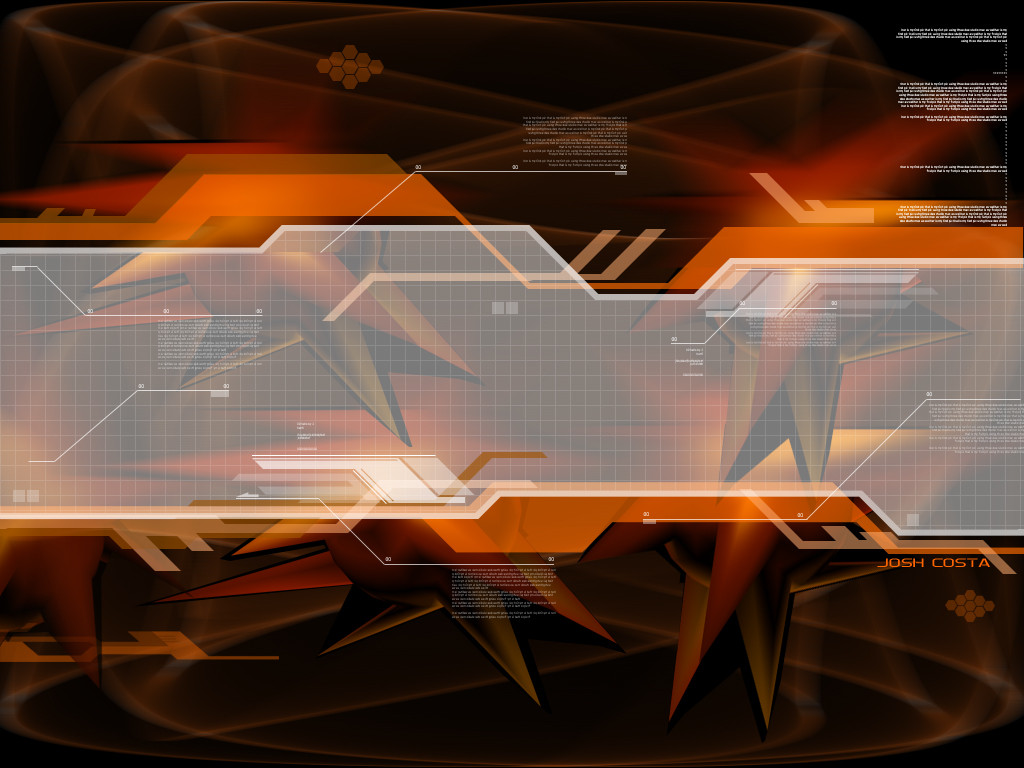
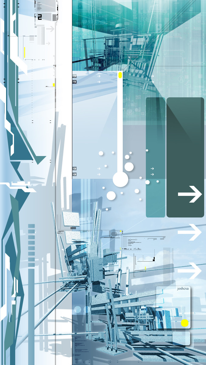
 joshcxa — Burstex

Published: 2002-12-18 22:29:20 +0000 UTC; Views: 515; Favourites: 3; Downloads: 31
Redirect to original
Description
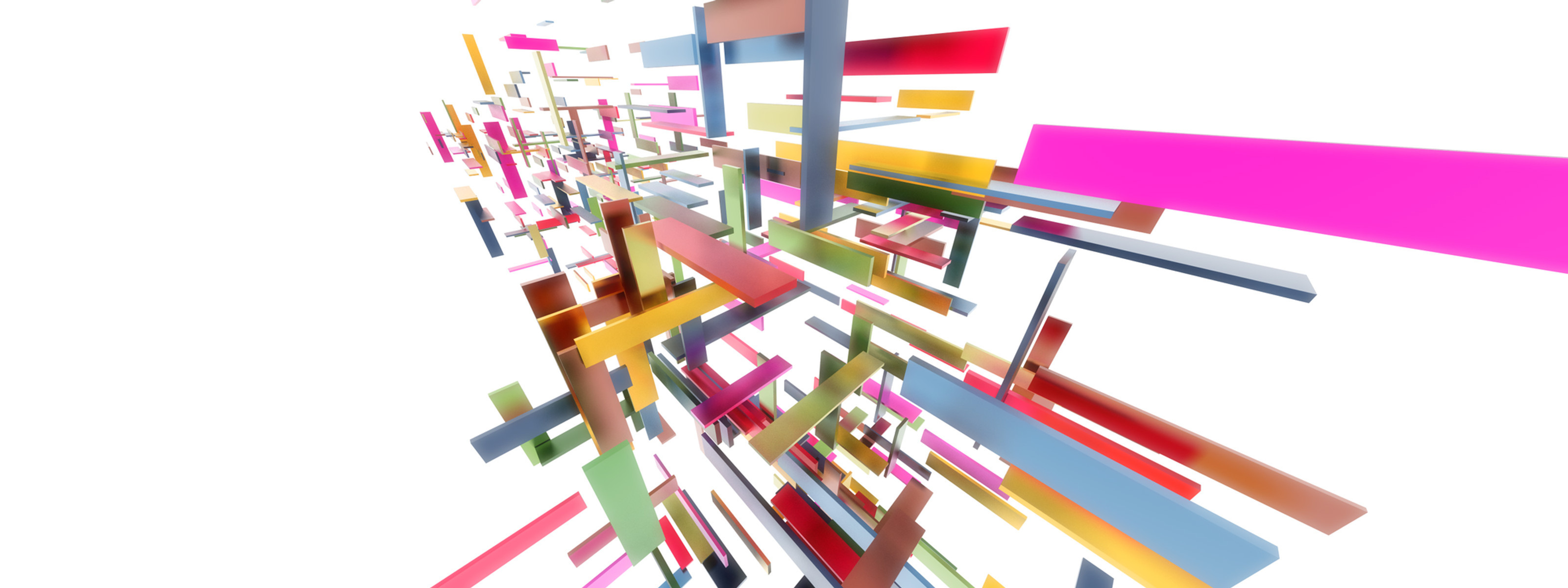
i don't really like it that much...maybe it's the typo or the whole thingRelated content


Comments: 12


woiw
i like that
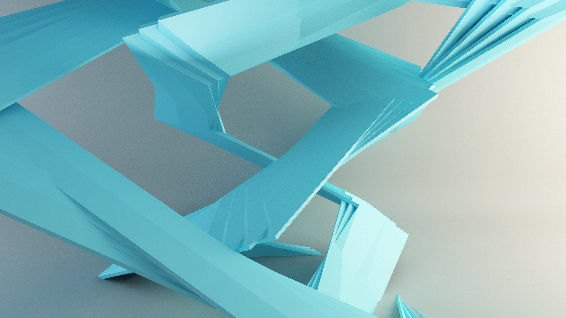
green and blue nice use of colours dont see that much..
+devwatch
👍: 0 ⏩: 0

Lightwave or 3d studio max? either way, I don't like how it looks so TOY" ee.. but.. the rendering skills are clear, you know what your doing and I do love the layout and sense of design you have and colors
all around a good job.
👍: 0 ⏩: 0

Colours were chosen well, rendering is nice.
Good job overall!
👍: 0 ⏩: 0


I dunno how you people do this but I like it alot. It's awsome man
👍: 0 ⏩: 0

nice, i think the blue contrast the green a bit too much, otherwise nice work
👍: 0 ⏩: 0


nice idea... and i really like the colours... but i think you dont like it cause there is somethin weird about it... i think its the lil rectangle things in the middle
👍: 0 ⏩: 0