HOME | DD
 JoshDixArt — Assassin Symbol
Published: 2010-03-12 14:07:04 +0000 UTC; Views: 4178; Favourites: 15; Downloads: 972
Redirect to original
Description
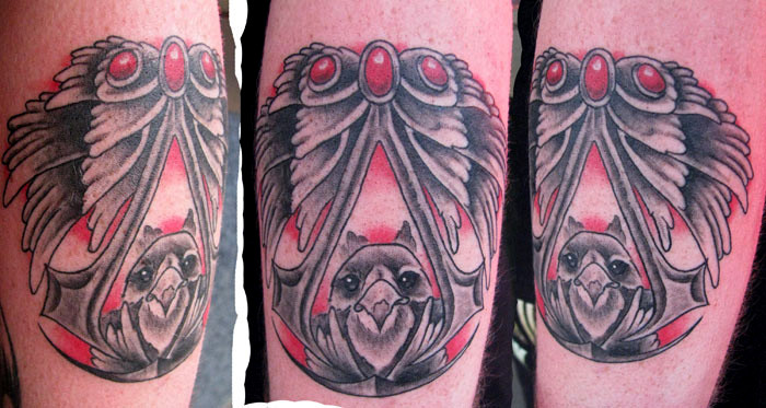
Something from assassins creed? That's what I was told. I changed the symbol a great deal to make it fill the space better and was happy that my client let me make any modifications I felt like.oh yeah and tried out something new on this one. No graywashes, just solid black. So much less irritation that way and it looks better and i think it takes about the same time if not faster.
Related content


Comments: 5

I will do my Assassins Creed tatoo next week, thanks, you give me some tips ^^
👍: 0 ⏩: 0

very nice. i considered getting the feathers on my Assassin's Creed tat, but for now at least went against it. just got the simple logo. i like what you did with it.
i dunno if adding the feathers and gems would look ok with a solid black A...hmmm
👍: 0 ⏩: 0

This amazing tattoo has been featured here: [link] If you like the article, could you please fav it so we can spread the news about this awesome fandom?
👍: 0 ⏩: 0

the only problem i've seen with solid black shading is that it tends to spread out in the skin after it heals. so you might have a smooth gradient before it heals, but afterwards the gradient tends to fall off and tends to be darker in spots than when it was first put in the skin.
If you can make it work though, more power to ya, I've just had better luck with a 50 percent wash personally.
Looks fucking amazing man, love what you did with that symbol, it's going to age much better now, and fills the area better for sure

👍: 0 ⏩: 0

nice one! i also work only with black in most of my works and i'm pretty happy with the results...
👍: 0 ⏩: 0