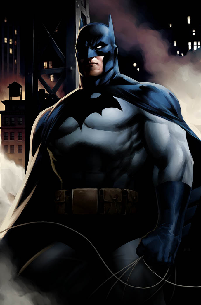
HOME | DD
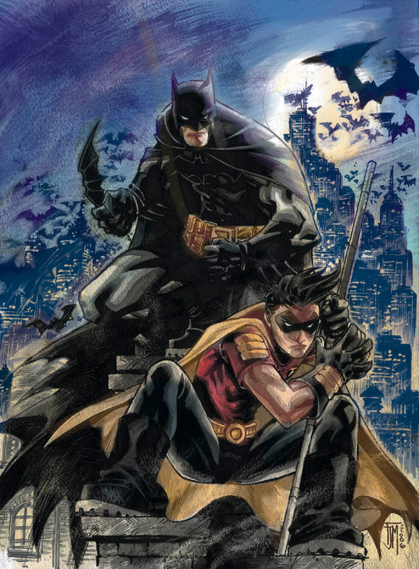
 JPRart — Batman and Robin

Published: 2010-09-07 01:22:17 +0000 UTC; Views: 104790; Favourites: 2469; Downloads: 3594
Redirect to original
Description
Here's a Batman and Robin piece that I did on the weekend. Original art by Patrick Gleason, digital paint by me.Let me know what you think.
Related content


Comments: 204

Really nice job !
I really love the way you give a real depth to the deviation.
The color scheme you use is really nice and bring out a lot's of details
Great job keep it on
 (Smile)")

👍: 0 ⏩: 0


Good job I love the color and the lines.
👍: 0 ⏩: 0


Bad Ass attittde in here. I like it.
👍: 0 ⏩: 0

Coloring is amazing. Now, do the same thing with the rest of the comic pages.
👍: 0 ⏩: 0

I really like their clothes here ")

👍: 0 ⏩: 0


Gorgeous! It's nice to see the Kid Wonder looking ... well, like a kid  (Wink)")
👍: 0 ⏩: 0


This is stunning. However, this is the second piece of Batman art I've seen recently and I have to ask, is the current Robin's face supposed to be so scrunched? Both of them drew his mouth very close to the base of his nose and I think it looks extremely odd, more so in this one because it looks like his nose is more concave than his jaw.
👍: 0 ⏩: 0


This piece is both good and bad in my opinion. On one hand, the angle is weird and Robin's face looks wrong and bizarre. On the other hand, there's something cool about it and the wrongness of it could be viewed as "stylization". There's a really tough intensity to the whole thing. And the quality of the painting overall is extremely well done. I could see this being the kind of piece that fans either love or hate. The one's that love it will think it looks bad-ass. The ones that hate it will never forgive Robin's face.
👍: 0 ⏩: 0


Somehow this reminds me off the movie Kick-Ass...
👍: 0 ⏩: 0


Wow.. Man, I really detest Damien but his expression here is just priceless! With the from the ground PoV it's like he and Bats are standing over some thug and Damien is going "Hey... *sniff* Did this guy just shit himself!?"
👍: 0 ⏩: 0


i hate i hate i hate
for being this good damn man this is just wow
why do you need to be this good for man
👍: 0 ⏩: 0

I LOVE the hyper-realistic rendering versus the exaggerated proportions. Gives it an other-worldly feel!!
👍: 0 ⏩: 0

Your digital paintwork totally put this terrific illustration in orbit!!! That's stellar coloring, JPR!!!
👍: 0 ⏩: 0


That robin is ugly. Looks like he had some growth disorder.
👍: 0 ⏩: 0

This is the up to date Batman and Robin, everyone should be aware that Dick Grayson is the new Batman. The new and current Robin is Damian Wayne.
👍: 0 ⏩: 0


This is bad ass, I love robins bad-boy pout lol. And batman doesnt have to even try to instill fear.
Most of all i love this angle, at first I think those gangster photos where they throw their face up and look down on people. But after a bit feels more like the viewer is a criminal, being caught with his pants down by batman and boy wonder.
👍: 0 ⏩: 0
<= Prev | | Next =>