HOME | DD
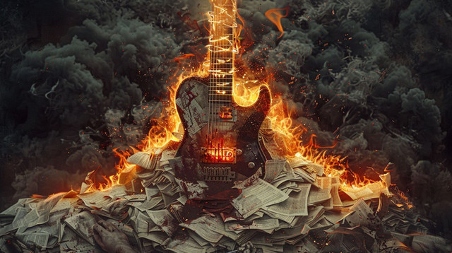
 KarimFakhoury — Last Judgment - CD Cover

Published: 2013-01-17 16:04:18 +0000 UTC; Views: 13428; Favourites: 283; Downloads: 65
Redirect to original
Description
CD Cover commissioned by Joey Alarcon, for his first album : "You Are Loved".Detail shots :
:thumb371600100:
Stocks: Mine and www.shutterstock.com/
© Karim Fakhoury
This is not a stock image, do not use, copy or manipulate the original artwork without my written permission.
To purchase this artwork as a print : society6.com/karimfakhoury/pri…
You can now follow me on my Facebook page for exclusive content and updates: www.facebook.com/Karim.Fakhour…
Visit my website for more info ! :
title= "www.karimfakhoury">www.karimfakhoury.com
Related content
Comments: 82

Merci beaucoup, content que ça te plaise!
👍: 0 ⏩: 0

Technical death metal cover is what I see here.
👍: 0 ⏩: 1

OH! That's beautiful!! You've combined all the images so seamlessly! I like BOTH of them and I think it would be magnificent if one were the front and the other were the back of the case. Gorgeously powerful and evocative. Brava Karim~
👍: 0 ⏩: 1

Thank you very much, truly appreciated!
👍: 0 ⏩: 0

Wow...Their loss, that is kickass.
If I had a rock band I would use it -nod- ..... One day I hope to xD
And I like them both together... I think they could be used on the same album -- Either one for front and one for back, or one for front and one for the CD cover (Or even the inside of a booklet that sometimes goes in a case). This is just my opinion though.
👍: 0 ⏩: 1

Thank you, glad to hear it! I totally agree with you, I also think they would go pretty well together even though that wasn't my first intention!
👍: 0 ⏩: 1

You're welcome!
Yeah, they have that sort of balance. Especially since not only did you change the direction but the color as well.
👍: 0 ⏩: 0

J'aime beaucoup. Le contraste est fort et la composition superbe! Par contre, j'aurais peut-être essayé d'utiliser une police sans-serif ou deux polices différentes pour le Nom du band et le nom de l'album.
👍: 0 ⏩: 1

Merci Vincent! Content de l'entendre venant de toi 
👍: 0 ⏩: 0

Haha, glad you think so man!
👍: 0 ⏩: 0

Non en fait c'est un autre band Français dont je ne dirais pas le nom qui voulait un look similaire tout simplement!
👍: 0 ⏩: 1

Ah ces maudits cousins !
Très beau travail Karim, comme d'habitude !
👍: 0 ⏩: 1

oh wow, this looks absolutely fantastic!
i actually think the white background works really well here, and i can't imagine why anyone wouldn't at least give this piece some good consideration.
i definitely hope some band out there sees the potential in this, you did great!
👍: 0 ⏩: 1

Thank you 
👍: 0 ⏩: 0

I think it might look cooler with a dark bg and different typo but this could definitely be an awesome piece of album art, those gys are n00bs for rejecting it
👍: 0 ⏩: 1

The typo is of course temporary 
Thanks a lot man!
👍: 0 ⏩: 0

If I had a band, I would so want this o3o amazing work!
👍: 0 ⏩: 1

Haha, thanks! Glad you like it
👍: 0 ⏩: 1

hey now thats a neat looking album cover. good luck!
👍: 0 ⏩: 1

Thanks a lot, truly appreciated!
👍: 0 ⏩: 0

super compo !! 

Dommage pour le groupe en tout cas 
J'aime bien, il y a beaucoup de détails partout et l'effet noir / blanc et top 
Tu t'es amusé pour faire ça ! Combien de temps à peu près ?
👍: 0 ⏩: 1

Merci beaucoup 
Et ouais ça arrive ce genre de truc, c'est dommage mais bon on peut rien y faire!
Pour le temps je sais pas, ça m'a prit 3 jours environ avec des bonnes pauses de temps en temps si ça peut te donner une idée
👍: 0 ⏩: 1

Mais de rien
Ouais effectivement un travail comme ça 3 jours + pauses c'est plus que correct !! Il y a du détail quand-même.
En tout cas good work !!
👍: 0 ⏩: 0
<= Prev |


