HOME | DD
 karincoma — breakfast time

Published: 2002-12-09 07:56:33 +0000 UTC; Views: 2175; Favourites: 18; Downloads: 318
Redirect to original
Description
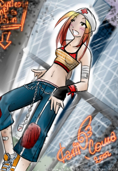
I designed it for my web site but I'm affraid I'll have to work on it a bit more :/ Hah, that's a self portrait (for those who haven't realised it yet).. Sometimes I'm in such a hurry that I don't have enough time to eat breakfast, so I use a cup of coffee as a substitute and not an addition to the breakfast's menutech info: painter7
Related content


Comments: 13

")


Yes this is a step away from your usual style isn't it? But it works wonderfull! It's so strong and bright and clean in it's messiness... Beautiful. I adore it. (Coffee's usually my own breakfast BTW... I just find it hard to eat first thing in the morning usually).
👍: 0 ⏩: 0

lovely desgin!! i love the colors
this is such a great concept
beautiful joblike always
👍: 0 ⏩: 0

dah, KArin, to nei wyglada jak twooj styl ^~
teehee~~
anyway, pytalas skad biore swoje ciooshki: szyje ^^
z pomoca mamy of course, a tamte wczesniejsze, to koopilam w GB X_____x;
nie moge wrzucic na devianta zadnej mojej pracy tej postaci, bo gah, nei mam nic sensownego >
👍: 0 ⏩: 0


jessssu karinka walnela cos niemangowego ale i tak fajnie wyglada
👍: 0 ⏩: 0

only one word.. VERY STYLISH! fine, that was two.. -.-;;;;
i love the greeeeen.. it would look great as a poster :3
👍: 0 ⏩: 0

Dobre! Jakby zupelnie inna kreska: prostsza, ale rownie dobra... No i zupelnie nie czuc tego mangowego stylu, ktory jest w 99% Twoich prac Zuch dziewczynka
👍: 0 ⏩: 0

Very stylish, love the callouts. Green and red, nice choices.
👍: 0 ⏩: 0