HOME | DD
 karincoma — . clockwork random stuff no2 .
Published: 2007-03-03 15:19:08 +0000 UTC; Views: 24933; Favourites: 377; Downloads: 14
Redirect to original
Description
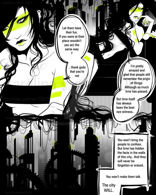
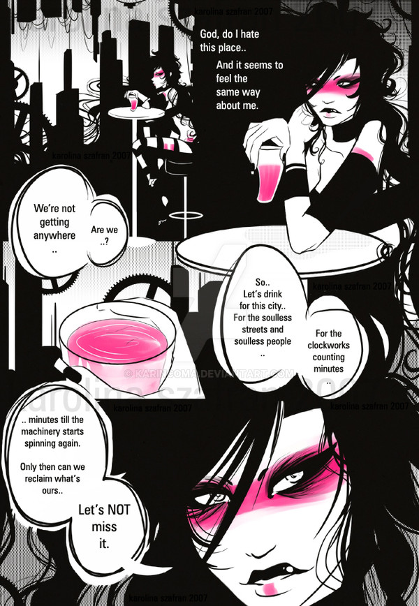
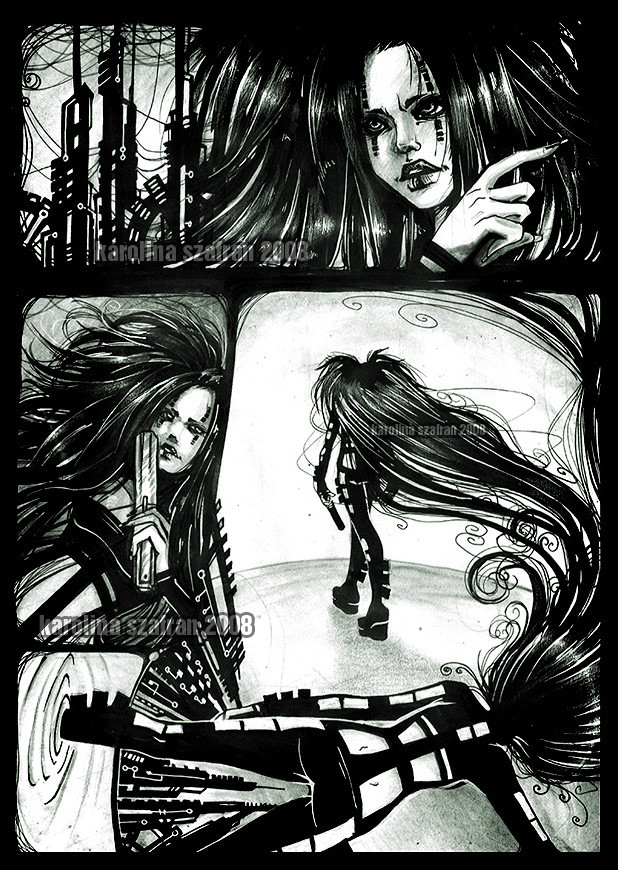
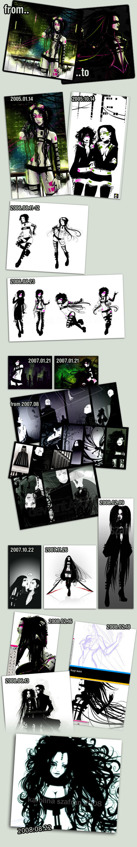
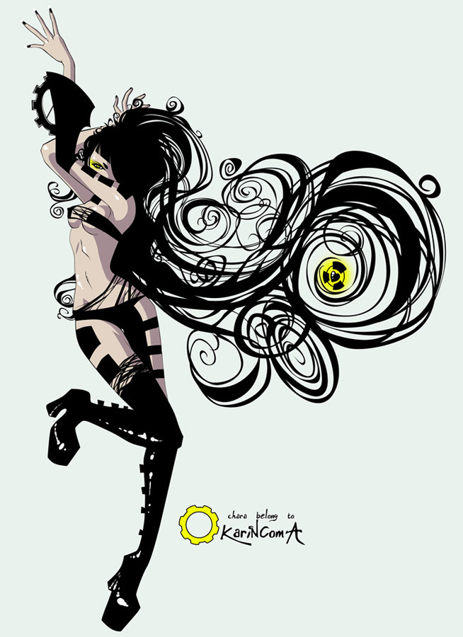
And another one..I'll finally have to make some character sheet.. Argh.
Hope you will enjoy it :*
media: painterX, ps7
+{K}+
Related content


Comments: 78

Nie no, troche bym za bardzo poleciala jakbym ja skumala z Koma jakos..
Co do tego czy jest w 100% czlowiekiem hm.. Nie wiem jeszcze  (Wink)")
Wlasnie jej dostawiam detale, tatuaze itd.
👍: 0 ⏩: 0


the fact her hair mingles with the frames to look like hanging cables just acts as more of a forefront for the futuristic style and feel this has-once again it's incredible
👍: 0 ⏩: 0

wow... this looks like it was done with vectors.. its so frickin clean, anyway it looks great.
👍: 0 ⏩: 0

I really like the drawings and character, but I don't get this at all (which annoys me anyway, since I can't ignore the content 
And make that character sheet indeed! I want to know all about her
")
👍: 0 ⏩: 0

She reminds me of Sin City, specially in this drawing. If you'd have used a font that resembles the comig writing, this would definitively be a sin city comic page
This character is amazing.
👍: 0 ⏩: 0


I really love the dialog behind it too! that's what REALLY makes it SUPER awesome!
👍: 0 ⏩: 0


she looks more nice in pink makeup
but she still Beautiful!!
👍: 0 ⏩: 0


Beautiful page setup // I like the way her hair flows into the background
-M
👍: 0 ⏩: 0


dig it, words feel a bit stale, however, i must admit i cant even think of a better way to present the mood through words than what's been presented...so i guess...wurd.
👍: 0 ⏩: 0

I think it should be "the gods" or just "god" to make it sound better. And why not "..." instead of ".."?
Just pointing some lil stuff out. The picture is very pretty and original.
👍: 0 ⏩: 1
'..' because some years ago I realised that I really dislike how '...' and '!!!' look ")
 (Smile)")
And yes, about 'the gods' - you're absolutely right. But now I'm too lazy to open this file again and edit it.. It's rather a random page which actually is not a good excuse, I know
👍: 0 ⏩: 0


How can we not enjoy it ^_^ I love it
👍: 0 ⏩: 0

<= Prev |