HOME | DD
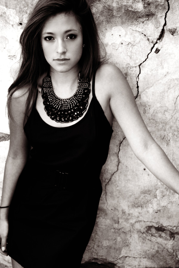
 kaysmith92 — Masks
Published: 2009-12-06 17:47:29 +0000 UTC; Views: 444; Favourites: 8; Downloads: 6
Redirect to original
Description
..Related content


Comments: 1

She's nicely placed in the composition, there's a nice line on the wall sort of balancing the other side of the photo.
I do get the feeling that this is a classy photo ad for jewelry. Something to consider would be to take off her earrings and arm band, maybe also necklace as they draw away attention if that's not your intention (Smile)")
It could also be cropped a little in the bottom to get rid of that "triangle" down left. And try not to cut the hands and arms, that's a rule..
What I like here are the contrasts, the deep blacks against the light. The elegance against that rough wall. Makes the details really stand out, especially her eyes.
Pluses for composition, contrast in black and white and choice of background
Minus for cutting hands.
-
Alexander
👍: 0 ⏩: 0