HOME | DD
 kheelan — confused-where am I
Published: 2003-09-10 21:12:13 +0000 UTC; Views: 2116; Favourites: 65; Downloads: 438
Redirect to original
Description
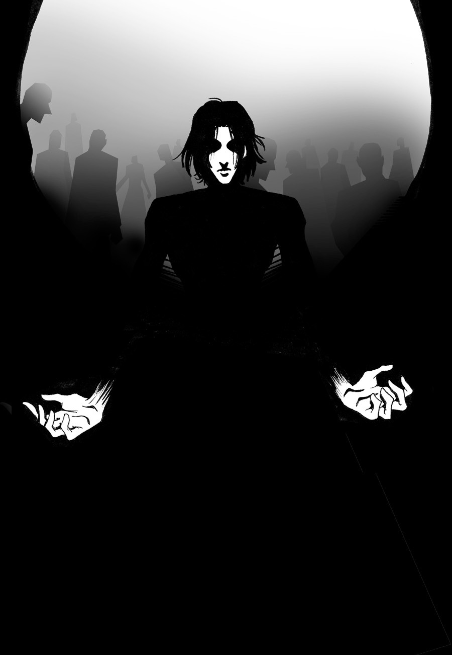
Well what do you know...I've submitted something, wow...I've no idea how often I'm gonna be able to (or if I'm gonna be allowed enough time to draw my own stuff...sad thing being, I've still got that damned artist block) but yeah, I'm re-obsessed with Trent Reznor again after seeing a music video of the song "Wish" (love that one) and I dunno, this poped into my head couple nights ago and so here it is, mainly ink drawing with really shitty CG background (no tablets and no PCs...I'm doomed) but anyways thanks for looking.Related content


Comments: 22


THIS IS SO GREQAT THAT I CAN'0T UNDERSTAND HOW Y OU ONLY GOT 20 FAVS!!!!!!!!!!!!!!!!!!!!!!!!!!!!!!!!!!!! !!!!!!!!!!!!!!!!!
👍: 0 ⏩: 0

Your use of highlights is outstanding! I love the contrast!
👍: 0 ⏩: 0

I'm in love with this piece; it's strikingly original, and believe me, being the webmistress of a NIN fan art site myself, I have my bouts of becoming "re-obsessed" with Trent and along with that rediscovering the beauty of his work. Anyways, I'm adding it as one of my favorites. When I see others inspired by his work through their art (especially ones who are as badass as you are), I can only relate that much more. Bravo~
the art of nine inch nails
👍: 0 ⏩: 0

Nice positioning and colours, and it looks rather threatening. I like the hands. o.o

👍: 0 ⏩: 0

It'sa a simplistic kind of lovely-dark, I think. The way the shadows have dominance over the pictures and play across Reznor's body is just amazing...The way you've got the arrangement between the positive and negative is very well-implemented here. I dig this one much.
👍: 0 ⏩: 0

wow... that's so incredibly rockin... i mean, the hands, THE HANDS! i love the exaggeration and the contrast and...
+fav, mon
 (Wink)")

👍: 0 ⏩: 0

Ooh, cool! He kinda reminds me of Snape from HP...
It's neat looking, tho.
👍: 0 ⏩: 0


I really like this!!! It's got a lot of feeling behind it! Know how the blockage goes, take a good art class it always helps ")
")
👍: 0 ⏩: 0


oh dude!!!
that rocks!!! ")
aww ;_; stupid blocks!! *sho`s it away*

👍: 0 ⏩: 0


holy fucking shit!!!! +FAV+FAV+FAV+FAV+FAV!!!! this is awesome. i love the effect of him coming into the light and the backround is cool. it has that foggy affect.
👍: 0 ⏩: 0

Cool, nice effects and I like how you inked it. The artist block will pass.. eat something or smell something.. that spikes your creativity ^^
👍: 0 ⏩: 0

Oh wow! O__O
It looks so professional. Like a comic book cover!
(bad example, i know.... -__-;
But it's awsome! I love it! The BG isn't shitty, it's looks great. Brings out the dude in the front more.
👍: 0 ⏩: 0

Yaaaahhh... O_O I LOVE this... I'm not sure why I love it sooo much, but I do... beautiful bg there... great lighting, I adore your ink pieces as always. And lucky me, first comment (I think!!). 
👍: 0 ⏩: 0

hey hey thats awesome ur negative and positive space rox ^^
👍: 0 ⏩: 0