HOME | DD
 Kirbopher15 — Terrain of Magical Expertise

Published: 2010-04-01 03:05:46 +0000 UTC; Views: 26817; Favourites: 368; Downloads: 216
Redirect to original
Description
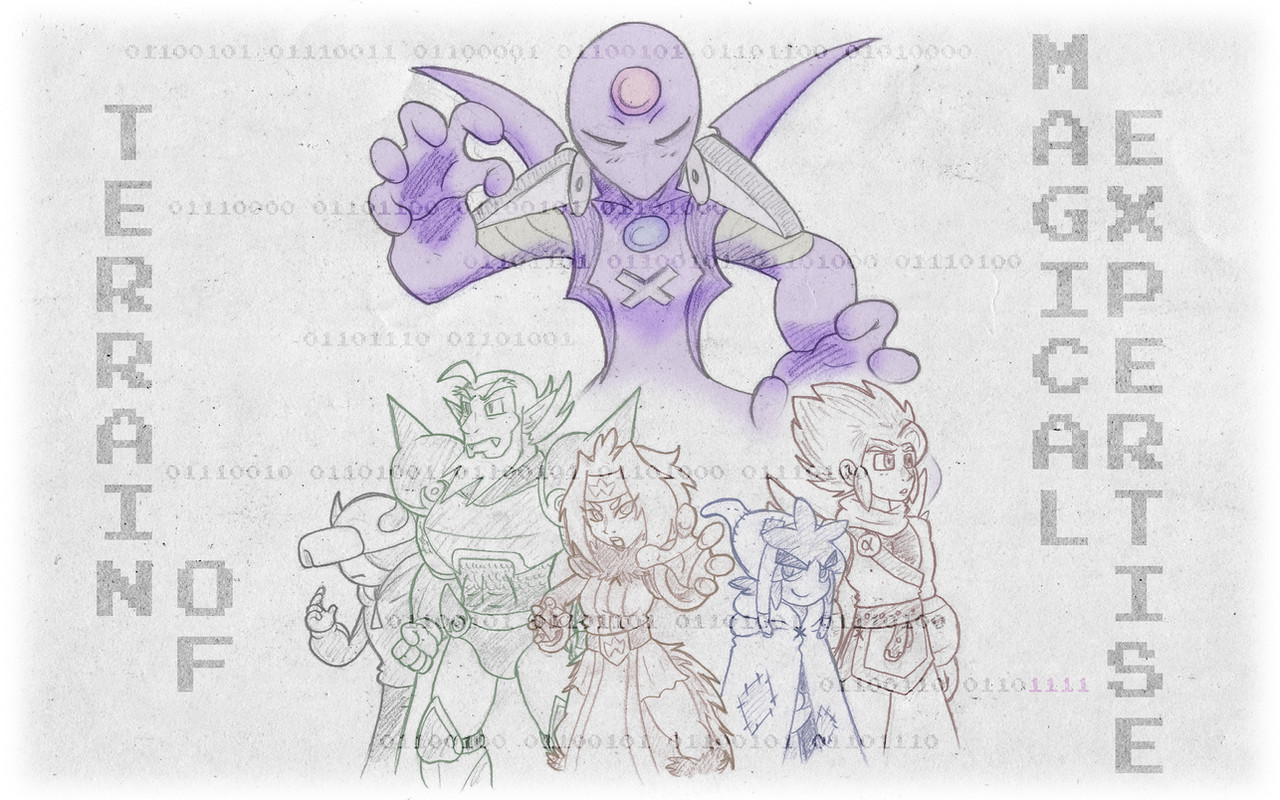
A poster I sketched out mainly on a piece of 18x24 paper. The world map in the background and Webmaster hovering over it were both two additional 11x14 pieces. The rest of the effects and BG art was done in Photoshop.The designs of Alpha and his friends are updated versions of the ones pictured in the last piece they were featured in . Alpha's color scheme lessened up a bit and he sports a new tail to go with his wings, Kirb's gotta burlap-sack for a new hat and more Cerulean color scheme, Flamey's got a tail to go with her wings and a haircut I've finally settled on, Gamecrazed I've slimmed down a bit and given a D-Pad stomach ornament and Nylocke has been given a new outfit that combines the look of his 1st Season armor/cape with the 3rd Season color scheme. Ruri, Zetto and Webmaster are nearly the same but were given a few updates.
S'not perfect, but it was a fun little project to do, took about 3 days to finish. I did the original sketch on a smaller piece of paper in class on a whim and decided to transfer it to a bigger piece of paper last Monday. Any critique would be great!
Related content


Comments: 172

Woah that's a good point. The art is amazing (and nostalgic) but I would have expected a foot there.
👍: 0 ⏩: 0

Very nice artwork Kirb. takes me back a year and a half where i first saw the whole TTA series. Alpha and GC had to be my faves though... maybe it's because of some cleche liking XD.
oh well, it was good times.
Now, ah, I just have three questions for you, if you don't shoot me for asking o.e
1. Why did you discontinue TTA if so many people liked it?
2. Is there a chance of picking up the series again in your spare time?
3. Why did you never post the TTA Movie on Newgrounds?
now, I'm sure your a buessy person with muchto do, so I'll just leave you to your work. HAve fun and good luck on future projects.
👍: 0 ⏩: 0


Thought it was spelled nailoke or something like that
👍: 0 ⏩: 0

I don't know why but, it reminds me of a Star Wars poster.
👍: 0 ⏩: 0


This has been bothering me ever since i first saw this picture. How come you look all raggedy and stuff? I also noticed that alpha's tail isn't like a lizard tail is there a answer to that too?
👍: 0 ⏩: 1

Wanted to make Kirb more like a thief or an imp or something. Alpha has a feathery tail to be consistent with his wings.
👍: 0 ⏩: 1
To tell the truth i don't think that look suits your character that much.
Speaking of Suits it would be cool to see him in one, what do you think?
👍: 0 ⏩: 0

Why does this remind me of MegaMan Battle Network so much....
Great art, btw.
👍: 0 ⏩: 0

I'm Currently making a manga that Crosses over TTA with Dragonball, Fullmetal Alchamist, Super Mario Bros. Z among many others. I'll Keep you Posted on the Chapters I Have Planned
👍: 0 ⏩: 0

Hey Kirb u might have sen this message and not wanted to reply but I'm sorry for asking this again but what software do you use for drawing and shading or do u just scan a sketch and then do some photoshop work?
👍: 0 ⏩: 0

So if TTA is a dead series, why do you still draw it? o_o;
Just, curious is all
👍: 0 ⏩: 0

Ah, Kirb...a breath of old, yet still fresh, air lingers on this drawing. It is phenomenal how much you've grown as an artist. Keep up the phenomenal work and I'll keep favoriting.
👍: 0 ⏩: 0

Awesome pic. TTA was a great series.
👍: 0 ⏩: 0

Thank you, my friend just bet me that 12 year olds can't draw and you just helped me win that bet. Very good, you will get better as you grow older! Keep it up!
👍: 0 ⏩: 0

gotta say i love this alot
one thing on alpha bugs me but not that much i just miss his huge wings X_o but meh
Flamy looks hot as usual (aaah didja see what i did?!)
as for nailock i think he looks better with a cape
GC's change looks better cause he's slimmer as for the D-pad i cant really say honestly X_o....its not that it bad, its just there and thats it...yeah half assed critic whateva X_=
webmaster looks more epic-er in this way cause he's like a saiyan god
Kagemamoru will steal your soul
Ruri looks hot as usual, something bothers me about zet though X_o the profile face is good no problems in that but his hair looks too squarish like you were trying to push it in for space aslo the hairline on his forehead looks a bit too square.
Kirb looks...wiser like this then when he was a marshmellow XD burlap sacks FTW
i aslo like hot you redesigned TOME up there, i was a dead-on fan of TTA so it brings back good memories seeing it up there
👍: 0 ⏩: 0

It's been a long time since i've seen these guys in an illustrated form like this.
The design tweaks you've made to the characters, i would have to say, have been made for the better. The design changes are a lot more subtle this time around (taking into account that Kirb himself has been redesigned before), but it's a good thing, as you've decided to hold onto the elements of the characters that you found fun to begin with, while still giving them some updates that are well warranted.
There are some awkward parts of the picture here, like the positioning of Flamey's tongue and the scale of Nailock (his footing implies that he isn't all that far away from flamey, but his scale conflicts with that), but overall you've shown some good improvement. Your work with hands in particular has gotten much better.
What i think your strongest point displayed in this picture is, is your colour palette. You've definitely shown improvement here. It's a lot more subdued this time around and that is most definitely a good thing. When you've used a tone of red, you haven't immediately gone for the most intense red available, you've carefully picked a suitable shade that doesn't overwhelm the surrounding colours. Every character has a very well definied palette of their own, and as a team they all complement each-other's. I particularly like your choice of colours for Nailock; you've brought out his cape as a highlight of his design without making it stand out too much against his hair and armour, and the blue hues selected for his sword are quite warm, so they work well alongside his warm colour scheme.
Working alongside your palette of course, is your shading. You've done a good job of defining the contours of the characters' designs with your use of a simple cel shading style method, through both selection of tones and placement. I will however, say that your light sources are not very clearly defined, as each character seems to have a different light source influencing them.
Though that may be explained through the context of the world in which the characters are inhabiting, you should place a bit more thought into where light is coming from before you get to the shading phase. You're already displaying the ability to do so with each of the characters individually, but as a whole the picture's light sourcing is not made clear.
My last bit of critique involves the floor. I feel like you had some opportunity to do more with the floor here; perhaps re-interpreting the design of the tiles as well as the characters. Maybe the tiles could have also been luminescent, to go with the whole virtual world thing and to provide a light source.
Overall, you've shown a clear development of skill with this piece and you should feel really good about that. There are still areas to improve on, but that is what's great about an artist. I hope i've touched on some useful topics, as i really want to see you improve further and i look forward to seeing more work from you in the future.
👍: 0 ⏩: 1
Thanks agent!
Glad that you enjoy my choice of colors, that's something I thought I was really getting good with but wanted to seek the approval of peers before claiming such. Nylocke was the only one I was torn on regarding his new color scheme.
Light source has never been a strong point, mainly because I flat-out keep forgetting it NEEDS to exist. I've been trying to be more concious of it, as it's obviously really important. The floor, yeah could've turned out better, but at least it got the idea across.
Critique much appreciated. B)
👍: 0 ⏩: 1
You're welcome, and sorry for mispelling Nylocke's name; like i said, it's been a while.
You were torn on Nylocke's colour scheme? How come? I think his is among the best in this picture. The combination of orange and green is always a bit tricky to get right in character designs, but i think you handled that nicely.
👍: 0 ⏩: 1
Oh no that's cool, you got it right. It was Nailock in the original, Nylocke's the new way I spell it now so people pronounce it right XD
👍: 0 ⏩: 1
Haha, oh boy, i'm guilty of mispronouncing it too then! Sorry about that!
Again i must ask though, why were you torn on Nylocke's scheme?
👍: 0 ⏩: 1
Yeah s'okay, most people said "Nail-ock"...also people said "Kir-baw-fur" or "Keerbifeer". Derp.
I went through a few different choices for Ny's color scheme. The first thing that came to mind was his original Red Cape, Maroon Armor bit. Then I tried Green Cape with Red Armor and finally Red Cape, Green Armor. Asked a few people for advice and eventually went with the one you see now. :0
👍: 0 ⏩: 1
Ah, i see. I like the choice you ended up with for Nylocke, he doesn't use many colours but he doesn't necessarily need to. He's also easily recogniseable.
Also, "Keerbifeer"? Really? That is a real thing that people were saying? Ugh!
👍: 0 ⏩: 1
Actually the VA for Flamegirl said that the first time she had to say Kirb's name. XD
👍: 0 ⏩: 1
oh XD
No offense intended, i assure you!
👍: 0 ⏩: 0

all i can think of when i see the overlord is andross?lol and i like the new additions the chibi pauper kirb love it combines your current stuff with your old and also the other edits on the cahrcters are quite good as well good job mr.kirbopher!
👍: 0 ⏩: 0

I know I'm gonna nitpick at this even if it is pretty nice.
-Alpha has a tail. Weird.
-Why must you change Kirb's character every time you change your avatar or NG ID? (again I'm nitpicking)
-Flamy is... ah whatevs she's alright.
-Zetto and Ruri look oddly kinda evil. I know Zetto was the anti-hero/antagonist for most of the series. But he ended up a good guy and he's on Parody Rangers. But I'm really bitching here.
-Nailock looks like a gargoyle gotta be honest.
-Why is Webmaster so menacing? I mean it was probably meant to look like an overseer but he looks more ominous than anything.
AGAIN, I'm nitpicking and maybe even bitching a little. But those are the things that strike me as weird. I can stand that it looks nothing like the original style of even season 3. Your style changed over the years. But don't take it personally. I do like it.
👍: 0 ⏩: 0

")


You know, based on how popular TTA is, if you had made it into a Doujinshi series instead of a flash series, and sold them for money, you'd be very rich by now. Probably would have been easier to make too.
👍: 0 ⏩: 1

I agree several hundred times. lol
👍: 0 ⏩: 0

Your new art style you've been perfecting over the last rough year or two is really starting to come to full fruition.
The characters really look like they're a product of your creative efforts and not just a mimicry of other common art styles.
The cartoon cel-shaded coloring it quite nice, and fits your content quite well, without sacrificing quality in the details of the characters.
Your composition feels a bit lop-sided with nothing going on in the top left quadrant and the characters not quite aligned in any particular manner. It makes it feel a little less structured that way, but let me stress this doesn't mean the piece is automatically 'bad' because of it. Simply put it feels like it could be that much better if the characters positions played off one another a little bit more.
Really its all quite impressive though, and its nice to see you still doing these cool collage pieces. When you do single character studies, try to accomplish the same level of detail as you have here.
👍: 0 ⏩: 0

So now Webmaster has a Andross model, since he has red orbs in his hands. Very cute indeed. No sign of the younger brother though, since I thought he might have gotten a remake as well.
Also, I look forward to seeing the TTA movie back up on your newgrounds account. Unless of course, you decided not to put it there. Which is okay.
👍: 0 ⏩: 0

Nylocke face freaked me out, only makes me wish there was a season four to see it in action, but o well thanks for the TTA artwork
👍: 0 ⏩: 0

awww, they look all cartoony now, i liked it better when they were serious looking
👍: 0 ⏩: 0


So what your saying is... There's going to be a season 4?
👍: 0 ⏩: 1


Awesome. The characters (Especially Alpha) look like they could on TV now!
👍: 0 ⏩: 0

hey excuse me for bringing this up but on the left side isnt that the feline babe from go go parody rangers?
👍: 0 ⏩: 1
Zetto and Ruri, the two characters in the background, are where Lord Zet and Nekoneko come from originally.
👍: 0 ⏩: 0

looks awesome kirbopher... tails clock got us with tta ep 074... it was pretty hilarious... (not the fact that it wasnt the real ep 074)but just the end when alpha shot zetto with the grid
👍: 0 ⏩: 0

Even if we'll never see the proper ending to their series, it's good to see that these characters still get the attention of their artist. This just might make me go watch the entire series for a 5th time XD
👍: 0 ⏩: 0
| Next =>