HOME | DD
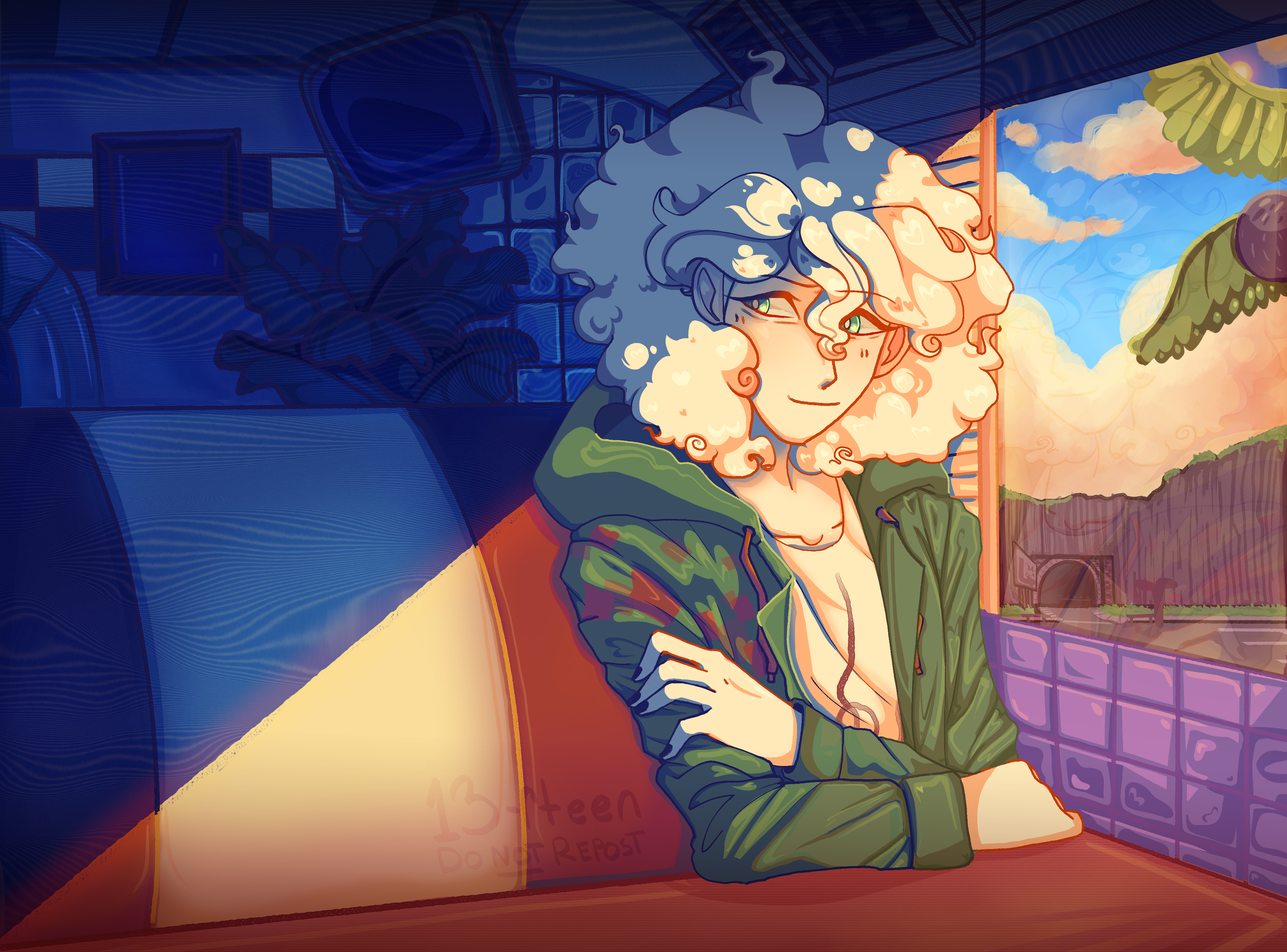
 Koa-Z — Nagito Color Study
#color #colorstudy #fanart #study #nagito #komaeda #superdanganronpa2 #sdr2 #sdr2fanart #nagitofanart #13rteen #komaedanagito #nagitokomaeda #sdr2goodbyedespair
Published: 2023-10-10 18:24:08 +0000 UTC; Views: 1014; Favourites: 13; Downloads: 0
Redirect to original
Description
DO NOT REPOST. Brushes & Techniques below
Brushes used (Clip Studio, Free):
Main: “ラフペン” from gyuukotu’s “Fill Set (塗りセット)”, content ID 1695210
Fill: Default India Ink brush pen - the rough pen is a little unpredictable, so I used this to flat the image and make sure that there were no gaps
Cloud Flat: "荒筆" from gyuutoku's “Fill Set (塗りセット)”, content ID 1695210
Cloud Blender: I downloaded it from the internet instead of the app 2 years ago and cannot find, with certainty, where it came from, since I get rid of everything on my hard drive that's not art every year ")
Misc. Techniques:
Screen Distortion: I used CSP's free cloth texture clipped above the "blue" layers and then liquified it in places for the screen distortion effect
Gradient Mapping: I cannot overstate how helpful gradient maps were for minor color corrections, you guys PLEASE try them on a finished piece of your own if you haven't used them yet. Click Layers > New Correction Layer > Gradient Map and then choose from the premade gradients before adding your own so you can see how they worked. I used a few different ones clipped to specific areas w/ lowered opacity & hard/soft light settings where I felt like the color was falling flat and it was SO helpful at giving it just that little bit more depth.
Hearts: I've discovered that you can cheat at hair and clothing rendering by just making hearts. Try and see how many you can find lol
Color Theory in General: The whole point of this piece, after it stopped being fanart (lol rip), was to be a color study focusing on the contrast between shadow and light and what I could do within the blues & the yellows to make them appear as if they're actually different colors. In the blue section, everything is p much blue, nothing is any other color. In the sunny section, a lot of the stuff is warmer variations of the standard colors, since I wanted it to be more vibrant and didn't feel like I could achieve that if everything was shades of yellow and orange. That being said, I stuck as closely to that as possible. But ANYWAY, juxtaposing the two starkly different color profiles also helps the blues in the blue side read as colors that they aren't, which was part of why I did this study.
Sneaky sneaky: I just modified the diner a bit in order to get the colors I wanted, i.e closing the blinds bc I can. As an artist it's important to remember that YOU have full control over every single part of the piece, you just should ideally have a reason to create inaccuracies/ break rules or else it can end up being a bit messy and disorganized & details/ your vision can get lost.