HOME | DD
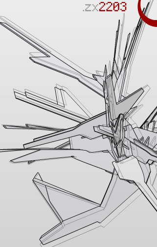
 kodslash — Nano Technology

Published: 2001-12-02 19:58:21 +0000 UTC; Views: 557; Favourites: 4; Downloads: 166
Redirect to original
Description
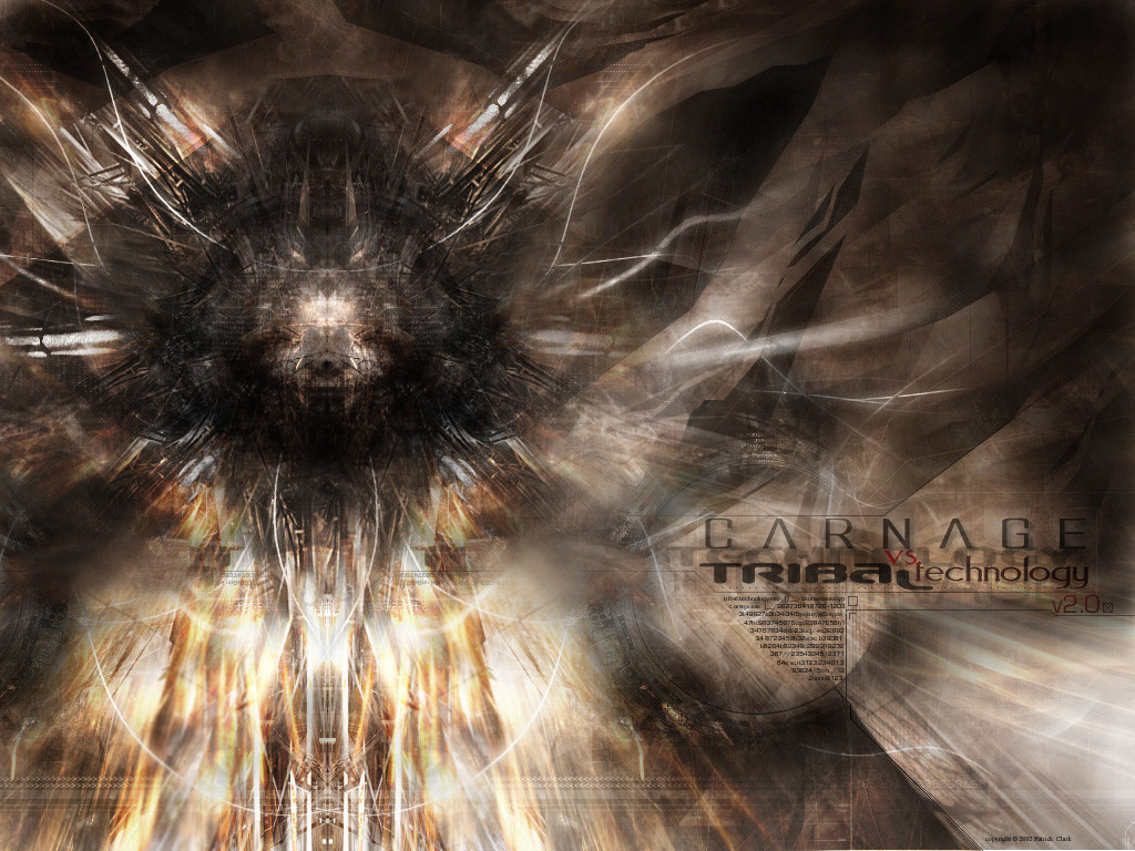
A completely new style for me, hope you like it.Related content


Comments: 11

Like this alot, I think I'd loose the dropshadows on the red areas so it was all 2d and some of the lines are a bit jaggy. Really liking the transformerness of it
-----
Simon
[link]
👍: 0 ⏩: 0


WOW!
Really cool style kodslash!!!
Like matt said, it would be great with some real 3D shapes... you should try it
👍: 0 ⏩: 0

oh wow.. this is definately different i like it. have u tried mixing this with some 3d? maybe that'd be cool.
-- matteo --
https://www.deviantart.com
http://www.wastedyouth.org
👍: 0 ⏩: 0

Originality - I have not quite seen anything like this, so it is definitely original enough to warrant A+. Very mesmerizing.
Technique - The only real drawback to this is the aliasing. Although I do not know how to tell you to fix it, I would definitely find out how because that would greatly improve this already interesting piece.
Overall - Keep up the good work. THis is a very interesting design and you could definitely be on the verge of something great with this!
[ K ]
👍: 0 ⏩: 0

thanks for the comments -_` I wasn't trying to model it after anything particular, just some random stuff in my head, but if it should happen to look like something then it's an added bonus I guess
👍: 0 ⏩: 0

attack of the oragami!!
i like the coloring here... and the subtleties in the line work. i agree with cuttheredwire in that it could use something more. i'm not sure of a bird, but something...
👍: 0 ⏩: 0

looks like jetfire's (aka skyfire) wings. That's why loiden. Same color and style. I like the style. If it were me, I'd imitae obects and animals along with random designs. A Bird of some kind would obviously be a good place to start. Some skins would go well too. I love it when an artist developes a style all thier own. Glad to see one in the mists of developing it.
Red... Boo!
👍: 0 ⏩: 0

I liek it.. except for the angeled lines are all pixely...
MatanzA does not 0wn j00! http://www.matanza.cjb.net
👍: 0 ⏩: 0

HOLY CRAP! that is definatly a new style for you (i just went through your gallery)! thats crazy good, the reason for the originality only bein an A is cuz its that trendwhorish style kinda common these days but its done very well... so i gave the technique an A++! nice job
----------------------------------------
If pro is the opposite of con does that mean progress is the opposite of congress
👍: 0 ⏩: 0

I like it.. of some reason it reminds me of transformers.. dunno why.. but.. eh.. I really like your new style
_________________
Titilituut .VS Peek-a-Boo
CrazysunART - http://crazysunart.narod.ru/
👍: 0 ⏩: 0