HOME | DD
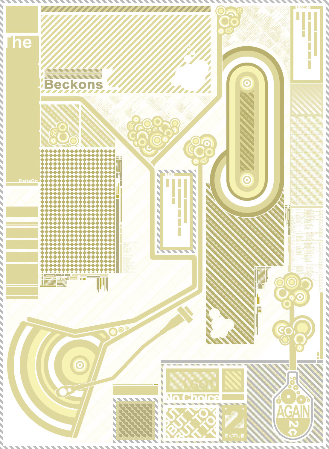
 kr8zie-xc — XC - Pattern
Published: 2003-01-05 06:40:10 +0000 UTC; Views: 398; Favourites: 3; Downloads: 41
Redirect to original
Description
Who doesn't love reoccurring patterns?It started out with a simple pattern. Kept adding to it. Eventually it ended up looking like an envelope, though I usualy see them when sent from europe, they have red and blue stripes around the edges, hence the address labels and the bottle loking thing that is supposed to be a postage stamp (cheap postage eh?). Then I added some more patterns.. and then even more....
I don't know if I got the turntable arm look right because I'm not too sure how it looks (bad resource pictures) so all you DJs will have to pardon me if I didn't.
I'm goign to use this a layout for a website that will be submitted for a scholarship. Yeh, I'm too lazy to make a new one...
anyways.... time to listen to some Phantom Planet (or At the Drive-In, or Sparta, or Beastie Boys, or anything else) while this behemoth submits really freakin' slow ony my crappy 56K connection.
Related content


Comments: 9

im deffinitely feeling the colors on this one. the patterns are awesome... nice job
👍: 0 ⏩: 0


colors hurt my eyes tho
They are plain, dull and neutral. How would they hurt anyone's eyes? It's like... it's not possible.
Great work... and considering that you took those craptastic U's out of there I guess it deserves a .
👍: 0 ⏩: 0

this 2d is great.. amazing work. colors hurt my eyes tho
👍: 0 ⏩: 0

i personally think it will look better if it was smaller. i dont know why, but i think it'll make it look very detailed.
but anyways, great work, decent composition although looks abit too cluttered in some areas.
and that blue colour doesnt really fit in too well.
👍: 0 ⏩: 0

Yes, and who helped you? I DID! nice job yeah i agree with elvee that a blue version would be purdy
👍: 0 ⏩: 0

Niceties all around. I personally like the BUT TODAY part the most, I don't know... I'm a sucker for text.
👍: 0 ⏩: 0

This piece is deceptive, really. You put a hell of a lot of work into the patterns, obviously, but what really impresses me is the feeling of repetition you achieve without really repeating any of the patterns exactly. I didn't notice that at first. If I'm this good at this style in ten years I'll feel pretty good. The grey could be replaced with a darker brown to give the piece more contrast, but that would take away from the subtlty. Maybe try a blue version? Those are just my random thoughts, really. Great piece.
👍: 0 ⏩: 0

Very nice job...I like a lot, the colors go nicely together.
👍: 0 ⏩: 0