HOME | DD
 kriptoner — kript gfx
Published: 2001-12-26 22:49:47 +0000 UTC; Views: 621; Favourites: 3; Downloads: 101
Redirect to original
Description
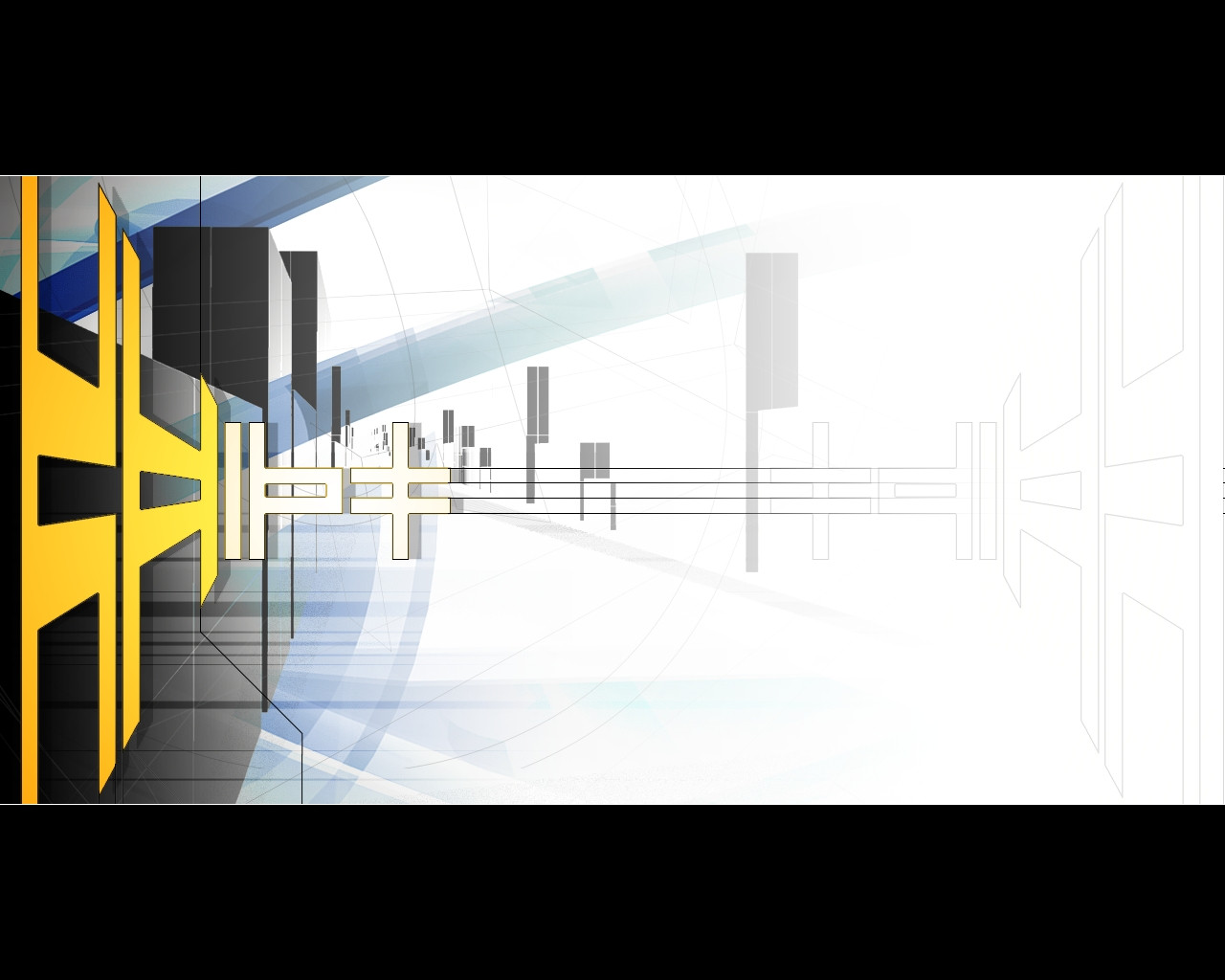
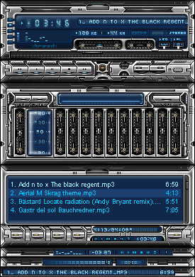
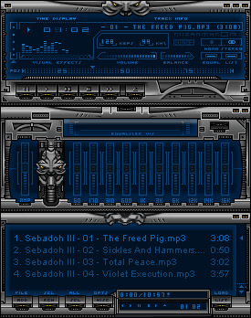
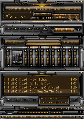
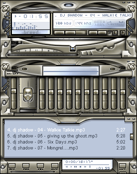
it is the main gfx design of the website i'm actually workin on :]Related content


Comments: 7

looks cool, but ah, I seen much better things from u. may be the style I dun really like ..
-----
(`’·.¸(`’·.¸ ¸.·’´)¸.·’´)
«´¨`·... http://demented.org/~loiden..·`.... «
(¸.·’´(¸.·’´ `’·.¸)`’·.¸)
👍: 0 ⏩: 0

sweet. i like the perspective and feel of depth. nice job. very high contrast tho, hehe
-----------
1 ) Wasting time is an important part of life.
2 ) It is a miracle that curiosity, creativity, and imagination survive formal education.
http://brandonland.tk
Quoth the ravern, nevermore
👍: 0 ⏩: 0

Great job, love the perspective. The shapes are cool too.
👍: 0 ⏩: 0

woops u got me skywolf ;] i noticed the jagged edges too, but it isn't really meant to be used as a wp, it is a part of a website gfxs and the version i used is much smaller..and the jagged edges are gone into ps algorythms
👍: 0 ⏩: 0

I'm liking it! The only suggestion I can make is the centers of the shapes on the left have jagged edges. Looks great otherwise!!
-Sky
👍: 0 ⏩: 0

How gripping and angry! Letterbox lines are so cinematic! Where's my popcorn and bocket 'o' cola???!!!
👍: 0 ⏩: 0

very cool looking design here. i like the somewhat 3d appearance of the left wall and the weird shapes that take place on that side of the deviation. overall a very well crafted and well done deviation.
:: jark
:: jarkolicious.com: http://www.jarkolicious.com
👍: 0 ⏩: 0