HOME | DD
 lassekongo83 —
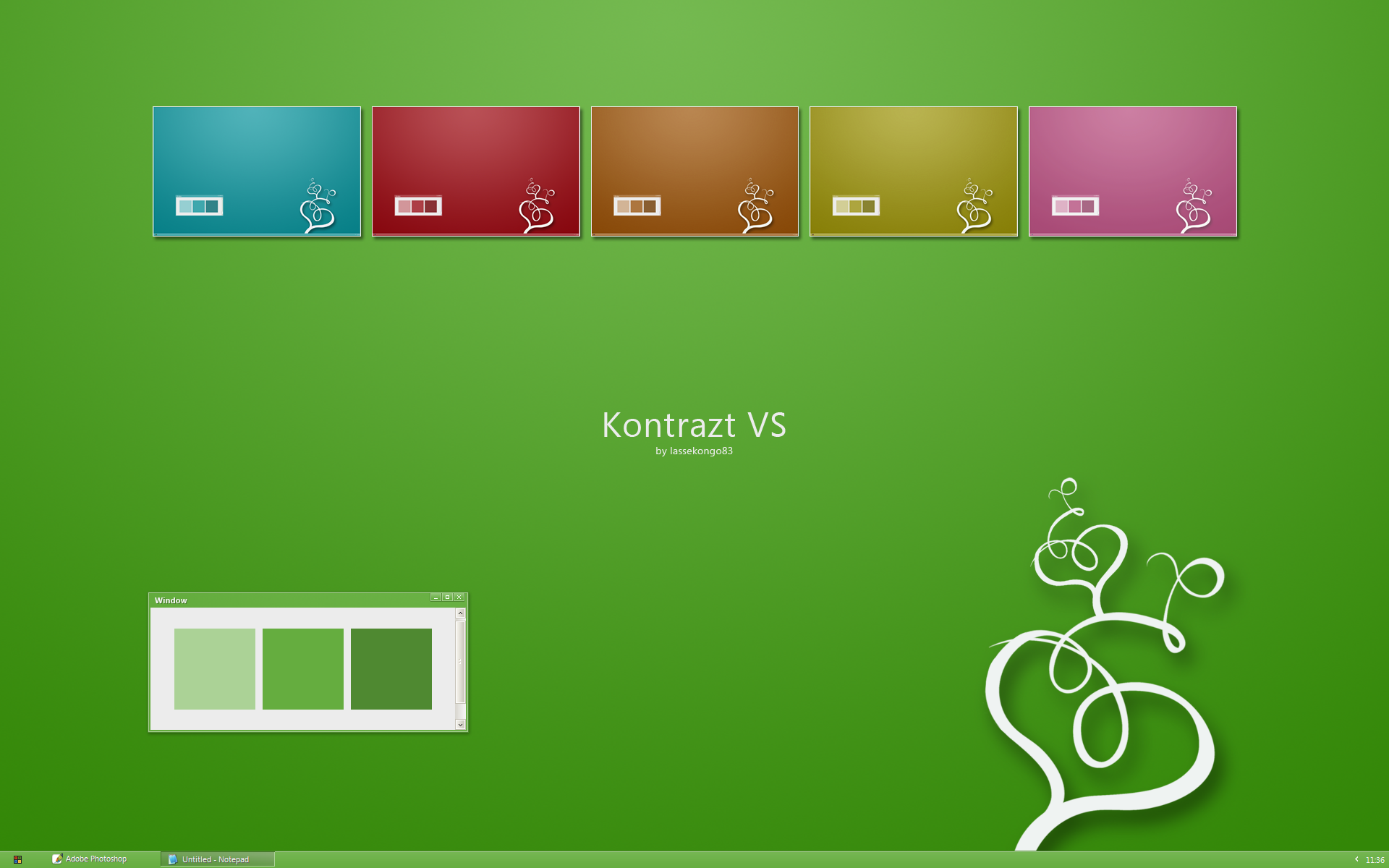
Hydrangea Visual Style
by-nc-sa
lassekongo83 —
Hydrangea Visual Style
by-nc-sa

Published: 2008-07-05 10:35:47 +0000 UTC; Views: 361323; Favourites: 587; Downloads: 124222
Redirect to original
Description
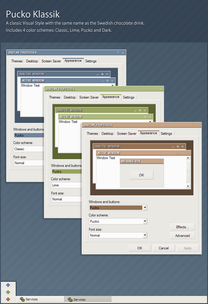
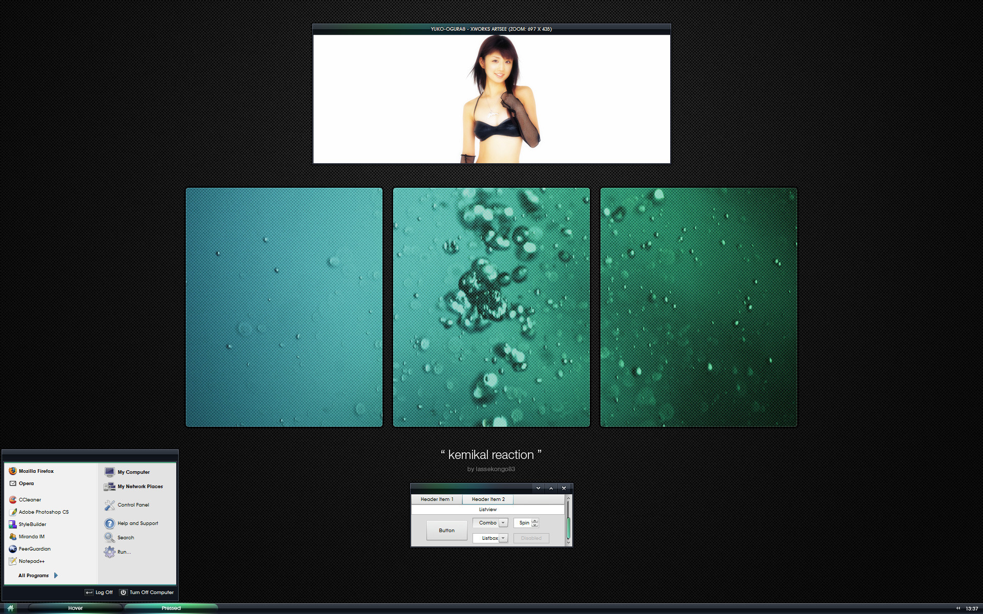
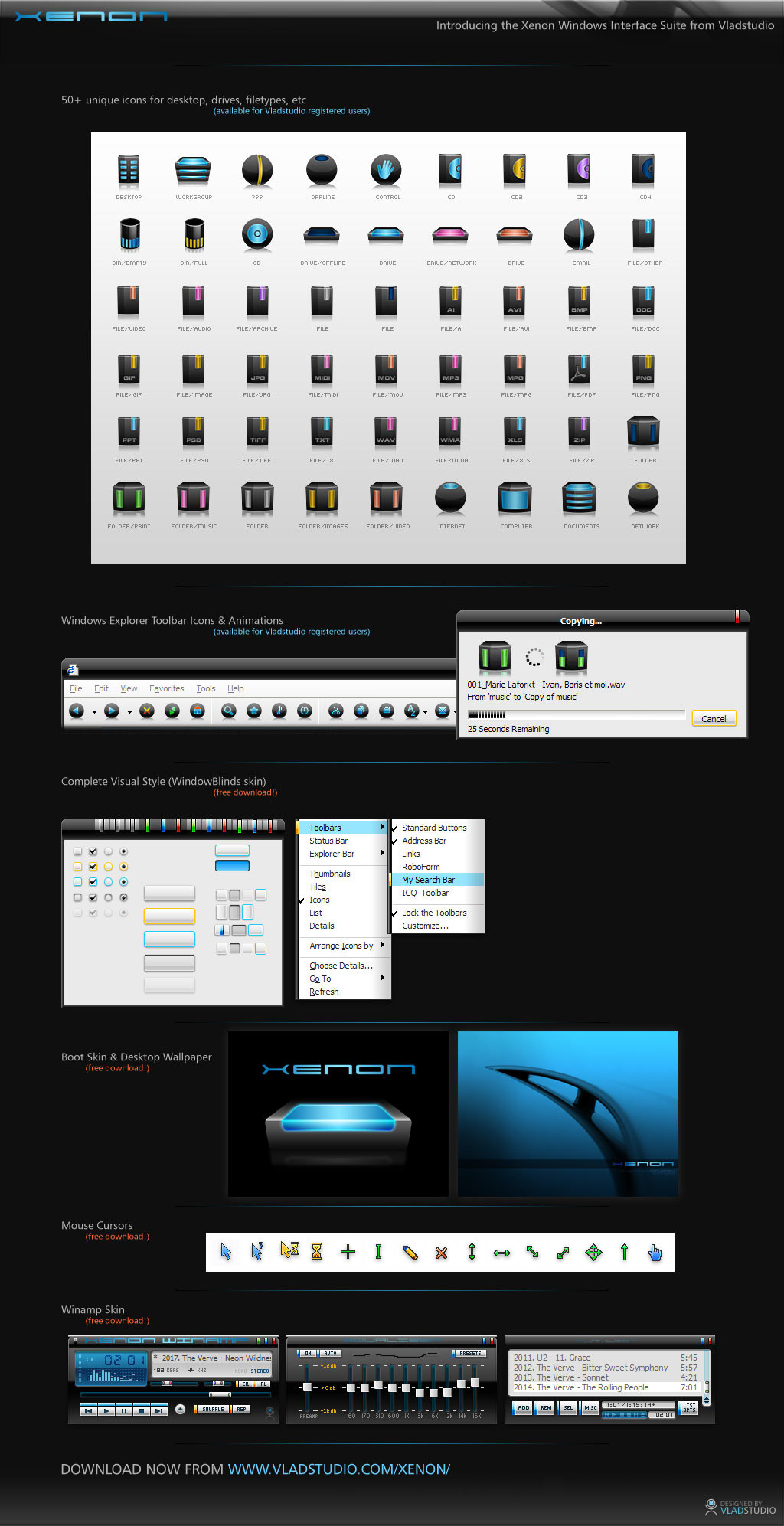
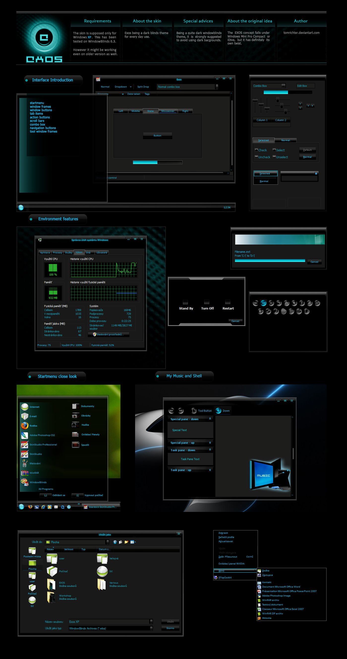
My version of a "standard" Windows XP style. Blue, Green, Silver + Black, Dark Blue and Pink.Not meant to be used with a double sized or vertical taskbar. (uglyness that is
") ) Keep it simple and compact.
) Keep it simple and compact.Wallpaper: [link]
ANY QUESTIONS OR PROBLEMS WITH MY VISUAL STYLES? SEE MY FAQ FIRST! - [link]
UPDATES
2008.07.16
- Added a new color. Dark Blue.
- Changed the preview to the new color.
Related content


Comments: 168


 (Smile)")


I don't like the grey. Too dark and murky for my tastes.
👍: 0 ⏩: 0

really good as usual lassekongo.
👍: 0 ⏩: 0

Another excellent vs lassekongo83! I have one question though. Why do you make different mstyles for each skin? Wouldn't be easier to make different mstyles for normal and compact version and pick our favorite colour from the "Color Scheme" dropdown menu?
 (Wink)")
👍: 0 ⏩: 1

I have asked this question in one of his previous VS. He said that the purpose of separate msstyle files is to make loading time faster.
In practice, almost all other VS I use combine all colors in one msstyle file and I don't notice that they are significantly slower. With lassekongo83 VS, I have to do some manual operations (creating a folder in C:\WINDOWS\Resources\Themes to match each msstyle file name).
👍: 0 ⏩: 0


love it man, very nicely done once again! - featured on jackrebel dot com.

👍: 0 ⏩: 0

Awesome! But the Taskbar is a bit to shiny for my taste.
👍: 0 ⏩: 1

I second that. The active taskbar button is too shiny and hard to read...
👍: 0 ⏩: 0


I generaly don't like your works because they are all to minimalistic for my taste. But this... This is absolutley gorgeus! Many people love "watrecolor emico" and though these two styles are similar, yours is far better and catching. And you used my favourite font, trebuchet MS. This one I'll be using for a long time...
👍: 0 ⏩: 0

looks great but you should start making vista themes.
👍: 0 ⏩: 0

The more I use the vs the more i like, good job
👍: 0 ⏩: 0

you are simply amazing, I Love your work n creativity effort that u put.
👍: 0 ⏩: 0


VERY nice! Maybe you should somehow improve min/max/close buttons...
But, I like this VS!
👍: 0 ⏩: 0

Snyggt jag tror denna versionen hade blivit snygg med en sån stjärna..som på shiftie.
👍: 0 ⏩: 0


live it, your simply great, keep up dooing what your good at
👍: 0 ⏩: 0
live it, your simply great, keep up dooing what your good at
👍: 0 ⏩: 0

perfect one
And, what media player do you use in the screenshot ?
👍: 0 ⏩: 0
From your previous VS, I wished the color to be more emphasized and the fonts more common. It seems like Hydrangea is exactly that. Thanks very much. I love square corners.
The taskbar in Hydrangea looks really small. I have edited advanced properties to increase font size to Trebuchet MS 10 (instead of 8). Everything looks good except the taskbar. Is it Ok to make it bigger?
Design question: Have you experimented with a green like this one ?
[link]
Most VS designers seem to avoid green, but surprisingly enough most of Vista like VS use plenty of green for the progress bar. There should be some basic design rules somewhere in play so that the majority of main colors are black, silver, blue. Are there such design rules?
👍: 0 ⏩: 1

Thanks.
About the taskbar, it was made to be very compact and simple. Saving some pixel space for fullscreen windows. I'm not very fond of thick areas and fonts, tough I do agree that it's more usable.
There are some design rules I think. I haven't really read all about it yet. 2 colors that should not be used too much are orange and red, because they are often associated with a warning or "turning something off". Green is an ok color, though it usally don't blend in so well with other colors. Blue, Grey and Black are the best colors, almost any wallpapers fits with them. Grey shouldn't be overused though, as it also can be associated with something that's disabled.
")
👍: 0 ⏩: 1
I switch back and forth between Interstellar and Hydrangea for comparison. They are both good, In my opinion, the optimal would be to combine the bests of the two:
- Task bar and the 5 colors from Interstellar
- I have the feeling the blue tone is different between the two VS. I like better the blue from Interstellar.
- Everything else from Hydrangea, especially the fonts and scrollbars. Finally I can now see clearly the scollbar in your VS
- Make the window titlebar from Hydrangea a little bit darker (but less dark than Interstellar).
- Increase the height of the taskbar. I understand a small taskbar could save some pixels. But nowaday almost everybody has big monitor. Some persons go as far as using gigantic 48x48 pixels icons. A more readable taskbar won't hurt.
- Mouveover on toolbar is currently neutral gray. In my opinion, it would look better if you give the same colored glow than what you have already done for the mouseover on buttons and tabs.
I hope your next VS will look close to this wish list. Thank very much in advance.
👍: 0 ⏩: 0

so clear! I'like green variarion. What do you think about working Micrisoft designer))
👍: 0 ⏩: 0


Looks Cool w/ the blue one but,
Please change the Max, Min and Close buttons! Sooo Bold..
A little lighter that matches with your taskbar..
👍: 0 ⏩: 0


Wow, I like this one. While the guy above said you need to try something new, I disagree. It seems like you're just continually refining this style to perfection!
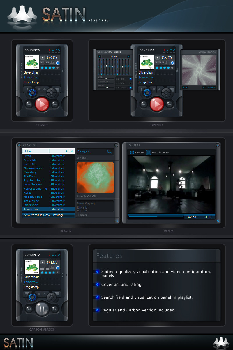
Whenever that foobar setup is done, I'd LOVE to get ahold of it!
👍: 0 ⏩: 0

I love those tabs... I use SlanXP2 just cuz of those tabs! Great job as always
👍: 0 ⏩: 0

Nice ")
👍: 0 ⏩: 0


great VS as always, you're my favourite vs designer... can't wait for foobar:>
👍: 0 ⏩: 0

another classic one. i saw the preview before reading the description and i thought that this would be great XP defaults. also, i was about to ask where that foobar config was before i saw it was WIP.
👍: 0 ⏩: 0

nice, simple and clear ; ]
from where you have icons into menustart ? MyComputer etc... DA ?
sry for eng. im pol

👍: 0 ⏩: 0


<= Prev | | Next =>