HOME | DD
 lhs — M.A. Composit

Published: 2004-02-06 06:24:31 +0000 UTC; Views: 5460; Favourites: 89; Downloads: 1483
Redirect to original
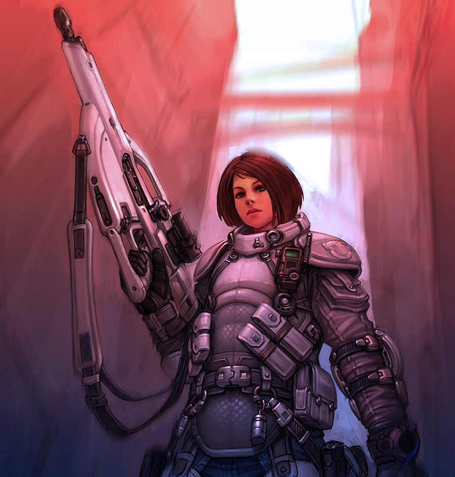
Description
Palette swapping combinations. Big file.Related content


Comments: 105

Wow, so cool! Let's see... I love the first one, and the one with the blue camo, and the second one down on the left is awesome, and the way you colored the armor on the second to the right, bottom row, is fantastic! I wish I could color like you !^__^
👍: 0 ⏩: 0


i like it! i realy like the way your exploring the posiblities and effects of different color combinations. great idea!
👍: 0 ⏩: 0

Wow How cool I love the different variations. I like the second one with the blue hair. Such a lovely character!
👍: 0 ⏩: 0

Sweetness!! I love all the different variations. Your work truely inspires me ^^
👍: 0 ⏩: 0

")

I dig the first one. The best of them all - character design is top-notch.
👍: 0 ⏩: 0


Wow, it's like you took everything I liked about your last entry and multiplied it. Great color combos.
👍: 0 ⏩: 0

Awesome! I love the one in blue camouflage.
Tempest
👍: 0 ⏩: 0


You sir, are crazy!
Man, how long did this take you? Each and everyone of them just plain rocks ass!
Killer stuff... super nice camo textures...
-Vlad D.
👍: 0 ⏩: 1

Thanks!
The original image took a month of on and off labor.
The color adjustment took 2 hours. Mostly because my photoshop kept on crashing.
👍: 0 ⏩: 0

hehe, so many versions
Some are outside, some are inside
Some have silencers, some don't
Some have even complection, some have goggle-tan
hmm, I can't decide which one i like the best
")
👍: 0 ⏩: 0

amazing variety! i like the one on the top left and the one second to last bottom row to the right. amazing details, hun! awesome how ya put in scratches in the armor!
👍: 0 ⏩: 0


i dig the first 2 in the first row, (the one in the left top corner, and the one next to it with the blue hair

👍: 0 ⏩: 0

I like them all! It reminds me of a video game where you can choose the look of your player.
👍: 0 ⏩: 0

Top row.. far right.. With the green hair. Very intese. I really respect your work
👍: 0 ⏩: 0

you are too good in things like this.. i specially like that second from the right in the last line.. i like the way her armors shows some signs of fight.. well at least more than in the other pictures. Good job
 (Wink)")
👍: 0 ⏩: 0

Oh cool! I like the first three the most but I epecially like the one in the blue camoflauge, nice work man that texturing and recolouring must have taken ages!
👍: 0 ⏩: 0


Ah... decisions decisions decisions.... the bane of any good artist: seeing too many good combinations with which a piece works well...
Personally, I like them all, but the ones I don't like somuch as the rest are the 1st/2nd of the 3rd column, and the 1st/2nd of the 4th column.
👍: 0 ⏩: 0

The second one is the best, imo.  (Smile)")
👍: 0 ⏩: 0

very interesting, did you color it manualy one by one, or made color replacements?
i must take more time to look at this. but the first 2 and 3-3 look great.
keep it up.
👍: 0 ⏩: 1
altho, red hair in the forest.... would make for a nice headshot
👍: 0 ⏩: 1
Thanks!
That's why when going hot, you keep your cover on.
👍: 0 ⏩: 0


Bottom left and top left are my favourites. The colours and the textures are fantastic
👍: 0 ⏩: 0

*amazed at the difference that only color can make*
👍: 0 ⏩: 0

Goodness! Did you just adjust the hues and that? Or did you manually paint all those compositions?
I love all of them, but the one that catches my eye is the very second one. Very spaceage and metallic. loving the colours of her hair.
👍: 0 ⏩: 1
All but 4 of these were simply hue adjustments.
The rest had some photo manipulation to get the camo pattern down.
👍: 0 ⏩: 0

i like the white one, and the blue one! nice
👍: 0 ⏩: 0

My...that must've taken quite a bit of time to do all of that. Extremely awesome job!
👍: 0 ⏩: 0

Well C3 is it, this one has the best colors. But I like all of them.
👍: 0 ⏩: 0

nice experiment... makes it abit like pop art...

👍: 0 ⏩: 0

i have to say that my favorite out of them all is the middle far left one (red hair and eyes, silenced P90, green camos) awesome picture, submit it as a single and I just might fav. it "
👍: 0 ⏩: 0

dude - you're a champ because this is soooo kewl!!!
👍: 0 ⏩: 0

I really like coordinates 3,3 the one with the sand colouring and the sandstone-like armor. she's hot ^_^
👍: 0 ⏩: 0

Absolutetly awesome. Im just gonna have to go on a rant here-
Texturing one the cloth is awesome. I love the regular striped stuff, and especially the digital. Neat variations in the armor, love the desert pattern.
Excellent job on the silencer, Although I think its a little abnormally thick, looks like the same size as the one off my SD5.
Love the glass background, very cool, love the original.
Great job. Really shows that you do a great job organizing your layers, how they all have minor differences. The amber hair is great, too. Only gripe is the shading on some of the faces, it looks as if they wore their tactical goggles sunbathing.
👍: 0 ⏩: 1
The suppressor was not made to scale, I just slapped it on in a lazy fasion.
I'm glad a few people mentioned the shading on the face. I made sure all the tan schemed versions had a goggle tan. I wanted those to have a desert op feel. So, when I think desert, I think of sun. When I think of sun, I think of tan. It's just my quirk.
👍: 0 ⏩: 0

Wow this is great, I like how you also put the silencer on the P90 only in certain ones.
👍: 0 ⏩: 0


Yeah, I get a little crazy with the Hue-saturation guage too... that colourize tool tempts me like a villain. Its hell to be indicisive about a colour sheme, 'specially when the picture (in your case) is so damn cool.
👍: 0 ⏩: 1
Thanks.
The indescision is the exactly whyI wanted to do an exercise like this.
👍: 0 ⏩: 0

they all look good but personally I really like the one with the tan armor and blue hair ^_^
👍: 0 ⏩: 0

man that's seriously cool. even though they're subtle changes they each give a different character. and man that lineart is SWEET
👍: 0 ⏩: 0

I really like the armor for the second from the right on the bottom, those are awesome. X3
👍: 0 ⏩: 0
| Next =>