HOME | DD
 lightfootcomics — Coloring Pulse WIP2
Published: 2011-10-25 00:29:38 +0000 UTC; Views: 730; Favourites: 12; Downloads: 49
Redirect to original
Description
A second round of options after [link]After thinking about it, I think that just out of habit, I'd prefer something vaguely similar to the original color scheme. It just seems so familiar to me that it's hard to break away from that idea. Also, the black and white version in the comic has a theme of which areas are like colors, and which are darker than others.
Other considerations where that maybe the suit wasn't blue at all. This is the first suit, probably the least impressive looking (maybe a prototype), and it might be all gray. But I guess I would then just see them painting them.
Tabitha's suit might not be the same colors, but it was never mentioned in the comic. I think that I'll just assume they are identical for now. Like the original Pulse comic, when they are upgraded her suits will be red instead of blue.
Okay, for these possible color schemes:
In the last set, most of the designs had certain areas that were usually gray: the bust, neck, shoes, arms, belt, area below her neck, the rings and circle on her back (not shown on the picture) and the bar that goes above her visor.
That seemed like a lot of gray, even though some pictures had a gray visor, or gray um...butt area. I thought that I should exclude gray from being in any of the areas where I was considering a color.
Of the two blues, the darker is somewhere inbetween the various options. The lighter blue is one of the darker options, and I thought that it blended together with the rest better.
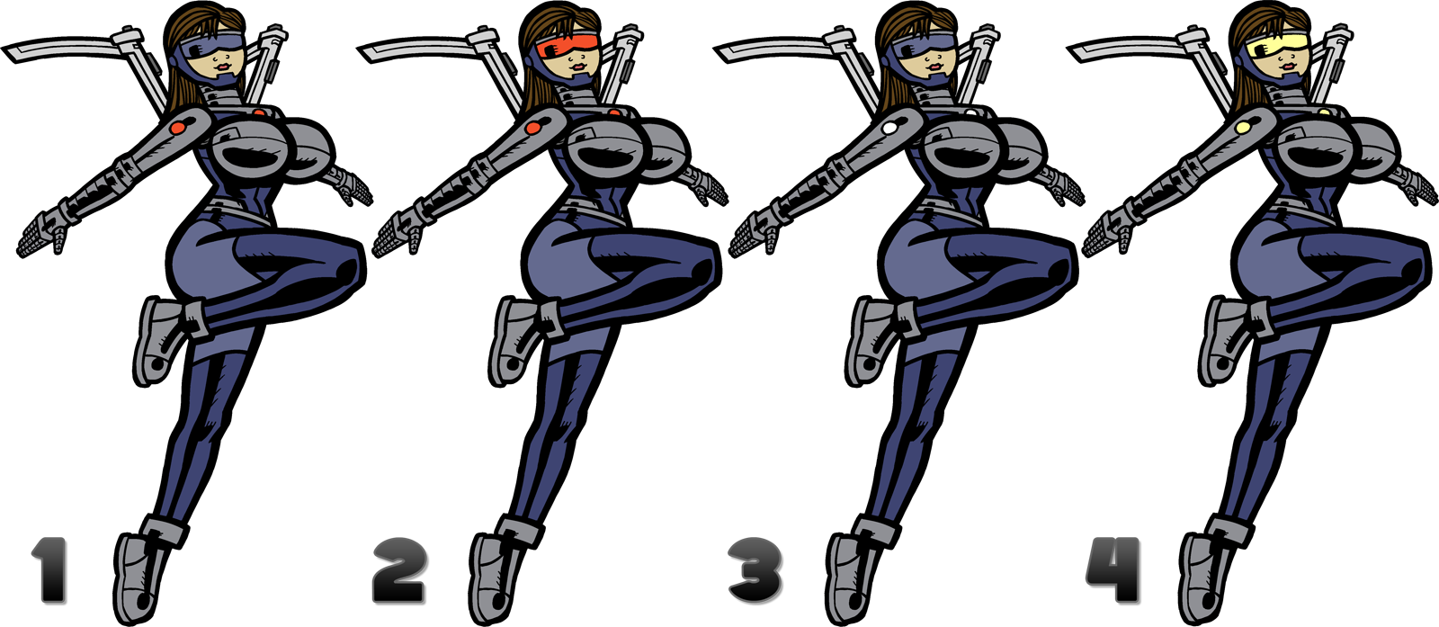
The biggest difference between them is the color of the visor, and the color of the lighted areas (shown in either red, yellow, or white here).
In the original comic, the energy inside the two was red, and the lighted areas where also red. And when they were cut deeply, red energy would leak out of the wound. Also their technology would have lighted red areas, and technology designed by others (like Nigel Robbins) would have lighted areas of another color (yellow for Nigel).
I don't know if I didn't think it through, but red energy (while maybe possible) probably wouldn't be compatible to power devices. I'm not a scientist, but I'd think that the color relates to properties of the energy, wave-lengths and stuff. That an energy that is red would be wildly different from the electricity we use to power devices. She wouldn't be able to power light bulbs.
That doesn't disqualify the lights from being red, but it's something to consider. The lights are meant to show when the suit is fully active, and also a way to display if they've run out of power.
1. Closest to the original here. Blue visor, red lights.
2. Red visor, red lights. I think the difference here is should the visor blend in or stand out.
3. Blue visor, white lights. Electricity is usually displayed as yellow, but it's usually white in reality.
4. Yellow visor, yellow lights. If the original wasn't an issue, probably the logical choice (yellow instead of red).
I think that except for the color of the lights I'm leaning towards #1. It's just hard to replace something after almost 13 years that I'm so used to seeing. Kind of like I resisted following some of the other racial options for the remake (like them being cyborgs), or giving Annie black hair instead of brown (her family is Chinese).
The visor should be blue I think. The red/yellow/white areas are lighted, but the visor is not. So it seems like it shouldn't be the same color as a lighted element. It should also blend in more than red or yellow would. The lighted areas are really meant stand out, so that it will be noticeable when the suits are unpowered or inactive.
The lighted elements are last. I think there's a case to be made for each option (although the only case for red is that it was the color before). It partly depends on if the color of the lighted areas should be the color of the energy in their bodies. It doesn't have to be, but would be more convenient.
Wow, there was a lot to say about the coloring of the costume for a webcomic character... And the comic itself is even in black and white!
Related content
Comments: 6

I'd go with #3 but maybe add a glow effect to the lights. Either a light blue glow or a simple white glow.
👍: 0 ⏩: 0

I would say 1 or 2, im leaning more toward 1 because it seems like the red visor may get a little distracting with everything already so well shaded
👍: 0 ⏩: 0

I'd vote number two. Red is just a very attracting color and you want that around the hero/heroine's faces. It's a very warm color to balance out all the cool blues and greys, you want that small burst of intensity, I'd think.
👍: 0 ⏩: 0


