HOME | DD
 liqachu — j2k4_currupted
Published: 2004-02-13 11:47:33 +0000 UTC; Views: 5001; Favourites: 24; Downloads: 1837
Redirect to original
Description
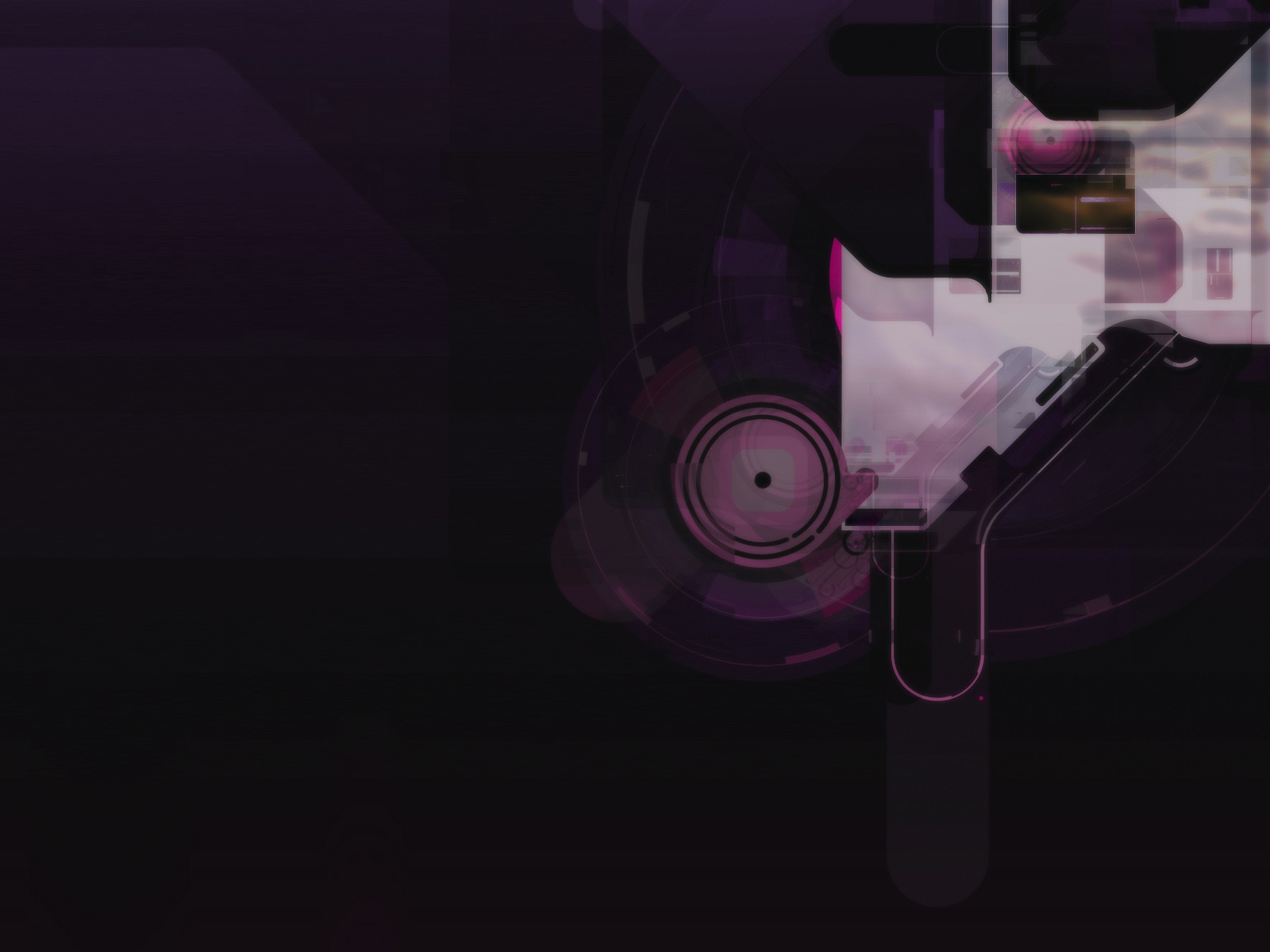
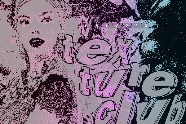
part 2 of a series of 3part 1: [link]
part 2: [link]
Related content


Comments: 14


very interesting stuff, nice and dark with shapes that leave plenty of possible meanings to make up
👍: 0 ⏩: 0

")


You know I like this a lot... my fav out of the pack.
👍: 0 ⏩: 0

i like these colors, and it looks nice on my desktop screen. I like dark when working. good for my ole eyes.
 (Wink)")
👍: 0 ⏩: 0

i dont like this as much as the first one. i think its because of the cloudy texture in the top right. but great job nonetheless
 (Smile)")
👍: 0 ⏩: 0

Awesome. The colors suit it perfectly. Also its nice to see a darker image again.
👍: 0 ⏩: 0


awesome job, works well with your style, love the subtle ness and the nice soft colors.
👍: 0 ⏩: 0

not sure about the colours, they look a bit washed out. i love the design though.
👍: 0 ⏩: 0

Wow thats a lot better the the first one..very very nice!
👍: 0 ⏩: 0