HOME | DD
 liquidology —
Ultimates Gatefold Cover
liquidology —
Ultimates Gatefold Cover

Published: 2007-08-10 00:35:25 +0000 UTC; Views: 94200; Favourites: 3796; Downloads: 5920
Redirect to original
Description
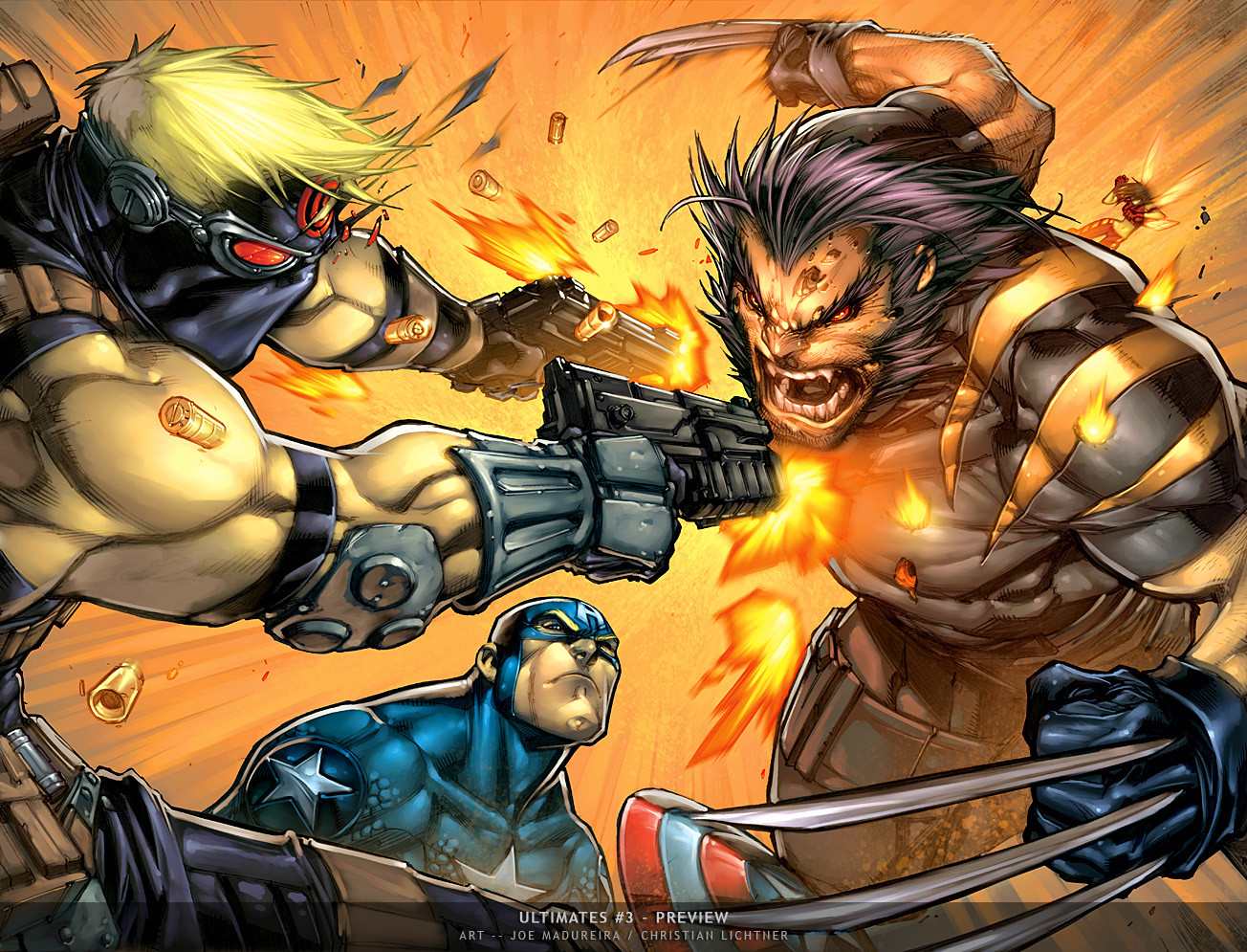
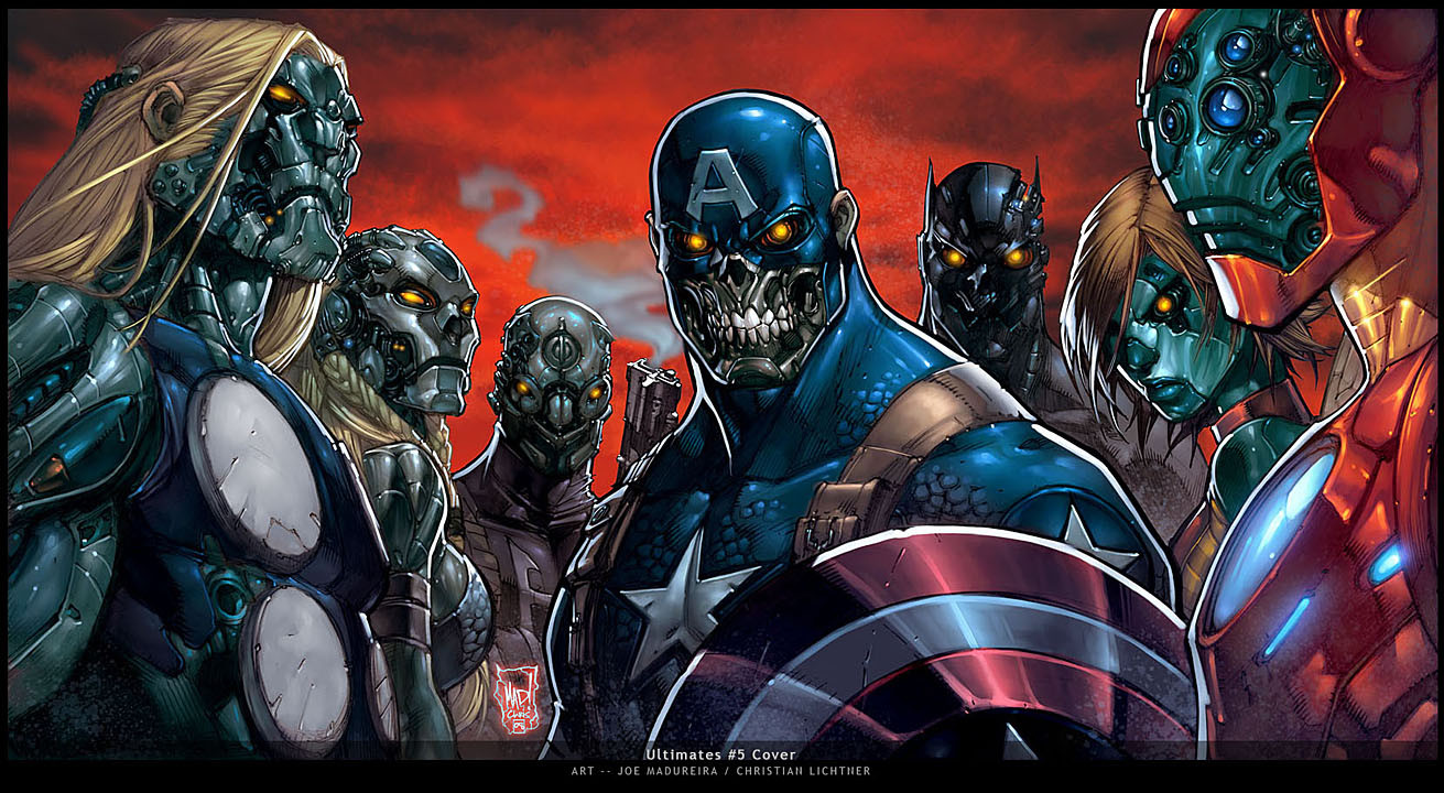
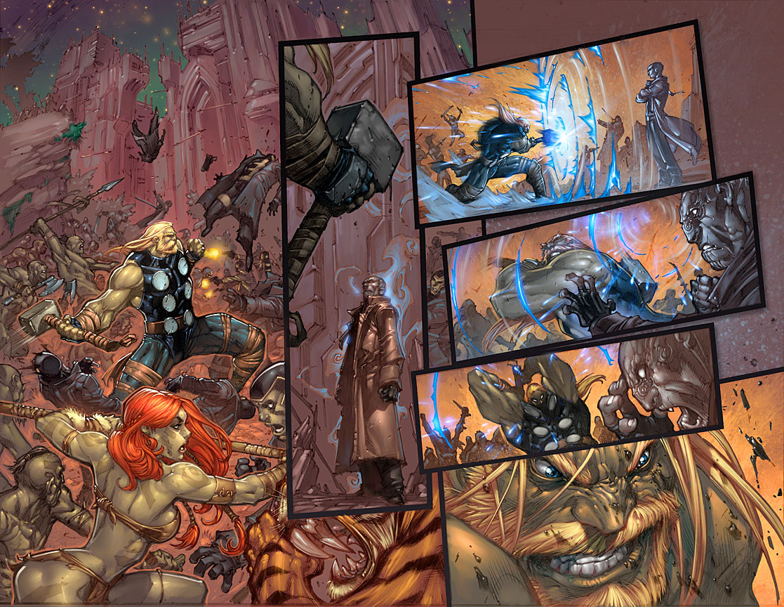
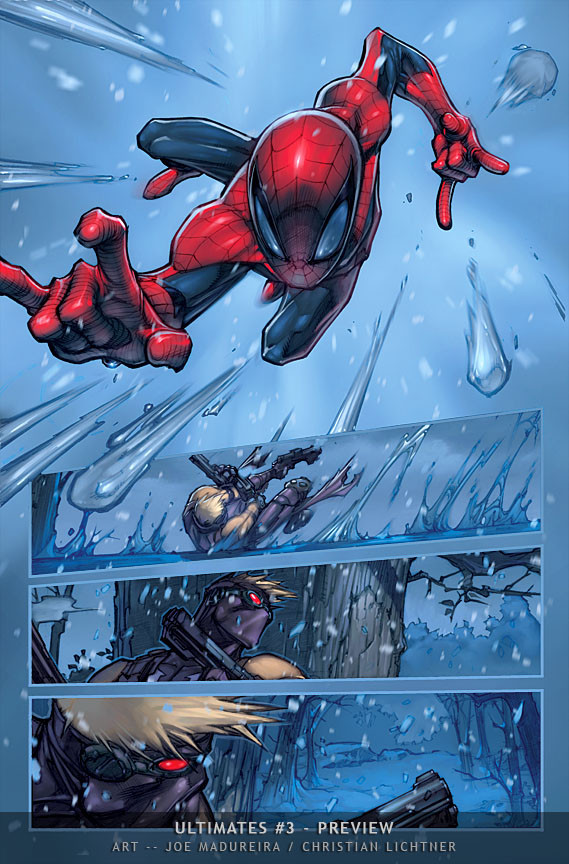
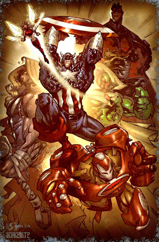
Ultimates #3 -- Gatefold CoverThis is a 6-Page Gatefold Cover for Ultimates #3. Art by Joe Madureira, painted by me.
EDIT: Doesn't quite fit... argh.
Related content


Comments: 327

 (Smile)")

whole image is sick.
I just wish Joe didnt have Magneto facing us..totally throws it off :/
👍: 0 ⏩: 0

Wow super awesome........Really great job!!!!!!!!!!!!
👍: 0 ⏩: 0
Wow super awesome........Really great job!!!!!!!!!!!!
👍: 0 ⏩: 0

It's great ")
")
👍: 0 ⏩: 0


Gorgeous Colours man!! Freakin awesome, compliments Joe M's art very well
👍: 0 ⏩: 0

you are the co-founded of liquid???
WOW!!!
Man, your skills are the best I've ever seen!!!!
I will pray to work with you some day!!!
👍: 0 ⏩: 0


I was JUST staring at an ad for this poster! Imagine my surprise to see it on dA a few moments later! 
👍: 0 ⏩: 1

Thank you very much!
I'm knee deep in the issues, and seems like every page is turning out just a nudge different, and not sure if that's good or bad!
👍: 0 ⏩: 1

I agree on the IronMan blast, and since I saw this piece a while back, i always thought Giant Man [or whatever his name is] should have had more atmosphere to him. He's drawn like he may be a few stories tall, but colored like he's 3 & 1/2 feet taller than the Cap'n. But I don't know. You're the pro, not me.
Which reminds me:
I was MAJOR fan of the Mad/Arniestotle team up when they were doing their thing. I liked how the paints really gave a new dimension to Mad's style [but I never liked that his actual lines would get compromised so much w/ the paints].
Then I saw your colors on the Venom piece, and I was like "HOLY COW! It's like all of the goodness from the '
And lo, none other than one of the founders was responsible for it.
Awesome.
👍: 0 ⏩: 0

WOW! i cant believe i will see you here sir...liquid and joe mad combination are one of the best!
by the way when will be the release of the comic book sir?
fan of yours. harveytolibao
👍: 0 ⏩: 0


A perfect balance of colors and focus. I just love the skillfully placed fades on the characters shading them into the bg so that another can take the focus. It takes great talent to place so many characters into one picture and still make the focus correct, as it wont be 'overwhelmed' with detail and clutter.
Ironman's blast seems a bit distracting though, he's way out there...yet the blast is colored as if its more in the foreground. Maybe a bit vibrant as well...mmm just my opinion.
Omfg...Venom's riveted tongue....hahaha...that's awesome...yet brings my mind to the gutter ahhaha!
Anyways, this is my fave in your gallery...gorgeous, amazing and highly inspirational. I'll be showing you and your art off to my DA peeps.
👍: 0 ⏩: 1
Thanks for all the thoughtful comments and feedback - the ironman blast has been a bit of an eyesore for me ... so good eye for noticing, and I think I'll most likely change it for the 'final' cover to be printed!
Again, thanks for the kind words, and feedback!
👍: 0 ⏩: 0

Man this is awsome, and you worked with JoeMad?! Man I love his work, Battle chasers ftw?
👍: 0 ⏩: 0


I'm trying to think of how it could be better....
No...
No...
No...ok Its perfec t
👍: 0 ⏩: 0

Too bad this wan`t wider and shorter!!!
👍: 0 ⏩: 0

This is really gorgeous! Wonderful colors! Hands down, coolest poster!
👍: 0 ⏩: 0

100 downloads. Nice.
When I downloaded the colours looked more saturated. I'm not sure how they're faded here but correct upon a download, but I still love this to death.
👍: 0 ⏩: 0

awesomeness just doesnt cut it for this fantastic piece right here sir....
👍: 0 ⏩: 0

see now thats just simply bad ass.
👍: 0 ⏩: 0

This is really beutiful, I've admired this picture for some time...I am so happy that you have an account here, your art with Madureira is really inspiring!

👍: 0 ⏩: 0

Nice use of white rimlight, very original and unique! What a huge image what resolution did you work on?
The colors are also beautifully harmonized, specially the skin tones.
Venon is incredible, he really pops out but it's not on your face or over saturated.
👍: 0 ⏩: 1
Each page is at 450dpi at comic size. A bit unwieldy.
👍: 0 ⏩: 0

Chris, is the entire book painted in this awesome style?
No more comics? WHAT? I'm speechless.....

👍: 0 ⏩: 0

its so beautifull brings tears to my eyes

👍: 0 ⏩: 0
its sooo beautifulll... brings a tear to my eye
👍: 0 ⏩: 0

This is the kind of work that makes me love comics!
👍: 0 ⏩: 0


I was wondering who was coloring Mad's work for the Ultimates book. I love your colors, they remind me of liquids colors back in the day when he teamed up with Joe on Battlechasers. Great comibination, can't wait to see the books!
Keep it up!
👍: 0 ⏩: 1
I'm actually coloring Ultimates. And I co-founded liquid! with Aron Lusen, which worked on Battlechasers...
👍: 0 ⏩: 1
Well..that all makes sense then (the name should have given it away) just out of curiousity, do you have traditional painting background, or did you just develop this style digitally?
I'm always looking to improve, so I was just curious.
👍: 0 ⏩: 1
I don't have a 'traditional' art background, however, I do make a point of trying lots of different things, which I think is really helpful.
So I've done marker comps for years, I've done watercolor/acrylics, a little oil, but not a lot, some sculpture, and lots of 3d stuff.
The more you do different disciplines, the better I think you get at each particular one. Again, that's just my philosophy...
👍: 0 ⏩: 1
Well put, I'm the same way man, not so much traditionally trained, but do a lot of different arts.
good to hear.
cheers!
👍: 0 ⏩: 0


This is one of my personal favorites. I always loved covers that showed opposing forces clash, whether it be x-men and alpha flight or marvel vs DC. Its beautiful how you made everything pop. Mind if I ask a question? For the line art did you paint over them with a color hold? And when you do paint do you or have you started in gray scale then add the colors atop? Sorry for the long comment. Just love whatcha done
👍: 0 ⏩: 0

Amazing colors. You did an awesome job with this. I think i'm going to have to pick it up.
👍: 0 ⏩: 0


This is awesome!!! I am SO going to buy it now!! I really like the way that you coloured things such as scarlet witch's magic and magneto's powers!
👍: 0 ⏩: 0

Wooow! You and Mr.Joe Mad did a hell of a job here, how much for coloring commission?
👍: 0 ⏩: 1
Thanks!! I'm currently not taking any commissions for coloring... I'm kneedeep in color it seems!
👍: 0 ⏩: 1
Ooh no problem I understand Mr.Lictner, I kind of figure that out you being a good colorist and all. I’m hoping we can work together in a near future, thats if
Liquid! isn’t working you too hard. Any projects your working on now?Will you be attending the NYC comic con next year? I will love to pick your brain sometime, sorry if I’m asking so many questions but you’re really an inspiration...Later
👍: 0 ⏩: 0

Holy shit, you color mad's stuff.. I loath you, in a nice way XD
👍: 0 ⏩: 0
<= Prev | | Next =>