HOME | DD
 Lizardman76 — How to Lie with Stats 1
by-nc
Lizardman76 — How to Lie with Stats 1
by-nc
Published: 2010-01-28 21:42:41 +0000 UTC; Views: 397; Favourites: 3; Downloads: 8
Redirect to original
Description
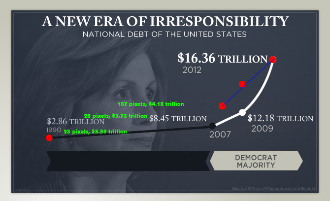
Someone pointed me to this image from the GOP's website:[link]
And I noticed that it looked way off (not in figures, but in presentation).
So I measured the distance between the vertical points (the green text), then repositioned the dots based on where they should be in scale between the lower left dot and the upper right dot (red dots). Unfortunately, there is too much information missing in the 17 years not in the image, but the final five are there. And as you can see (and can measure yourself if you want), according to these figures, the trend heads down a bit more than expected.
So the figures say the debt will not rise as quickly in the next three years than the previous two, but the visuals say otherwise.
How to lie with stats.