HOME | DD
 lobuster — LoBuster - Infinity

Published: 2002-08-14 20:11:26 +0000 UTC; Views: 541; Favourites: 2; Downloads: 67
Redirect to original
Description
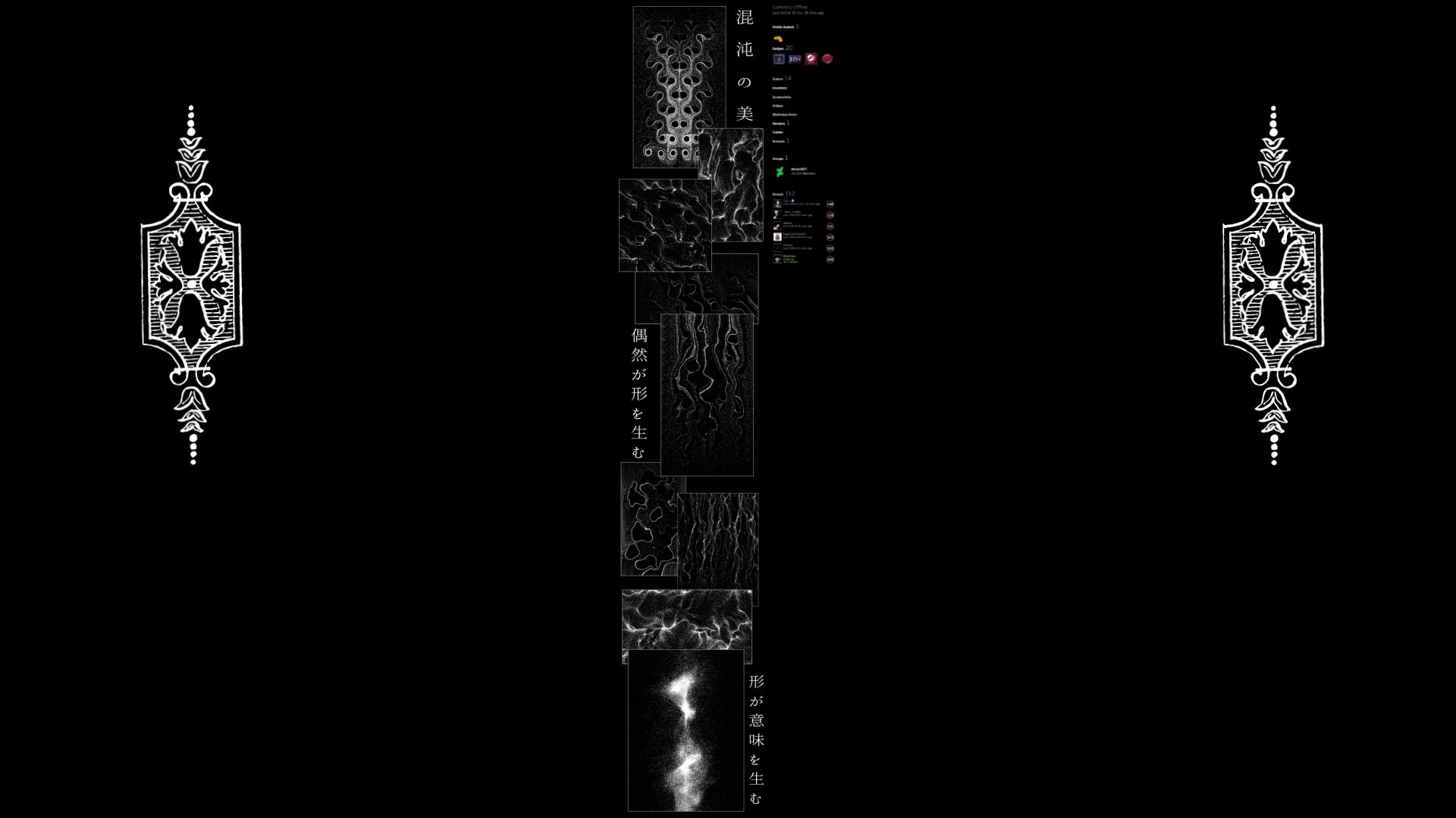
This wp has been on my work bench for ever .. it was fun to do it and I think im done. Had fun doing the 2d (Experimented w new ideas) .. hope it fits w the scene ..Related content


Comments: 15

A dark underwater world...I especially like the lower part of the picture, whereas the upper right part distracts me a little (but is fine as it is)....the shapes and textures are hard to grasp...
👍: 0 ⏩: 0


Y000 LOBUSTER sh*t it's AWESOME! ehehe
This goes directly to 2 places! My desktop and my fav's
great work dwd
👍: 0 ⏩: 0

i love the blacks, whites, and greys you used, it makes things standout and gives us a sense of shadows.
👍: 0 ⏩: 0

Thats pretty awesome. I see what style you are trying for in here, gj
👍: 0 ⏩: 0

I think the lack of colour is what makes this piece stand out. Love the dark feel it has to it. Great work, hon
👍: 0 ⏩: 0

the 3d looks real nice and complex..the 2d needs soem work though..same with topography....nice though..
👍: 0 ⏩: 0

I like it, it just looks really cool, Like the whole composition of it, GJ
👍: 0 ⏩: 0


Looking very good. The 2d feels a bit cumbersome but not too bad overall. The bordering wispy things are rad, as is the centerpiece colored render. Perhaps my only real complaint would be a lack of color, as even the blue in the focal point is just like a highlight here and there.
👍: 0 ⏩: 0


Oooh, very nice! Remind me of ink and water... and it kinda makes me thirsty looking at it.
👍: 0 ⏩: 0

Nice! 2D is supposed to be a little bit more micro, but the overall piece is fabulous! Good work!
👍: 0 ⏩: 0