HOME | DD

logoscries — LadyFace_WIP

Published: 2010-11-17 23:28:26 +0000 UTC; Views: 206; Favourites: 1; Downloads: 8
Redirect to original
Description 
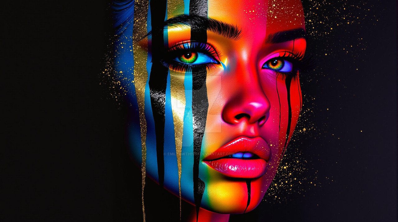
Working on some color techniques. Let me know what you guys think. Doing a few different passes of this one.
Related content
Comments: 6

Vonny88 [2010-11-20 03:37:26 +0000 UTC]

Continuing where I left off. Anyways, you should try making your base color of your skin a color that is used the most in your bg. the using a skin tone color added in some value with the skin. (If that makes any since at all) I really can't wait to see what you do for your next color piece. Yaaaa I know overload on comments on this one. Well I hope I was able to help. Also your placements of shadows and lights is really good in this pic. I love the fact that you made the left cheek pop out by giving it a little lighting. okay I'm really done now.

👍: 0 ⏩: 0

RonniePriceII [2010-11-19 23:06:57 +0000 UTC]

If you want some input from me i might add a a couple more values to the hair as well it still reads slightly flat. but then again it is hard to critique a WIP because you never can tell what was already being thought about Also great to see you drawing again, you are very talented buddy! keep it up i look forward to seeing more!

👍: 0 ⏩: 0

RonniePriceII [2010-11-19 23:03:37 +0000 UTC]

ooh nice facial rendering

👍: 0 ⏩: 0

Vonny88 [2010-11-19 05:23:54 +0000 UTC]

I need to re critique this one because the computer I was on did not do it justice. I would still fade down the strong yellow color under the chin and around the mouth I would also add in a dark purple color in the shadows with low opacity. Then I would add in some back lighting on left part of her face (Where the shadows are). You should make it a purpleish color. On the next pic you color you should try not done yet. I will finish this comment later see ya!!!

👍: 0 ⏩: 0

Vonny88 [2010-11-19 05:15:21 +0000 UTC]

You can forget about what I said about it looking cloudy or hazy; it was just the computer I was on.

👍: 0 ⏩: 0

Vonny88 [2010-11-19 02:39:06 +0000 UTC]

Nice drawing ! I m loving the line coming from here lips to her neck. Now for coloring critique . Well the overall picture looks to cloudy or hazey. Also, It kind of looks like you used the dodge and burn tool. If you did I would stay away from using those tools for now. I see there is some yellowish color under the neck which doesn't look that well. I would get rid of the yellow areas around the mouth, by the chin, and under the neck. I know you have it around the eyes, but they are not as strong or opaque as the other areas mentioned. Another thing I've noticed, is there is not enough contrast in the skin tone. You should try adding some dark purple into the shadows of the skin with your brush on a low opacity. If you mess with the Brightness and contrast and the Curves in photoshop you can create more contrast in the overall picture. When you adjust the curves you want to make a slight "S" using two points. Anyways, I am really glad to see you back to drawing and coloring again!!! Keep up the good work.

Wooo if you have any questions I would definitely be glad to try to answer them.

👍: 0 ⏩: 0