HOME | DD
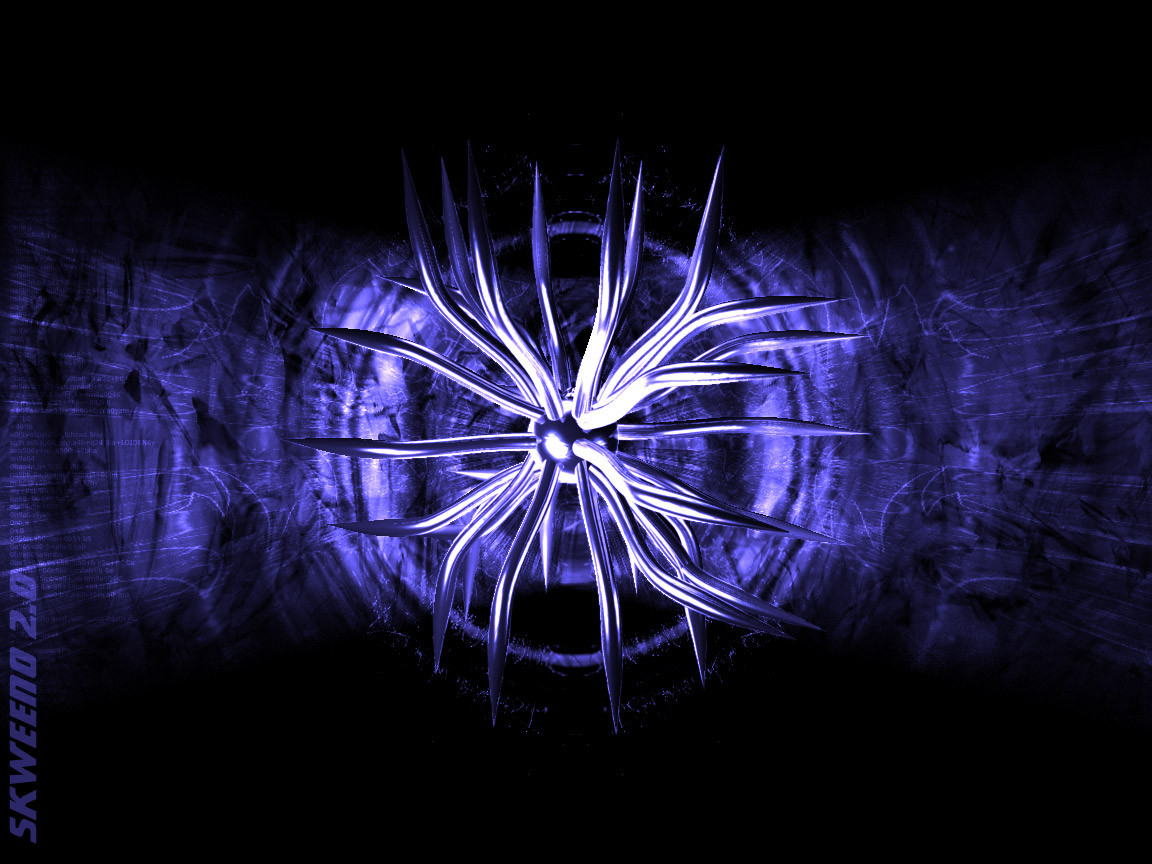
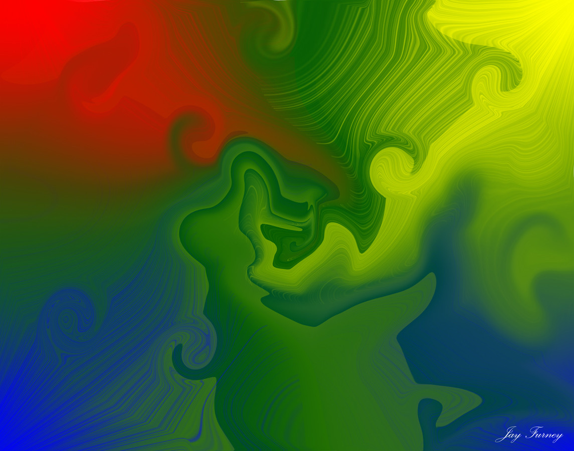
 loiden — Skweeno v2 Blue
Published: 2001-10-15 05:09:33 +0000 UTC; Views: 635; Favourites: 3; Downloads: 131
Redirect to original
Description
I made this version cus someone thought the girl made the wall in unbalance.. (sorry mazzieRelated content


Comments: 28

 (Smile)")

amazing *jealous*
big black bomb attack! - https://metalicangel.deviantart.com/ - http://digitalcoma.org - http://virus.visualpain.net - resist us! FIGHT BACK!
👍: 0 ⏩: 0

dig this color better!!! good 3d work you got! that object looks aggressive, nice work on those tentacle, spiky thing!!!
beg to differ
👍: 0 ⏩: 0

omg! hur gör man sånt här?? =O va har du för feta program egentligen?? hehe
Jimjum
👍: 0 ⏩: 0

this one is really great!
how did you do it? 3dstudio max?
metal mental meltdown
👍: 0 ⏩: 0


This is excellent man, as said already, the purple looks excellent.
https://zep.deviantart.com (¯`·.¸¸.-Take me by the wrist.¸¸.·´¯) https://zep.deviantart.com
👍: 0 ⏩: 0

its cool but not as cool as the pink one.
I want to see it painted black.
👍: 0 ⏩: 0

Now this is more like it. I liek ballance and symetry, and this feels better than the previous. Plus I even love the color.
-Mea
Credendo Vides.
(By Believing, one sees)
- Voyage of the Basset.
👍: 0 ⏩: 0

rocks
like it much
the spidery thing in middle is sooooo coool
👍: 0 ⏩: 0

eheh...surely this one is better man..
but, the color...i loved purple!
..:: Fu©k M3 B|T¢H ::..
👍: 0 ⏩: 0

Heh hee, the girlz iz leadin' you 'round by the short hairs!!
I love this wall, the colors are beautiful, and the depth and light in the middle are astounding...great work loid!!
-Tsp
I lost my fetish, will you help me find it?
👍: 0 ⏩: 0

Groovy, another tentacle focused piece. I like the colors and the lighting on this piece, though the tentacles are kinda jaggy in places.
👍: 0 ⏩: 0

i like this one better. but like others have said the text needs some work. a nice little white text would have look better i think. jmo
keep it up.
👍: 0 ⏩: 0

The pink one was way better
.netium
[ technetium | kwanstudios ]
👍: 0 ⏩: 0

nah i liked the other one better, and the text there dont really blend in
the
will bite your toe whahahahahah
👍: 0 ⏩: 0


Wicked man, the model and background is very cool. I tihnk a more desaturated blue would look better though, but that is of course just my opinion
Good work man, your skweeno series is awesome
||D.V.S||
👍: 0 ⏩: 0

Yeah, thi version is much better. I like the better and the girl did offset the previous version a bit. But now you have reached the peak with this wallaper.
::Till all are one::
👍: 0 ⏩: 0

that tentacalised thingo in the middle looks super-sweet. i want one for my room
[..louie..]
👍: 0 ⏩: 0

i like the texture behind the 3D shape. minus 10,000 points for using tentacles blatantly... but it does look pretty good.
👍: 0 ⏩: 0

THIS is wicked loiden! You've done it again, it's amazing.
The blue is lovely! And the shape is kicking it, abstract and wicked!
[Daewon] [Inspecter Gadget] [Secret Agent Man] [Scooby Doo] [ http://www.jeroensmeets.nl]
👍: 0 ⏩: 0


Nice work, I really like the colours you have chosen and the way the 3d spiked ball blends in will the background making it look like its creating the ripples/disturbance there
--Patt--
👍: 0 ⏩: 0

This looks great... but it can be improved still
1. Whats up with all that aliasing on the centre piece?
2. Sorry the text is ugly :/
madgrafx.net . now online . http://www.madgrafx.f2s.com/
👍: 0 ⏩: 0


yep, this version is a bit better I think.
The colour and balance are improved.
Good work Loiden
_________________
see me in a polar bear suit ?
http://spots.flatland.com/mikehealy/pola r/pics.html
👍: 0 ⏩: 0