HOME | DD
 LoneWolf2 — Shwibbles

Published: 2005-08-23 01:13:52 +0000 UTC; Views: 988; Favourites: 18; Downloads: 249
Redirect to original
Description
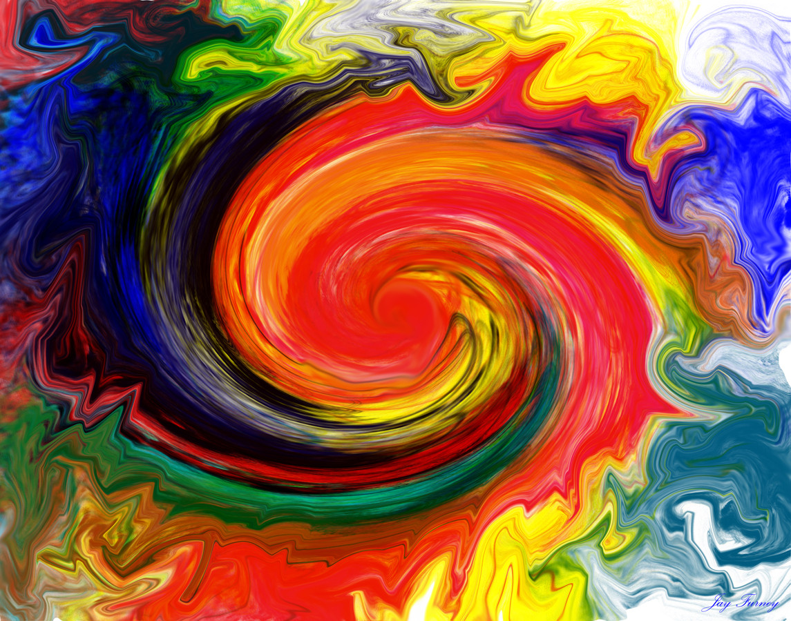
Probably my fav. peice ive done in a little while,dono why.rejected from bohemica.
Related content


Comments: 8

")


looks cool. i think there should be more of the vectory stuff though
👍: 0 ⏩: 0

the colors go well together, but there's not much depth and contrast to them :/
and the flow isn't helped much with the line going through your focal point, you should incorporate it to the center to give it more flow.
👍: 0 ⏩: 0


I agree, one of your best. I love the colors. They blend so well and they radiate a good vibe.
")
👍: 0 ⏩: 0

I dont like where the bohemica logo is placed but I like how you divided the peice, nice work.
👍: 0 ⏩: 0