HOME | DD
 lower — Fragile

Published: 2001-09-18 02:02:54 +0000 UTC; Views: 301; Favourites: 1; Downloads: 48
Redirect to original
Description
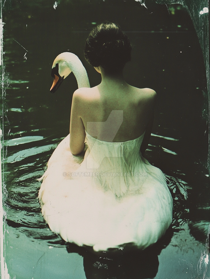
Fragile - my first black and white piece. I played around with the writing. It turned out a little too dark for my liking.. needs more contrast I think. But tell me what you think.Related content
Comments: 4

I like the lighting, pose and exposure, but the text is almost too much. Out of place? Not so severe as that...
Her (your?) expression would suggest allure, sensuality, sexiness; I see little confusion. Some anguish maybe, but I'm not even sure as to what that suggests. Mainly I think this is because the model's focus is on the camera, which delivers a solid feel of direction. When the subject is moving away or looking away from the viewer an entirely different set of emotions fuels the pose. She looks anything but fragile. Rather, she looks quite strong.
As far as the text goes, it doesn't do much for me in terms of emotional impact. It contradicts what I see in the woman and therefore makes me re-evaluate the entire thing.
I just realized that his is two years old and you've probaly figured all of that out by now. Selah. At least it provoked a hell of a response, which I suppose means it's good art.
👍: 0 ⏩: 0

whoo..really nice.
the contrast is great.. all b&w images rock..
that girl seems lucious too..
Essence of the Mind - http://www.trishock.com/trunks
👍: 0 ⏩: 0

its great! you did well for your first b/w piece.
👍: 0 ⏩: 0

I think this piece has plenty contrast, the largest of the text (white) offsets the darks of th pic very well, the arrangement of the text also adds to the confusion message, assumin thats what yer goin for
I like it a lot, keep it up
👍: 0 ⏩: 0

