HOME | DD
 MachSabre — Sandman Adventure Theatre
Published: 2012-04-20 06:01:14 +0000 UTC; Views: 2312; Favourites: 51; Downloads: 37
Redirect to original
Description
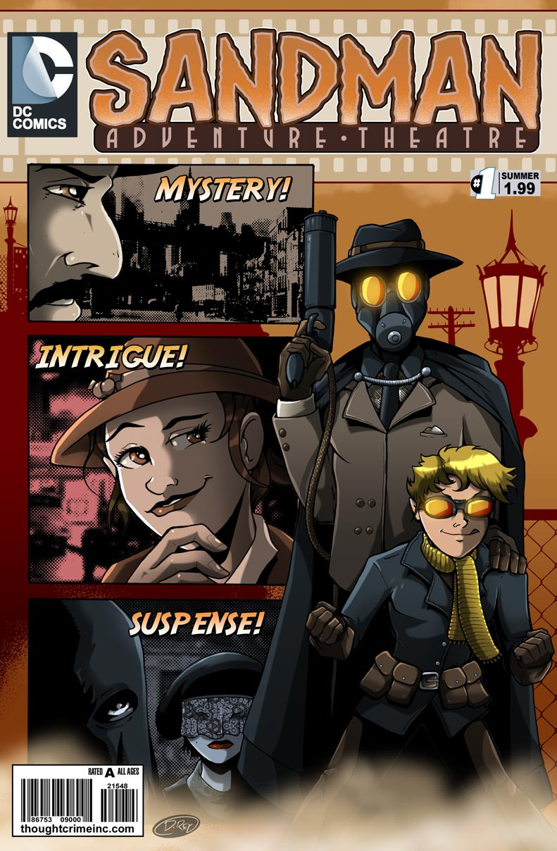
I was going to make this for the DC ABCs with "G for Golden Age Sandman" but I thought that would be cheating, since his name doesn't start with a "G". But I started it and thought I'd turn it into a "faux cover"See, Sandman Mystery Theatre was always one of my favorite comics of all time. Wasn't always a fan of the art, but I always loved the writing. I thought it'd be kind of neat to combine elements of the darker and more mature Vertigo comic, such as the muted colors, the cast of characters, some of the villains... And then merge them with some of the more classic golden age concepts like Sandy the Golden Boy, and treat it somewhat like a "Batman Adventures" type of comic.
One thing I do got to say... The new DC Comics logo, REEEEALLY does not play well with cover layouts. I try to keep open minded about logo designs and graphic arts, as I kind of do that myself on the side... But the new logo just doesn't... Work. A logo is supposed to invoke the feel of the product. You're supposed to look at that logo, and from it, totally get a feel what the comic, movie or even toyline is about. This new logo just lacks the graphic punch that is expected from the company that gave us Superman, Batman, and Green Lantern. It's what I expect for a web 2.0 logo, like I expect them to try and sell me server space or something.
Anyway, hope you like the faux cover.
Related content


Comments: 4

Look's great. I would love to read a new Golden Age Sandman comic.
👍: 0 ⏩: 0

The new logo does seem to feel branded instead of unique like the old one, but still this is a very nice piece of work.
👍: 0 ⏩: 0

I first thought that was the Mad Gasser of Mattoon.
👍: 0 ⏩: 0

The cover is great!! Has a wonderful pulp-y feeling to it. I'm hearing the dun-dun-dun! music when I look at it.
And you are so right about the logo. It's dull &...well, I suppose it reflects the 'grim & dark' approach they're taking at the moment.
For which: sigh.
👍: 0 ⏩: 0