HOME | DD
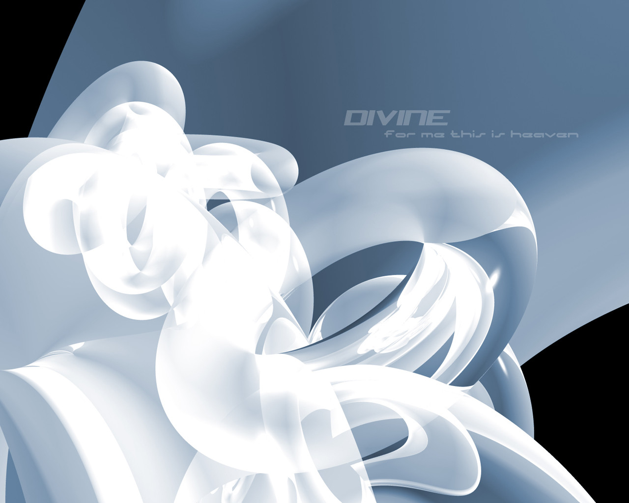
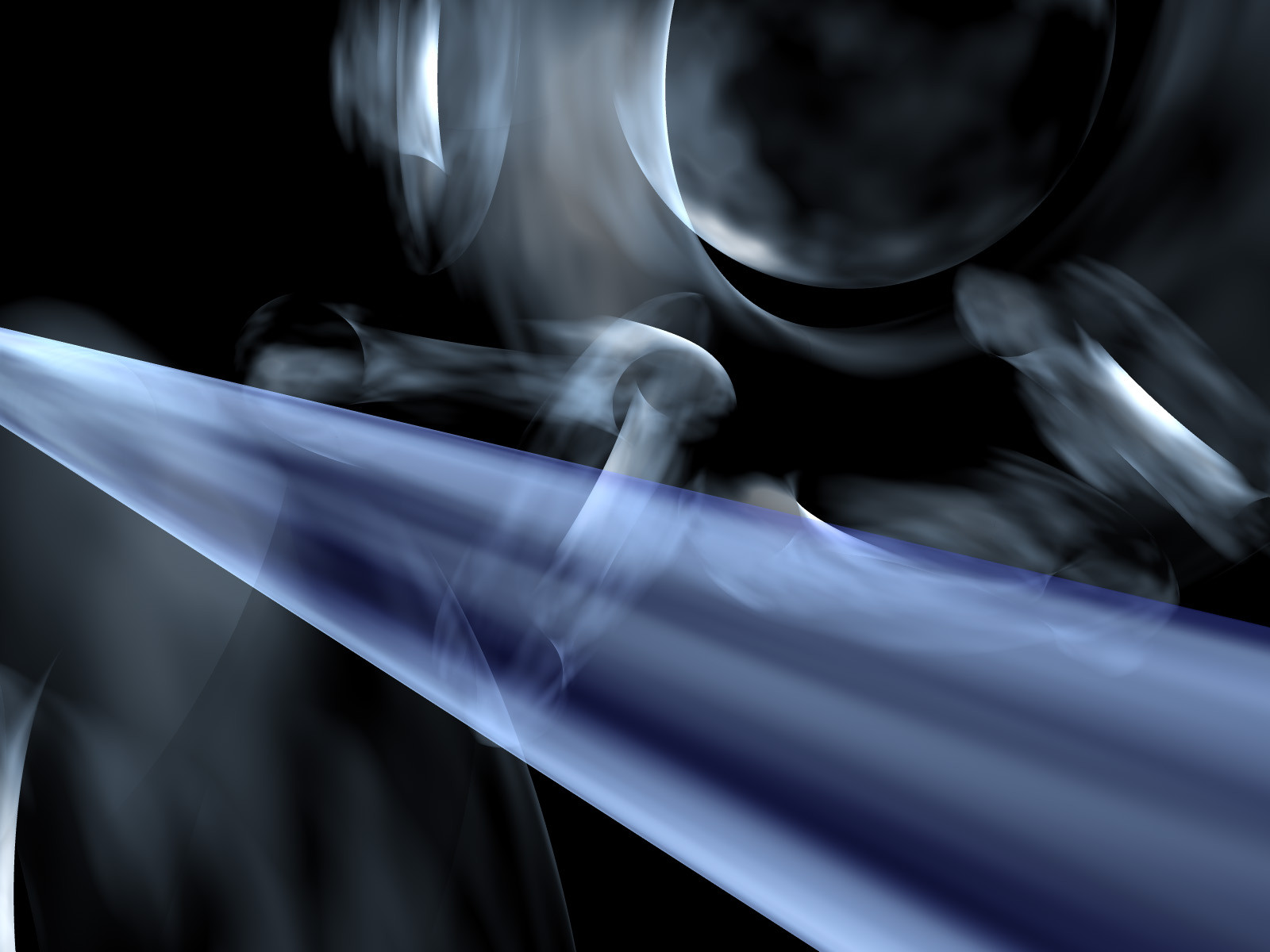
 mage — Divine - for me this is heaven
Published: 2002-03-04 05:31:57 +0000 UTC; Views: 2595; Favourites: 13; Downloads: 539
Redirect to original
Description
Included in the zip are 1600x1200 and 1280x1024 versions so you can cover both tracks of resolutions.Wow, I love it when it seems like your computer does all the work for you
Welp, hope you enjoy it
Related content


Comments: 34


well, I'll definitely give you skill
But looking at the picture a bit more, I see the complication growing as your vision is drawn to the back of the wallpaper, you can't make out exactly what you're looking at, maybe rings? a complication of entangled rings that have just fused with each other.
I love the way you managed to really get the curvy look on the main ring. What program did you use for that?
Great job all in all
 (Wink)")
👍: 0 ⏩: 0

Yep, definitely different, but very soothing. I love how the whites seem to float on the page. Excellent designing my friend.
-----
sasso
👍: 0 ⏩: 0

dam look at all these comments lol its obvious this is a great peice i love the transparency of the tubes
-----
Constipated
Check out some of ma Devs ~~~~~> [link]
Finally Caught the Lightning ~~~~~> [link]
When i Look at your Art it is like Praying with my Eyes
👍: 0 ⏩: 0


sooo smmmooooth !
i love this bluey grey stuff.. its just gorgeous !
-----
pewxi
http://www.pewxi.com
👍: 0 ⏩: 0

whoa thats freaken alsome, to bad it wouldnt match my comp.
👍: 0 ⏩: 0

one thing I have to say is that you have a nack for 3d...which I don't have atm....and I think I never will.
this looks really great.
-----
° °
check out the mechLUST winners! http://pixelcatalyst.plastiqueweb.com/pr ojects/mechanicallust/results.html
flux fora http://uic.globe.com.ph/cgi-bin/outpost/ YaBB.cgi?board=flux
The Angry Key Deviants https://forum.deviantart.com/208834
👍: 0 ⏩: 0

mage, this came out great. from calming colors to the soft shapes, its all good! the color theme is nice so dont worry about it!
👍: 0 ⏩: 0

Very nice work. I think the typo is fine (sorry mink), but IMO the left side is a bit too...I don't know...light. It's just my personal opinion. I guess I like darker walls.
Now, having said that...DAMN! The wall is wicked cool! Nice job mage.
-----
Two roads diverged in a wood, and I-
I took the one less traveled by,
And that has made all the difference.
👍: 0 ⏩: 0

DAMN! that is really awsome. great original wallpaper. i love it. going straight to my desktop.
-----
5t3iggy
.:I decided i want you now i know...i need:.
👍: 0 ⏩: 0

hey mage
this is imply beautiful, i dont know how you get those so crisp transparencies of flowyness of movement. you inspired me to try making some purely abstract objects for a while.....thanx you for the inspiration please keep up the good work.
its beauty that keeps us on going thanx for sharing the beauty you see...
👍: 0 ⏩: 0

This is really cool. It was a good idea to change the style that you always use a bit for this.
-----
-BahamutFFL-
www.unitedff.com
👍: 0 ⏩: 0

wow man! very very very nice wallpapper! its is going to my favourites and to my desktop! peace.
-----
BlackPony !
+ www.incubus.pt.vu
+ www.hoobastank.pt.vu
👍: 0 ⏩: 0

You did it again.. Wow I don't think one things bothers me about this wp. Great job and keep the skills going..
👍: 0 ⏩: 0

ooooooooooooooooooh, aaaaaaaaaaaaaaaaaaaaaaaaah. this is really nice work, mage! I love your renders.. and I love blue, too. have any good tutorials that I could use to get started in 3d? i assume you use 3d studio max.. why don't you release some of your own tutorials!! you've certainly got tons of talent!
-----
http://wwdesignco.com ~ WWDesign
http://aoe2.com ~ AOE2.com
http://3d-gaming.com ~ 3D-G.com
Latest Wall - Memory of War - https://www.deviantart.com/deviation.php? id=190198
👍: 0 ⏩: 0

OH!!!! That is sweet. That typo is really 'divine'! hehe. Excellent work, it looks absolutely amazing. The colors and everything flow so nicely. Awesome work.
-----
German ::
English ::
👍: 0 ⏩: 0

dig the chromatic feel to it- very soothing... suprisingly nice on the eyes also, you always manage to put components together nicely
-----
:// fear what you dont understand >
~higgs aka jon
👍: 0 ⏩: 0

Donuts! I see donuts!
-----
.[link ]. As Close As We Could Get
.[link ]. Valentine Wish '02
.[link ]. Gallery
· You believed in all your lies, didn't You? Didn't You? ·
👍: 0 ⏩: 0

gotta lov those donuts eh mage?
-----
_-¤ http://solacedeviant.cjb.net ¤-_
::][solace][::
👍: 0 ⏩: 0

Not overly difficult to produce as u said, but yeah, looks nice. Too much typo though
Bryce is awesome for bustin' out walls like that! Nice work.
-----
||D.V.S||
👍: 0 ⏩: 0

I really love the soft curves which blend so well together. It's fortunate that u being a one color man, and the color u chose is blue. As for the text I feel that it's a bit flat/fat, and it doesn't add much support for the shapes. I would prefer something more technical like.
-----
👍: 0 ⏩: 0

this is pretty nice and all, but as a fellow bryce user, im not all that impressed... texture could have been a bit better, but i like the concept you are using here by all means
-----
-
++The VS.: https://www.deviantart.com/deviation.php? id=204380
++The Colaboration: https://www.deviantart.com/deviation.php? id=191575
++TrickSoft:: http://www.tricksoft.net
++My Whore: https://ekud.deviantart.com
👍: 0 ⏩: 0

hey, i like this one... sweet job man!
-----
+ Black and White Series: https://www.deviantart.com/packs/details. php?id=1506
+ Gallery: https://justice.deviantart.com
+ Projects: Halo Project http://haloproject.com || Justice-Dot-Nu http://justice.dot.nu
+ Latest Dev: https://www.deviantart.com/deviation.php? id=185001
+ Quote: My life is a dark room. One... big... dark... room.
👍: 0 ⏩: 0


i don't get what your guys obsession is with those damned 3d renders. i mean, hell, this is fucking sweet, but i just can't put it on my desktop.. it's just so... i dunno. personally i don't like the text, it seems too cold. i would have used a handwriting font. (but this is just my ranting)
but as far as how this compares to all your other stuff, the quality of this is outstanding. great job steve, i didn't know you had room to improve!
-----
http://www.livejournal.com/users/viviane / -
👍: 0 ⏩: 0

thanks everyone for the compliments, and I appreciate it mink that you told me what you didn't like about it and how to improve it rather than that you just didn't like it The best comments are negative ones that help you out, in my opinion.
-----
-mage
👍: 0 ⏩: 0

that font you used is ugly (the bad kind of ugly). the text just sits there and doesn't compliment the abstract form. the form is kinda flat because everything is a similar hue or whatever it's called. the black spaces in the 2 corners are too small to be interesting.
👍: 0 ⏩: 0

i like this. and theres a good thing theres not much typography, i HATE TEXT ON MY DESKTOP. cant we just leave it at a cool picture people? why do you have to put stupid writing all over the place? sometimes, i refuse to visit sites, no matter how cool the image, simply because its plastered all over the place.
-----
Eh up!
👍: 0 ⏩: 0

wowww it's impressive but it isn't too abstract to be heaven huahuahuahuahauhauhauhahauhahuauh kidding...
👍: 0 ⏩: 0


I really like this! Very soft and abstract, has quite a unique style even though it's not very hard to make.
-----
you dont need eyes to see
you need vision
cyber|crash
abstract thought - visualised --> http://www.cybercrash.be
👍: 0 ⏩: 0

it has a very simplistic feel to it that works very nicely....the font also is a good choice...it works with the fluid feel of the pic....
-----
.:spunj13:.
editor, asylumpublications http://ionscribe.rmes.andrews.edu/~cmalo ney
tired of living with people who are tired of living
👍: 0 ⏩: 0