HOME | DD
 MariiBoops — CONTEST IV RESULTS
#contest
Published: 2019-06-02 16:13:13 +0000 UTC; Views: 826; Favourites: 37; Downloads: 0
Redirect to original
Description
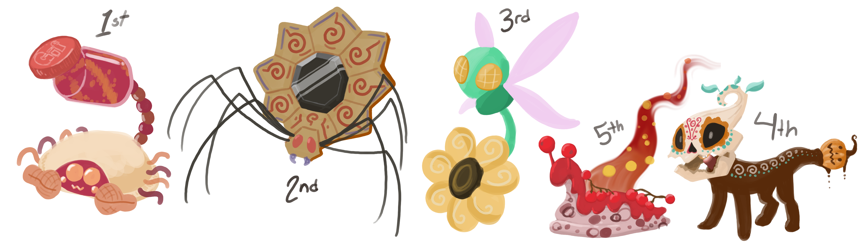
Before I begin, the drawings above ARE NOT the official entrees. They are redesigns of those entrees made to show what I would do with their ideas to get more points from this contest. This excludes the middle one, I couldn't think of anything."EXTRA" is the points gained from each vote on the recent poll.
Made by Probe100 .
PB&J - (10/10)
Jar - (10/10)
Cute - (10/10)
Attack - (10/10) : Exactly what I had in mind, actually. It’s the entire point of the location they reside in, changing the velocity of the player to solve puzzles. The inclusion of having one, the other, or both is also a natural step for the concept.
Nice Touches - (7/10) : Uncrustables are my life. I don’t care if I’m almost old enough to drink, gimme the round freezer bois. However, I do feel as if the peanuts being the tail is a bit weird.
Overall Design - (10/20) : It’s a bit clunky, honestly. The combination of sharp and smooth lines aren’t well implemented, and filling the jar with the substance it’s firing out would avoid adding unnecessary blue to the color scheme, or just making the jar white with a darker background. The face is like if you put googly eyes on an Uncrustable sandwich, which is funnier in thought than execution.
Guidelines - (25/30) : It’s perfectly fine to animate. You avoided too many joints on the tail by only having spheres indicate their position. However, i deducted points because the color of the legs are the same as the line in the sandwich, which while easy to draw still, can be confusing to the viewer.
EXTRA: 4
FINAL: 86
Made by Probe100 .
Insect/Arachnid - (10/10)
Sunflowers - (10/10)
Gem - (10/10)
Attack - (5/10) : The part where it uses light is interesting, but the rest would be a hassle to animate and plan out.
Nice Touches - (1/10) : There aren’t many items of interest beyond the key elements required by this contest.
Overall Design - (19/20): It just works. It’s hard to explain, but it’s a very sensible design.
Guidelines - (26/30): It’s very easy to animate considering all 8 legs are just single lines. However, the head might get lost in the petals due to the color.
EXTRA: 2
FINAL: 83
Made by Gakriele-lvs .
Insect/Arachnid - (10/10)
Sunflowers - (10/10)
Gem - (10/10)
Attack - (3/10) : The pendulum thing sounded like it was going somewhere, but it’s really just a shooting attack.
Nice Touches - (1/10) : It really is just the bare basics, honestly.
Overall Design - (16/20): It’s a very solid design, despite being a bit bare.
Guidelines - (29/30): This would totally be a good set of animation. It’s both easy and has unique elements.
EXTRA: 3
FINAL: 82
Made by Katkrazy339 .
Dia De Los Muertos - (7/10) : This is one of those instances where a trait can be on the entire body, such as the colored marks being everywhere.
Food - (4/10) : It’s a bit hard to tell that its chocolate. Besides, chocolate is a very simple choice for the two holidays presented.
Halloween - (0/10) : I have absolutely no idea what about this is suppose to be Halloween.
Attack - (2/10) : There isn’t really a good attack, but an interesting puzzle can be made to defeat them.
Nice Touches - (6/10) : it does make sense for multiple different skull designs to exist, given the nature of the faces.
Overall Design - (12/20): It’s hard to see the body. The skull is somewhat plain, but it still looks pretty decent and original.
Guidelines - (19/30): This would be easy to animate, but there isn’t much fun I can have with it.
EXTRA: 6
FINAL: 56
Made by Art-a-bod .
Fruits and/or Nuts - (3/10) : I get it, but anybody looking at this would only see a lava slug.
Tea - (0/10) : Absolutely nobody would guess “tea” just by looking at this.
Sea Life - (4/10) : As far as I’m aware, slugs are associated primarily with land-dwellers. I know sea slugs exist, but you’d have to make it much more apparent that this was from the sea.
Attack - (8/10) : The ideas aren’t perfect, but can be re-written into something a bit more viable. Attack 2 is the better of the three.
Nice Touches - (5/10) : I know it’s a flame, but the way it’s drawn here can be interpreted as a much cooler-looking animation.
Overall Design - (13/20): This creature is generally well-designed. It’s more or less like a generic Pokemon or the fire slugs from multiple games such as Pikmin 3.
Guidelines - (20/30): Being one complete blob with a flame, it would be a little more difficult to animate but still not too hard. It leaves room to attempt multiple ways to handle it.
EXTRA: 0
FINAL: 53