HOME | DD
 markerguru — botcon litho art

Published: 2008-04-25 21:52:27 +0000 UTC; Views: 32895; Favourites: 722; Downloads: 1406
Redirect to original
Description
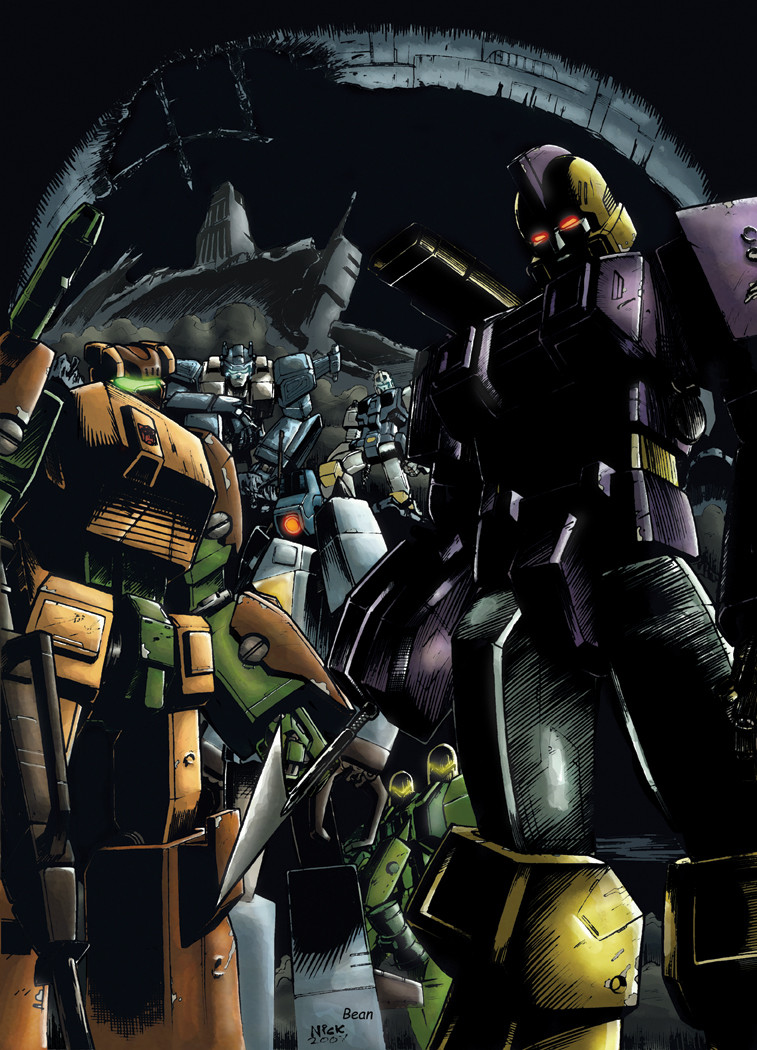
ok kiddies, here is the litho for this years botcon.its based on the 1984 original battle box art.
well, enjoy
 (Smile)")
lineart
colors
Related content


Comments: 127

wow... looks totaly different here... O_o
👍: 0 ⏩: 0


HAHA i have the original on my wall!!
I must say this is very good work ^_^ its Fat-J Approved!!!!
👍: 0 ⏩: 1


this is cool but...something look odd. red decepticon symbol perhaps?
👍: 0 ⏩: 1

blame the story for that. good decepticons, bad autobots
👍: 0 ⏩: 0


that is verry cool! i love these sort of things every time you look at it you spot something new!
👍: 0 ⏩: 1

Ok, my brother was next to me when I looked at this. So I'm putting both of our comments on here
Usa: Holy s**t!!! This is awesome!!!
Brother: Nice!
👍: 0 ⏩: 0

Heh, very cool. I like the glowy bits on Meg's cannons. Everytime I see that purple prime I don't think he looks evil so much as he looks like he's in drag.
👍: 0 ⏩: 0

very nice reminds me of the old G1 box art (something I'd love to see come back)
👍: 0 ⏩: 1
well, its a retake of the old g1 boxart battle
👍: 0 ⏩: 0


Too cool man. Everything in this piece looks great. How long this take you?
👍: 0 ⏩: 1
2 days when i got off my ass to actually do it.
👍: 0 ⏩: 0

Duuuuuuude...
Do you mind if I use this in my tf group my friend?
I promise to link your deviantart page to it crediting you.
👍: 0 ⏩: 1
Thanks for getting back to me my friend.
And I am very greatful for you allowing me to use the image.
I'll make sure to credit you most definatly bro.
👍: 0 ⏩: 0

awesome work as always both of you!! ")

👍: 0 ⏩: 0
HOLY CRAP!!! 

It's a rehashed G1 Boxart look dude this is fantastic some of the best work I've ever seen you and Josh do.


👍: 0 ⏩: 0

So awesome! The Evil Autobots vs. the Heroic Decepticons. lol it just sounds weird..
👍: 0 ⏩: 0


Super! I hope there'll be art of the other chars in the new designs^__^
👍: 0 ⏩: 0

Like the modification you have done.A job well done for both you and Josh.
👍: 0 ⏩: 0

Nice, I picked up on the homage right away.
--LBD "Nytetrayn"
👍: 0 ⏩: 1
very cool. you get a gold star
👍: 0 ⏩: 1


-absolutely cannot imagine a Megatron for Shattered Glass- but now that I see him he damn surprises me! He looks so good it's shocking! So is Starscream!
For the Autobots... Haha, wonder why Optimus is at the baack.;;
👍: 0 ⏩: 0


Madness. XD Kind of remind me of the classic art on the back of those G1 toy boxes.
Hey...how come the Decepticons have their logos red instead of their purple. O,O<

👍: 0 ⏩: 2
| Next =>