HOME | DD

matthiasmuth — You Can't Escape

Published: 2008-08-20 20:06:58 +0000 UTC; Views: 21125; Favourites: 133; Downloads: 458
Redirect to original
Description 
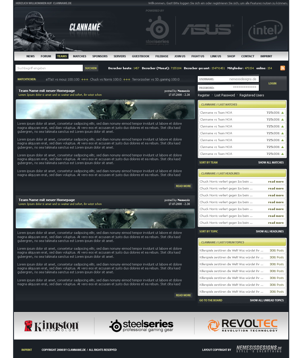
forum icons by -kol.deviantart.com/ (just placeholders)
Related content
Comments: 134

matthiasmuth In reply to ??? [2008-08-23 14:53:47 +0000 UTC]

Square721 Ex BT

👍: 0 ⏩: 1

Ne0x84 In reply to matthiasmuth [2008-08-23 14:57:23 +0000 UTC]

zthx

👍: 0 ⏩: 1

Ne0x84 In reply to Ne0x84 [2008-08-23 15:05:05 +0000 UTC]

wo kan man die laden?

👍: 0 ⏩: 0

wnB91 [2008-08-23 10:59:10 +0000 UTC]

Bam alter...
von meiner Seite aus, weil du endlich mal nen neuen Style ausprobiert hast und den richtig gut umgesetzt hast Gefällt

👍: 0 ⏩: 1

matthiasmuth In reply to wnB91 [2008-08-23 11:30:24 +0000 UTC]

wohoo danke digga

👍: 0 ⏩: 0

Fresh-Designs In reply to ??? [2008-08-22 18:31:25 +0000 UTC]

Nice job

👍: 0 ⏩: 1

matthiasmuth In reply to Fresh-Designs [2008-08-22 22:23:44 +0000 UTC]

thanks for the

👍: 0 ⏩: 1

Fresh-Designs In reply to matthiasmuth [2008-08-23 01:06:05 +0000 UTC]

you're welcome

👍: 0 ⏩: 0

Flechsi In reply to ??? [2008-08-22 11:51:15 +0000 UTC]

Sehr schönes Teil digga
was mir nicht so gefällt ist, dass der Login etwas in der luft liegt :S
Ansonsten echt top

👍: 0 ⏩: 1

matthiasmuth In reply to Flechsi [2008-08-22 11:54:54 +0000 UTC]

vielen dank digga

👍: 0 ⏩: 0

johannes-meyer In reply to ??? [2008-08-21 21:22:59 +0000 UTC]

krasses ding

*fav*

👍: 0 ⏩: 1

matthiasmuth In reply to johannes-meyer [2008-08-22 04:55:14 +0000 UTC]

danke

👍: 0 ⏩: 0

elemeNt-XY In reply to ??? [2008-08-21 17:53:19 +0000 UTC]

Was ist das denn für eine Schriftart bei "CONTACT IMPRINT"?
Hoffe du verrätst es mir

👍: 0 ⏩: 1

matthiasmuth In reply to elemeNt-XY [2008-08-21 19:19:38 +0000 UTC]

swis

👍: 0 ⏩: 1

elemeNt-XY In reply to matthiasmuth [2008-08-21 19:37:54 +0000 UTC]

danke

👍: 0 ⏩: 1

matthiasmuth In reply to elemeNt-XY [2008-08-21 19:43:53 +0000 UTC]

immer wieder gerne^^

👍: 0 ⏩: 1

elemeNt-XY In reply to matthiasmuth [2008-08-21 22:31:08 +0000 UTC]

👍: 0 ⏩: 0

the-danzor [2008-08-21 15:55:53 +0000 UTC]

Another awsome design!

👍: 0 ⏩: 1

matthiasmuth In reply to the-danzor [2008-08-21 16:01:37 +0000 UTC]

thx dude

👍: 0 ⏩: 0

termi1992 In reply to ??? [2008-08-21 15:54:44 +0000 UTC]

WoW!!!! Also der Head, ist mal Boom *_*

sehr sehr geil!

👍: 0 ⏩: 1

matthiasmuth In reply to termi1992 [2008-08-21 16:02:14 +0000 UTC]

wooooow endlich mal wieder ein commi von dir ^^ hab schon gedacht du wärst tot ^^ sonst warst du immer der erste
thx

👍: 0 ⏩: 1

termi1992 In reply to matthiasmuth [2008-08-21 18:38:26 +0000 UTC]

naja dauert alles seine Zeit bin nicht mehr der jüngste

👍: 0 ⏩: 1

matthiasmuth In reply to termi1992 [2008-08-21 19:21:16 +0000 UTC]

jo in deinem alter gehts schon so langsam richtung grab

👍: 0 ⏩: 0

eclipSe-Saitex [2008-08-21 15:43:57 +0000 UTC]

Der "Read more" & der "All polls" - Buttons ifnd ich nicht gerade schick. :/
Aber der rest ist schon richtig nice gemacht

👍: 0 ⏩: 1

matthiasmuth In reply to eclipSe-Saitex [2008-08-21 15:45:07 +0000 UTC]

thx
ja die buttons... mit buttons hab ichs generell nich so^^

👍: 0 ⏩: 1

eclipSe-Saitex In reply to matthiasmuth [2008-08-21 15:48:42 +0000 UTC]

Macht aber das Design nicht gerade schlechter.

👍: 0 ⏩: 0

flyx2k7 [2008-08-21 15:27:20 +0000 UTC]

Einfach geil!

👍: 0 ⏩: 1

matthiasmuth In reply to flyx2k7 [2008-08-21 15:44:32 +0000 UTC]

vielen dank

👍: 0 ⏩: 0

xexaplex [2008-08-21 15:10:45 +0000 UTC]

sehr geil...header flasht mich^^

👍: 0 ⏩: 1

matthiasmuth In reply to xexaplex [2008-08-21 15:19:35 +0000 UTC]

danke

👍: 0 ⏩: 0

aronarts-webmedia [2008-08-21 15:09:39 +0000 UTC]

Gefällt mir. ^^
Schoen Strukturiert. xD
Am besten find ich die latest wars. ^^

👍: 0 ⏩: 1

matthiasmuth In reply to aronarts-webmedia [2008-08-21 15:19:19 +0000 UTC]

danke
ja irgendwas muss man sich ja immer einfallen lassen xDDD

👍: 0 ⏩: 0

Torsten85 [2008-08-21 13:00:10 +0000 UTC]

Ist total geil...vom aufbau und farben einfach genial!!

👍: 0 ⏩: 1

matthiasmuth In reply to Torsten85 [2008-08-21 14:08:39 +0000 UTC]

dankeeeeeee

👍: 0 ⏩: 0

Ja-Lie In reply to ??? [2008-08-21 12:18:28 +0000 UTC]

Joa...ich finde es auf jeden Fall gelungen...und da einige Stellen dabei sind die nicht nicht so 100% sind...fällt das gar nicht so doll auf

👍: 0 ⏩: 1

matthiasmuth In reply to Ja-Lie [2008-08-21 14:07:06 +0000 UTC]

danke

👍: 0 ⏩: 0

inGraphics [2008-08-21 10:55:41 +0000 UTC]

Mir gefällts sehr gut
Eine mischung mit Effekten und Professionalität... oder so Gibt auf jeden fall ein

👍: 0 ⏩: 1

matthiasmuth In reply to inGraphics [2008-08-21 14:06:08 +0000 UTC]

danke alter
ich denke, ich werde noch ein paar layouts in dem style machen

👍: 0 ⏩: 1

inGraphics In reply to matthiasmuth [2008-08-21 14:09:54 +0000 UTC]

jo, kein ding und mach das
ist auf jeden fall ein cooler style !
Wäre nicht schlecht wenn du mir mal zeigen würdest wie
man paar lichteffekte machen kann

👍: 0 ⏩: 1

matthiasmuth In reply to inGraphics [2008-08-21 14:18:19 +0000 UTC]

dir?^^ wieso das??

👍: 0 ⏩: 1

inGraphics In reply to matthiasmuth [2008-08-21 14:22:58 +0000 UTC]

ICQ >>

👍: 0 ⏩: 0

ZexX-Styles In reply to ??? [2008-08-21 10:05:35 +0000 UTC]

hübsch hübsch

👍: 0 ⏩: 1

matthiasmuth In reply to ZexX-Styles [2008-08-21 14:05:41 +0000 UTC]

thx

👍: 0 ⏩: 1

ZexX-Styles In reply to matthiasmuth [2008-08-21 14:26:19 +0000 UTC]

np

👍: 0 ⏩: 0

F3rk3S In reply to ??? [2008-08-21 09:19:44 +0000 UTC]

sind einige schöne stellen dabei, aber einige die mir nicht ganz gefallen, was aber größtenteils kleinigkeiten sind. aber den footer bereich finde ich nicht schön gemacht, die idee gut aber wo und wie die fonts zueinander stehen ist alles sehr fliegend ohne fix punkte aufeinander

👍: 0 ⏩: 1

matthiasmuth In reply to F3rk3S [2008-08-21 14:04:13 +0000 UTC]

danke
aber wie meinst du das mit der schrift? das check ich nich so richtig ^^
die copyrights stehen untereinander und das "go to top" und "contact | imprint" steht auch auf einer linie

👍: 0 ⏩: 1

F3rk3S In reply to matthiasmuth [2008-08-21 14:44:31 +0000 UTC]

ja ich weiss, aber wie das gesammte zueinander ist, es findet alles keinen zusammenhang un sieht aus als ob es einzelne texte sind. weil zuviel freiraum dazwischen hängt.

👍: 0 ⏩: 0

skinless-gfx [2008-08-21 07:52:40 +0000 UTC]

Wie schon gesagt, GEIL

fav.

👍: 0 ⏩: 1

matthiasmuth In reply to skinless-gfx [2008-08-21 14:02:19 +0000 UTC]

danke sehr

👍: 0 ⏩: 0

Mav3rixX [2008-08-21 07:42:20 +0000 UTC]

Der Header is geil

👍: 0 ⏩: 0


| Next =>