HOME | DD
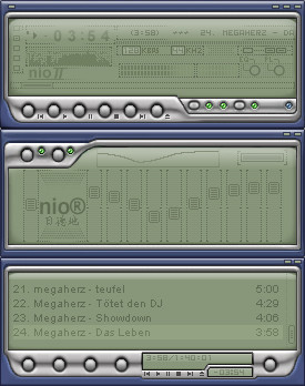
 mattnagy — Nio II
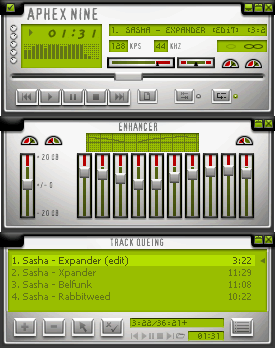
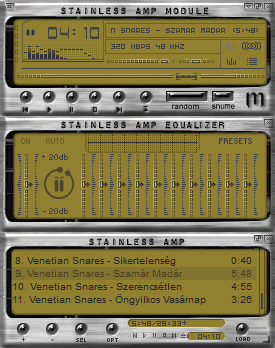
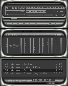
Published: 2003-01-27 14:03:59 +0000 UTC; Views: 2295; Favourites: 13; Downloads: 996
Redirect to original
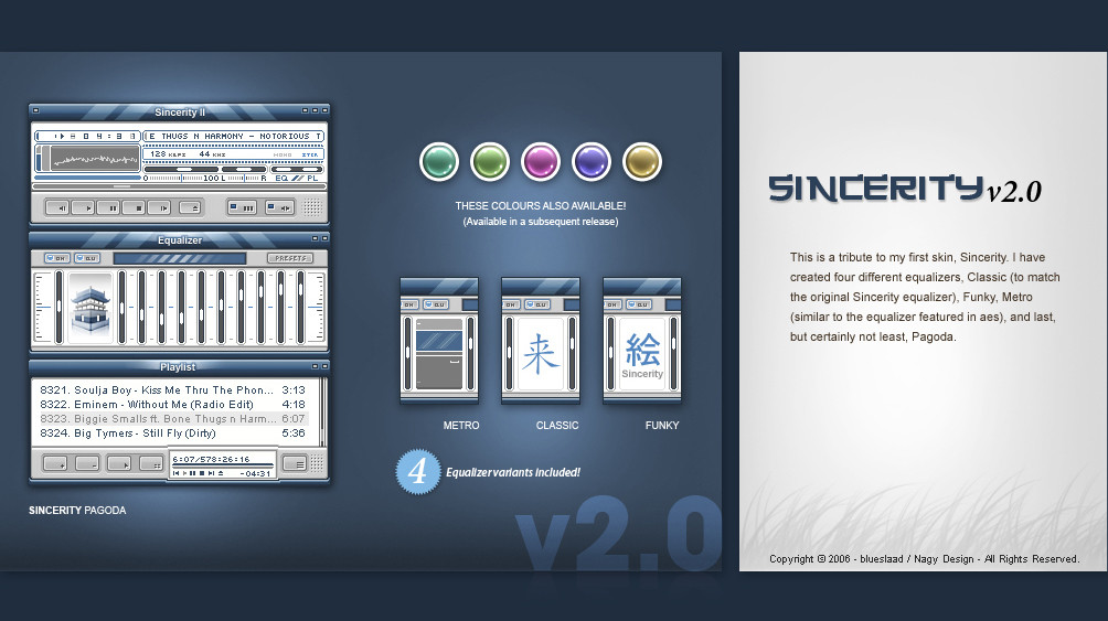
Description
A long project in the making, I wanted to make it perfect for you guys. The rest is up to you, Enjoy!Related content


Comments: 25


usually green and blue wouldnt work but you made it.
(Nio is the swedish word for nine)
👍: 0 ⏩: 0

Dude each time i visit your profile there is always something new and nice.
Your work is great i like the mettalic ways of your skins.
I hope to see more great work from you.
👍: 0 ⏩: 0


Looks really nice
I always liked the metal+lcd style, and this skin is a good contendant in this cathegory.
The only complaint I've got, and the one that will prevent me from using this, is that in winshade mode the text is nearly impossible to read, which is bad if you're using winshade 99% of the time
Overall, it's a good work, but don't forget usability please
👍: 0 ⏩: 0

wow already all this people for this skin!!!what's nio2??? ,a tornado?; ]
nice skin very clean .
👍: 0 ⏩: 0


Awesome work, as usual . The chrome looks fantastic - easily the best you've done. My only request would be for a bit more contrast in the darker green you've used in the windows. Other than, very impressive
.
👍: 0 ⏩: 0


nice, clean skin, but also very detailed. great job on the II version!
👍: 0 ⏩: 0

Interpretation/Review: Smooth skin, good color scheme and font style type. You blend in blue and green very well, where dark colors are good for supporting as background.
Pros/Cons/Suggestions: Very nice overall, although I like black more then blue as background, but this is still great. Good work.
Award:
👍: 0 ⏩: 0


Excelent! I think that shuf./repeat buttons and eq. buttons are much better than in the first version of nio!
👍: 0 ⏩: 0


well done. I really like the colors and buttons. and the lcd screens are also great.
👍: 0 ⏩: 0


cool...its done...i really cant find anything wrong with the skin...perfect man...great work.
👍: 0 ⏩: 0

i dont know, its not bad, but most of the skins you got look the same, except for a few ones... even though, and as i said before, its not bad
👍: 0 ⏩: 0

woot, nio is my favourite skin by you, this one looks more sharper. I liked the little circles in the middle of the eq though shame there not there, but that dont really matter
👍: 0 ⏩: 0

you already know what i think of this
very nice touchup on the original nio. the metallic areas have alot more contrast now and it really lifts the overall design up a notch. The design, particularly in the borders, has a 'classic' sorta feel about it ... very retro
awesome stuff, dude.
i like the vol controls too
👍: 0 ⏩: 0