HOME | DD
 mcr-raven — Angels of the unknown
by-nc-nd
mcr-raven — Angels of the unknown
by-nc-nd
Published: 2008-10-27 00:00:18 +0000 UTC; Views: 32378; Favourites: 499; Downloads: 0
Redirect to original
Description
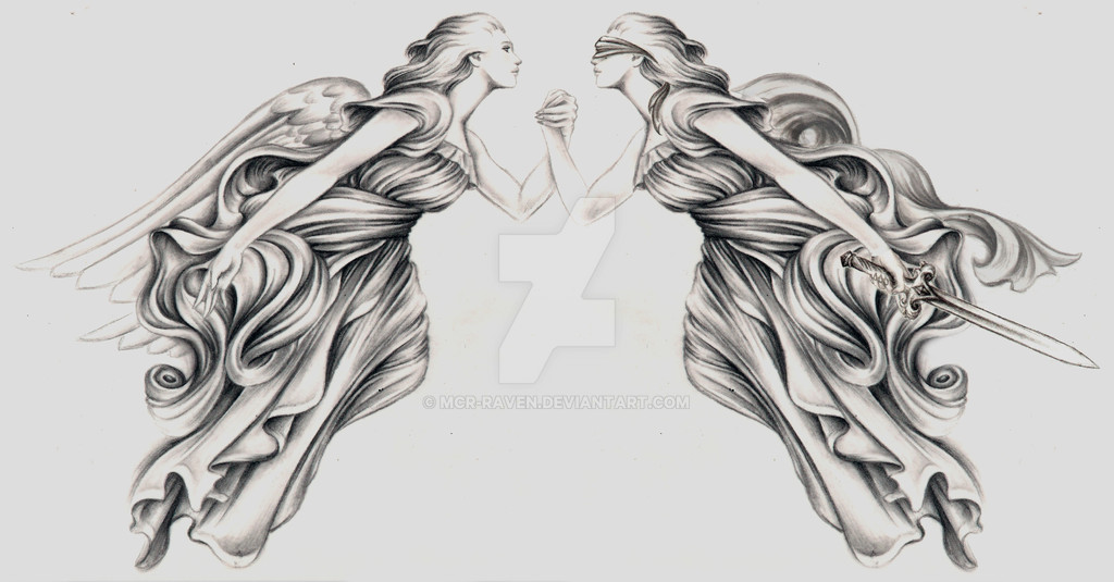
A tattoo design for a client.He wanted something based on 3 words:
- freedom
- equality
- justice
he would just let me draw something and this is the result.
I still want to change it a little though.
I think it's a little empty in the middle, don'tcha?
(it's to be placed from shoulder to shoulder on his back)
-
figures are based on James Jean's Fables
Related content


Comments: 74


it is a bit empty in the middle, like you said
but honestly, becides that minnor, and I do mean minnor detail
this is simply stunning and I am pretty damn sure that
your client is going to love this!
~

👍: 0 ⏩: 0


i like this so much ... ! how precisely you draw the lines and how the dress falls ... it is so beautiful ...
this thing with the left angels hand ... maybe it would look even better if you lift it a little bit ... with a lil bit more tension
👍: 0 ⏩: 0


The pic is pretty awesome.But if you want something in the middle it would be nice if its something like a sign.Ask the client for example what he would want there.If i was to say what-I would ask for tribal sign.
👍: 0 ⏩: 0


I love it! As far as the middle goes, It's not bad. I would ask him if he wants anything in the middle. I think the left angel's hand looks a little awkward(empty) due to the other one havening the sword, makes it a bit unbalanced. But besides that It's amazing!
👍: 0 ⏩: 0

Not missing anything.
It gives emphasis on the hands.
👍: 0 ⏩: 0


You are very talented, I love all of your drawings, but this one's my favourite.
👍: 0 ⏩: 0

Eee, I missed you. Wow this is really beautiful though, so symbolic and well done. Though I do agree that it is a little empty in the middle...
What if perhaps they were extending their arms downward to clasp hands instead of intertwining them? Maybe they could have something on their wrists? That might make it a little less dead space in the center :3
👍: 0 ⏩: 0

if I say anything besides "looks freaking great!", it's that you are a saint when it comes to folds and wrinkles.
👍: 0 ⏩: 0

i think that it does look really nice, escpecially if yu were to put it on someone's back. But if yu put it anywhere else the middle does seem slightly missing something u.u
👍: 0 ⏩: 0

 (Smile)")
👍: 0 ⏩: 0


Nay. some empty space is good. if u want, add more details on their clasped arms/hands; thats about it. there's enough gorgeous details already, and my IS IT gorgeous. u have simply exquisite skills.
i must draw swirly fabric one of these days again, for the heck of it. swirly fabric is fun!
")
👍: 0 ⏩: 0

that looks awesome and it fits the concepts too. Yes, I do think there needs to be something in the middle too, but I don't know what.
👍: 0 ⏩: 0


my god this is so stunning
the details on the clothes are amazing and i love their gentle faces...
they're just perfectly angelic
b-e-a-u-t-i-f-u-l
i think it's perfect as it is....

👍: 0 ⏩: 0

James Jean is one of my favorite artists and I think you used the right inspiration for this piece.
Since it's on the shoulders I would say to leave it as it is. You probably don't want to overload it. It's already wonderful enough.

👍: 0 ⏩: 0


wow, you are GOOD. damn good!
you are a pro, I guess... and... a tattooer maybe?
👍: 0 ⏩: 0

i don't think it looks too empty
if i had to add something id probably just do a banner/scroll
with the three words maybe
but i think it looks great as is
👍: 0 ⏩: 0

i dont think it is empty, when you put it on skin it gives a texture and a background to it... and as i said above as nimrodella, nice composition
👍: 0 ⏩: 0

pretty good representation raven, i like the image, its like a medieval allegory
👍: 0 ⏩: 0


If you think it's too empty in the middle, maybe you could make the blindfold elegantly swirl between them?
👍: 0 ⏩: 0


For shoulder-to-shoulder, I think the negative space helps make a statement of simplicity and delicacy. I love it! :-D
👍: 0 ⏩: 0

I don't think it needs anything. I think back designs look more elegant and balanced when they stretch across the shoulder blades with more weight on the sides than in the middle. I think it will work out well.
👍: 0 ⏩: 0


When I first looked at it, I thought WOW!!! That would be an EPIC tattoo!!!! Than I read your author notes, And I was like SWEET!!!! lol. That is an awesome idea. If the guys a christian, it would be sweet having a cross in the center. If not, perhaps something that represents night and day. Just a thought, I dont know a lot about these things, lol. Itd be cool to see your end result!!!
👍: 0 ⏩: 0

that is beautiful beyong amazing
i would perhaps but latin calligraphy between the two as more detail may destroy the representtion you have here
👍: 0 ⏩: 0

Maybe something entwined in the middle from the level of the bottom of the robes?
👍: 0 ⏩: 0

Beautiful! Considering the shoulder to shoulder placement i dont think the empty space is an issue ^^ Lovely piece!
👍: 0 ⏩: 0

i think this design would look sick on the back. beautiful design. i think you captured the concept beautifully.
👍: 0 ⏩: 0

i like the fact that it's kinda empty in the middle. i don't know, i think that if you add something, it'll be too much.
it's pretty beautiful the way it is
👍: 0 ⏩: 0
| Next =>