HOME | DD
 MechaSoldier — Crystal man

Published: 2006-01-17 02:49:24 +0000 UTC; Views: 174; Favourites: 2; Downloads: 7
Redirect to original
Description
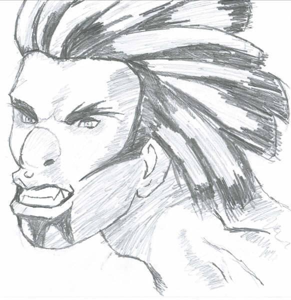
I'm trying to practise and improve my comic drawing at the moment and this is a character that i saw in a book that i just had to draw. Drawn on A4 paper using a black fineliner, hasn't been touched up or anything. This is NOT my character.Comments please
Character © its respective owner
Related content


Comments: 5

i really like the lines. i think u've done a great job for practice.
👍: 0 ⏩: 0


You've opened to advanced critique, and I'll do what I can do.
First tip, and really just a tip, is that when you look at the original character you should probably realize that most, if not all, of the lines that were made in that were made with single strokes. Sure, that seems kind of obvious, but what i mean is that even the lines where the thickness varies were probably done with a brush tip marker or some other kind where you can vary the thickness of a single stroke. Those techniques are hard to get down perfect, since you have no room for mistakes, but i can say first hand, the results you get from them can be wonderful. I'd suggest trying it out, and see if you can't find someone who already has them and borrow, cuz brush pens aren't all that cheap.
Second, and this is probably more toward the original artist rather than you, is the area in the neck. The lines there fit in with other lines, it's not like it's out of place, but the front of the neck could use more reflective quality. Assuming the marks on his chin and above his right eye (the white circular stuff) are there to show reflection, it could've used that in the neck as well to show a little more reflection. But, if this head were connected to a body, he could've made that little quirk obsolete.
Third would be, if you can't think of a character of your own (and creativity eludes us all sometimes), try taking one of the characters you admire, like this guy even, and try redrawing him with slightly, or very different features. Try exaggerating things, or stretching out the shapes that are already there. Sometimes you can take something that's just 'good' and give it some impact and flare. Like for this guy you might try putting the ice in more places on his face and suddenly you've got a different character that you can call your own... depending on just how close you draw the rest of the face.
Finally, composition. I hate composition myself, just because I have a bad tendency of getting it wrong. But it's really important... no really, it's really important. (lots of really in that sentence) Composition can give the viewer's eye something to follow, like when I start looking in detail on that drawing my eyes follow the individual lines in the face, but the overall picture is out of place. There's too much space at the bottom for there to be all that space to the left. If the neck touched the bottom, than even an 'unbalanced' composition is still good. Sometimes putting something to the side improves the composition, in this context it's a good idea because he's facing into the blankness, it makes it look like there might be something just off the edge of the page, and it works well.
Just keep in mind that the artist you copied from got where he did for a reason, and if you really like the style of his imagery, study it at least a little, figure out why he does certain things. The little lines that may seem unneccesary could well be there for a good reason and if removed could ruin the image. So study up on your favorite artists (heck, I still do it and I'm in college) and figure out what they're all about. Good luck
Oh, and I do like it. I would have rather seen an original work of your own, but not much can be TRUELY original anymore. Keep up the good work.

👍: 0 ⏩: 0

really cool! love the way you have drawn it. lovely lines.
 (Smile)")
👍: 0 ⏩: 0

Very nice ^_^ I love the shading and harsh angles involved, and I sincerely an having trouble finding room to improve.
👍: 0 ⏩: 0